Motivating Scenario: You have conducted your post-hoc tests. So, you know if a given pair differ significantly from one another. Now, you want to effectively summarize all these pairwise differences. Our goal here is to simplify a complex table of pairwise comparisons into a compact, easy-to-read and interpret summary.
Learning Goals: By the end of this subchapter, you should be able to:
Derive and label significance groups (“a”, “b”, etc.) from pairwise comparison results.
Explain the meaning of overlapping letters (e.g., “a,b”) in significance group displays.
Visualize significance groups on plots to clearly communicate post-hoc results with ggplot.
comparison
p.adj
significant
S22-SR
0.0000
TRUE
SM-SR
0.3378
FALSE
S6-SR
0.0000
TRUE
SM-S22
0.0000
TRUE
S6-S22
0.4859
FALSE
S6-SM
0.0000
TRUE
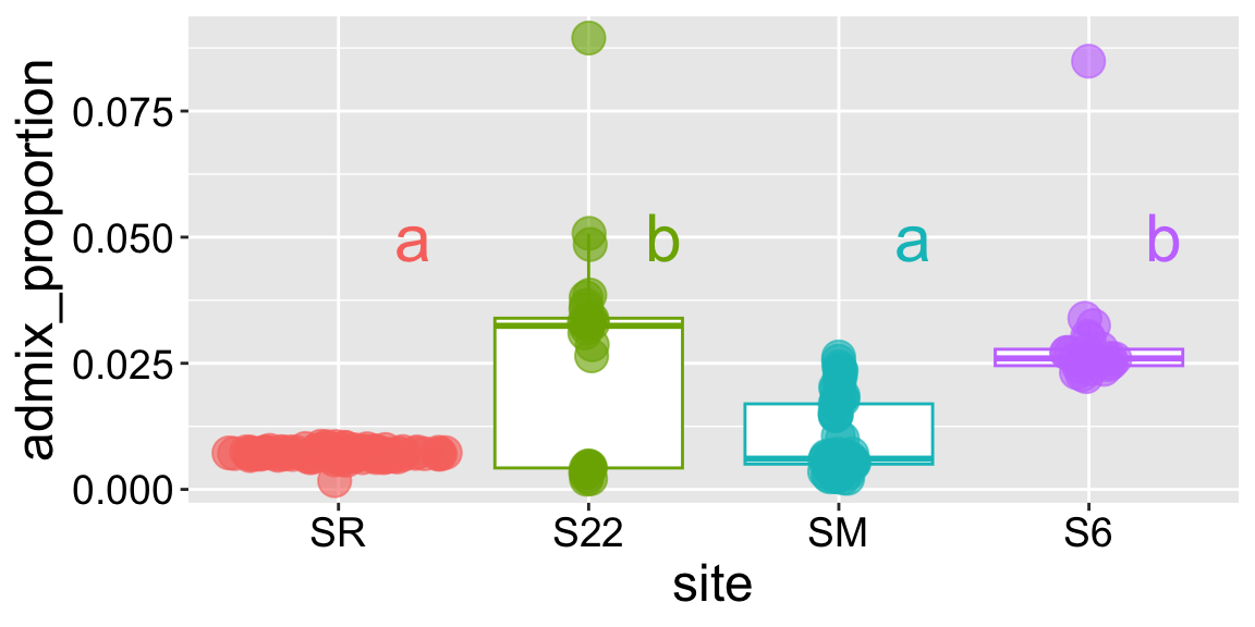
So we now know which pairs differ from one another! But, there is a real mental burden in trying to make sense of results from many pairwise tests. Defining “significance groups” helps us present results of a post-hoc test. Here, we assign the same letter to groups that do not significantly differ, and different letters to groups that do. In our case we see that:
Site SR and site S22 significantly differ. So we put them in different significance groups.
We’ll assign SR to group “a”.
We’ll assign S22 to group “b”.
Site SR does not differ significantly from site SM, but does differ from Site S22.
We’ll assign SM to group “a”.
Site S6 differs significantly from sites SR and SM, but does not differ from Site S22.
We’ll assign S6 to group “b”.
These letter-based summaries are handy for communicating complex post-hoc results. But remember, they are shorthand for results of your post-hoc tests, not new analyses. We can communicate these groups by adding this information to a plot:
Consider the hypothetical (and not uncommon) outcome of a post-hoc test, displayed in the right margin. Here:
Groups X and Y significantly differ. So we put them in different significance groups.
We’ll assign X to group “a”.
We’ll assign Y to group “b”.
But Z differs from neither group. So,
We’ll assign Z to groups “a” and “b” because it does not significantly differ from either group. In a plot we would show this as “a,b”.
When you see a category with two letters (like ‘a,b’), it means the sample is not significantly different from categories in group a and in group b, but all categories uniquely assigned to a are significantly different from all categories uniquely assigned to group group b.
R automation
As you might imagine, logic-ing this all out can get messy. Luckily, you can pipe your glht() output into the cld() function which will assign samples to “significance groups”:
library(multcomp)lm(admix_proportion ~ site, data = clarkia_hz)|>glht(linfct =mcp(site ="Tukey"))|>cld()