15. Normal distribution
Motivating scenario: You are beginning your journey into linear modeling and have heard about the normal distribution. You know it’s a key assumption of linear models and need a brush up.
Learning goals: By the end of this chapter you should be able to:
- Identify the key features of a normal distribution.
- Explain the roles of the mean (\(\mu\)) and standard deviation (\(\sigma\)) in defining a normal distribution.
- Explain the central limit theorem and why the normal distribution is so common in nature.
- Explain the difference between a probability mass function (for discrete data) and a probability density function (for continuous data).
- Conduct a Z-transformation, understanding what a Z-score represents and why it is useful.
- Visually evaluate if a distribution is “normal-ish”.
- Know common transformations to make a distribution more closely resemble the normal distribution.
Histograms
Code to make a histogram
ggplot(gc_rils, aes(x = petal_area_mm))+
  geom_histogram(bins = 12, color = "white")+
  theme(axis.title = element_text(size = 30),
        axis.text = element_text(size = 30))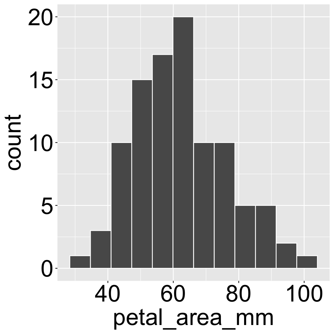
By now, we have seen a bunch of histograms. Some, like Figure 1, have come from raw data, while others have come from resampling techniques like bootstraps or permutations. As a refresher, histograms display the distribution of a single numeric variable by “binning” the data, placing these bins on the x axis, and displaying the number observations in a given x-bin on the y axis.
Mathematical Distributions
Histograms are remarkably useful visualizations because they show the shape, range, and variability in a dataset. By knowing the shape of the data, we can understand the data’s statistical properties.
Although data comes in many shapes, there are some distributions that are so common in nature that they are given their own name and come with many mathematical tools. If we are lucky (and we often are), the data can be reasonably approximated by one of these handful of mathematical distributions. What this means is that we can summarize a histogram by an equation. This also means we can have a pretty good sense of our data by knowing
- The mathematical distribution it (roughly) follows
- The values of the key parameters in this distribution.
This is remarkably powerful because we can then effectively summarize hundreds of data points with a few numbers, and because we can apply a whole bunch of mathematical machinery to generate sampling distributions and do statistics!!
This section focusses on the normal distribution. Other common statistical distributions include:
Binomial: The number of “successes” in n trials. This is a natural distribution for e.g. the number of hybrid seeds out of n genotyped offspring.
Poisson: The number of observations in a certain space or over a certain time. This is a natural distribution for e.g. the number of pollinator visits observed in a fifteen minute time interval.
We will revisit these distributions later in the book.
The normal distribution
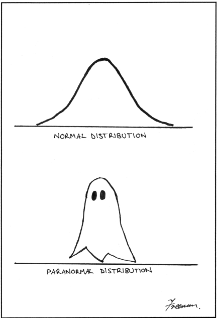
Perhaps the most common and well-known distribution has a shape similar to a bell and is called the normal distribution (Figure 2). The normal distribution is characterized by a few key features:
- A single, central peak where the data are most frequent.
- Symmetry about the center line.
The shape of this distribution is described precisely by its probability density function (PDF). This equation is defined by two key parameters:
- The population mean, \(\mu\), which sets the center of the distribution.
- The population standard deviation, \(\sigma\), which sets the width (or spread) of the distribution.
\[f(x) = \frac{1}{\sigma\sqrt{2\pi}} e^{-\frac{1}{2}\left(\frac{x-\mu}{\sigma}\right)^2}\]
With these two parameters, we can fully characterize any normal distribution!
Sampling from a normal distribution
The equation obscures the fact that sampling involves random chance. The outcome of sampling isn’t predetermined, it’s uncertain. However just because it’s uncertain does not mean that all results are equally likely.
I built the webapp below to encourage you to “walk the field,” pick Clarkia xantiana flowers, measure them, and see how a normal model captures that built-in randomness. Try to pick five, then ten then 30!
What’s ahead
Here is how we will wind through the normal distribution and learn a few other things on the journey:
- First, we’ll get a feel for the normal distribution, introducing the concept of a probability density function and how to calculate it in R.
- Next, we’ll explore the key properties of the normal distribution, using an interactive web app and R’s
pnorm()function to calculate probabilities. We’ll also cover the Z-transformation, a key tool for standardizing data. - Then, we’ll simulate data from a normal distribution to verify the mathematical properties of the normal to build a deeper intuition for the sampling process.
- We’ll then discuss the Central Limit Theorem, the amazing principle that explains why the normal distribution is so common in statistics.
- Next, we’ll cover the practical skills of assessing if your data is “normal-ish” using visual tools like QQ plots.
- Finally we’ll explore common data transformations to make data normal.
We conclude, as always, with a chapter summary.