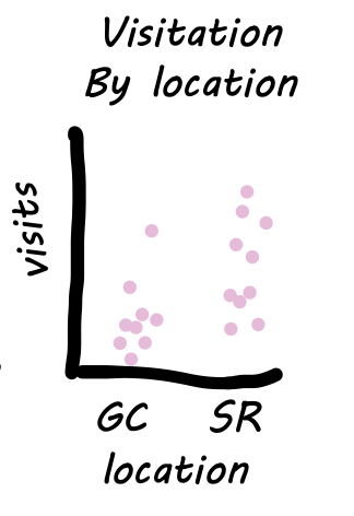
• 3. Two continuous variables
Motivating scenario: You want to visualize the relationship between two continuous variables.
Learning goals: By the end of this sub-chapter you should be able to
- Make a scatterplot with
geom_point().
- Show trends with
geom_smooth().- Show a linear regression with
method = "lm"
- Show a moving average with
method = "loess" - Optionally suppress the grey ribbon by setting
se = FALSE.
- Show a linear regression with
- Transform the scale of x or y axis with e.g.
scale_x_continuous(trans = "log1p").
Visualizing associations between continuous variables.
When Brooke watched pollinators visit parviflora recombinant inbred lines (RILs), she was hoping that these observations also informed the probability of hybrid seed set. The first step in evaluating this hypothesis is to generate a scatterplot – a visualization that shows the association between continuous variables.
We use geom_point() to make such a plot and add trends with geom_smooth(). There are numerous types of trendlines we could add with the method argument:
- To add the best fit linear model type
method = lm.
- To add a smoothed moving average type
method = loess.
By default ggplot adds uncertainty about its guess of the line with a grey background. This is sometimes helpful but can get in the way. To remove it type se = FALSE.
At times transforming the data makes patterns easier to see. We can transform our presentation of the data with the trans argument in the scale_x_continuous() (or scale_y_continuous()) functions.
We present the data with geom_point(). Because some data points overlapped
- I increased the point size (
size = 3) and
- I made the points partially transparent (
alpha = 0.4).
A small jitter could have been ok, but jittering continuous values gives me the ick, because I want my data presented faithfully.
ggplot(ril_data, aes(x = mean_visits, y  = prop_hybrid))+
  geom_point(size = 3, alpha = .4)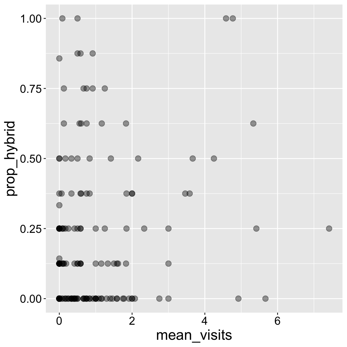
Sometimes nonlinear scales better reveal trends. Transforming the scale on which the data are presented (rather than transforming the data itself) is nice because we retain original values.
ggplot(ril_data, aes(x = mean_visits, y  = prop_hybrid))+
  geom_point(size = 3, alpha = .4)+
  scale_x_continuous(trans = "log1p")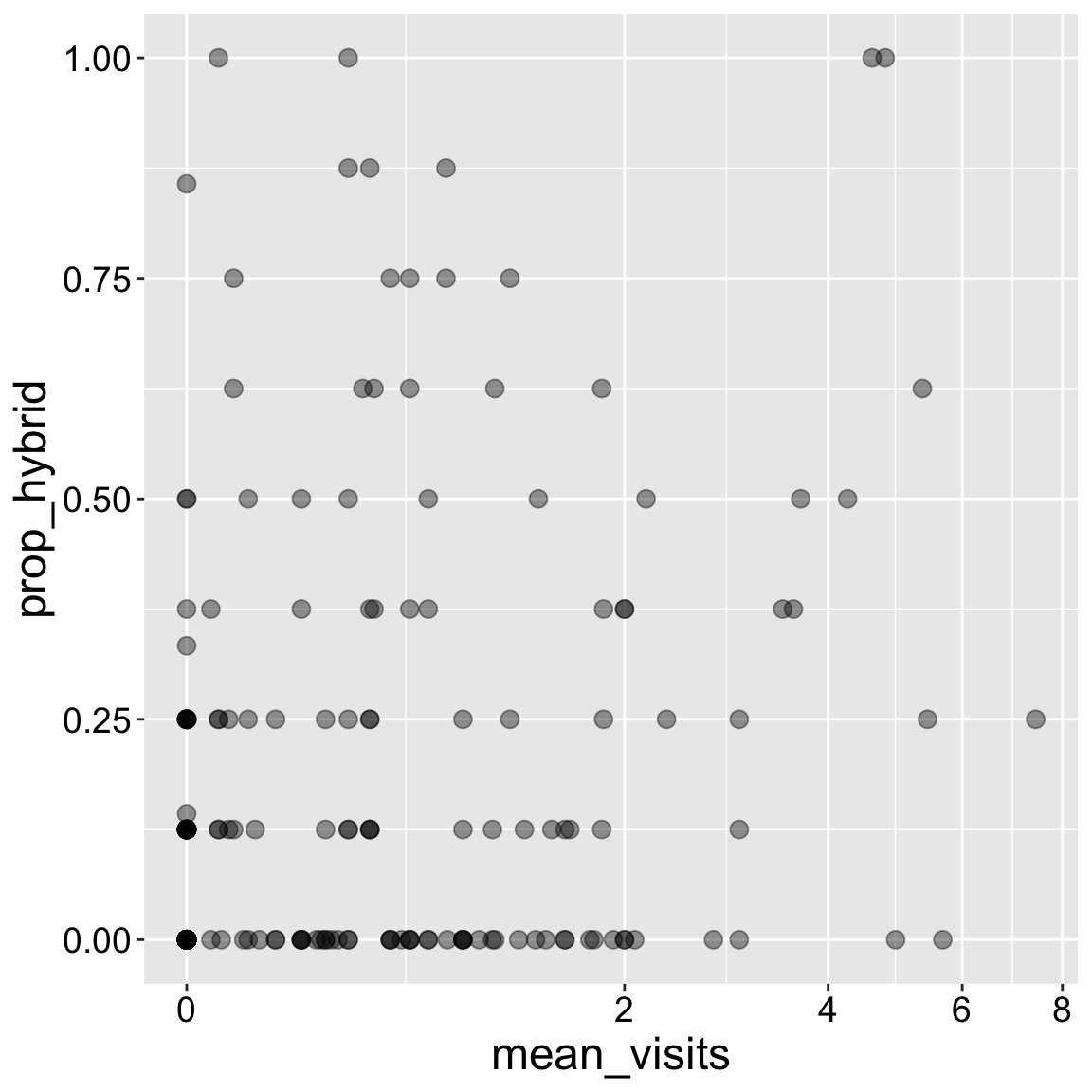
Take care not to lose data when transforming: The log of any number less than or equal to zero is undefined. To avoid losing these data points, I transformed the data as log(x+1) with the "log1p" transformation. If the data were all greater than one, I could have used the log log10 or sqrt transform.
The geom_smooth() allows us to highlight patterns in our data. There are lots of ways to draw trends through data, and we can specify how we want to do so with the method argument.
Here I present the standard “best-fit” line with method = "lm". The grey area around that line represents plausible lines that would also have been statistically acceptable (more on that later).
ggplot(ril_data, aes(x = mean_visits, y  = prop_hybrid))+
  geom_point(size = 3, alpha = .4)+
  geom_smooth(method = "lm")+
  scale_x_continuous(trans = "log1p")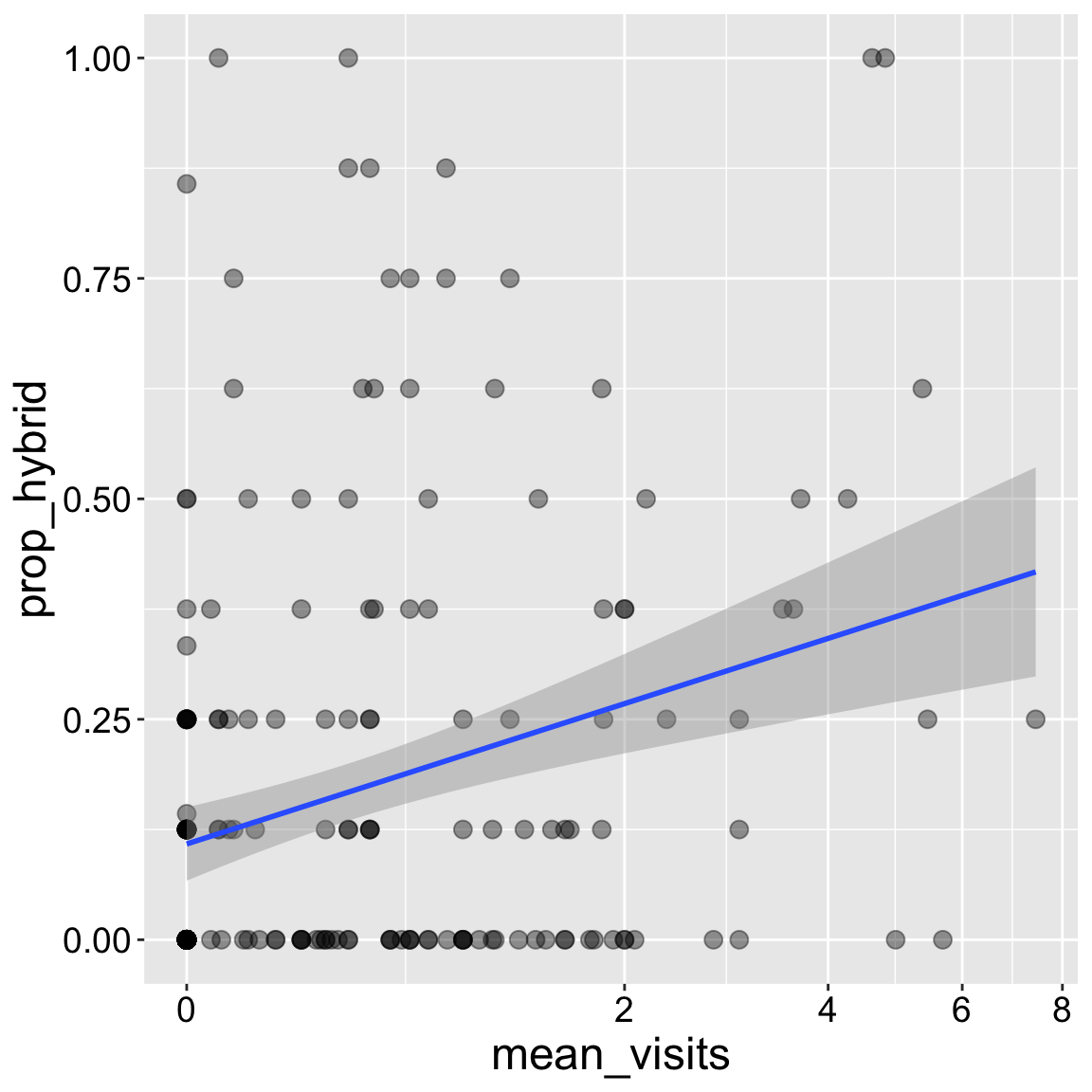
Sometimes a simple line does not do a great job of highlighting patterns. Specifying method = loess presents a smoothed moving average.
In addition to showing that moving average, I show you how to suppress that grey area with se = FALSE. I tend to like to include the uncertainty in our estimated trend so I usually don’t do this, but sometimes showing the uncertainty hides other features of the data, so I wanted to empower you.
ggplot(ril_data, aes(x = mean_visits, y  = prop_hybrid))+
  geom_point(size = 3, alpha = .4)+
  geom_smooth(method = "loess")+
  scale_x_continuous(trans = "log1p")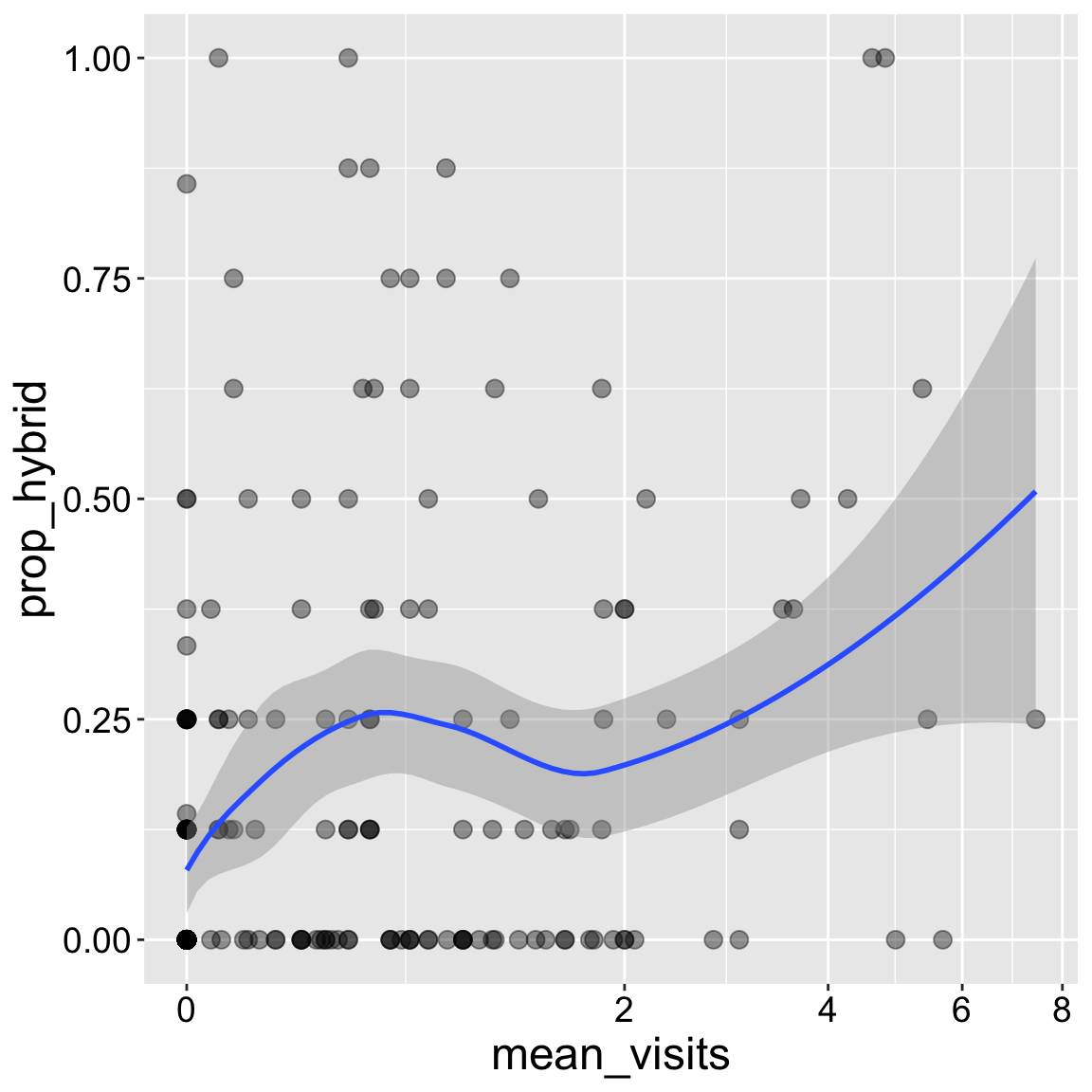
Interpretation: Returning to our motivating question, we see that the proportion of seeds that are hybrids appears to increase with pollinator visitation. Later in the term we will address this question more rigorously.