Because they can be used to parameterize an entire distribution, the mean and variance (or its square root, the standard deviation) are the most common summaries of a variable’s center and spread. However, these summaries are most meaningful when the data resemble a bell curve. To make informed choices about how to summarize a variable, we must first consider its shape, typically visualized with a histogram. When data are skewed or uneven, we can either transform the variable to make its distribution more balanced, or use alternative summaries like the median and interquartile range, which better capture the center and spread in such cases.
Chatbot tutor
Please interact with this custom chatbot (link here) I have made to help you with this chapter. I suggest interacting with at least ten back-and-forths to ramp up and then stopping when you feel like you got what you needed from it.
Practice Questions
Try these questions! By using the R environment you can work without leaving this “book”.
The tabs above – Iris, Faithful, and Rivers – all attempt to make histograms, but include errors, and may have improper bin sizes. (Click the Iris tab if they are initially empty).
Q1) Iris, Faithful, and Rivers – all attempt to make histograms, but include errors. Which code snippet makes the best version of the Iris plot (ignoring bin size)?
Before addressing this set of questions fix the errors in the histograms of Iris, Faithful, and Rivers, and adjust the bin size of each plot until you think it is appropriate. (Click any of the tabs if they are initially empty).
Q2a) Which variable is best described as bimodal?
Q2b) Which variable is best described as unimodal and symmetric?
Q2c) Which variable is best described as unimodal and right skewed?
Penguins
Q3) I calculate means in two different ways above and get different answers. Which is correct?
Q4) What went wrong in calculating these means?
Q5) Accounting for species differences in mean body mass, which penguin species shows the greatest variability in body mass?
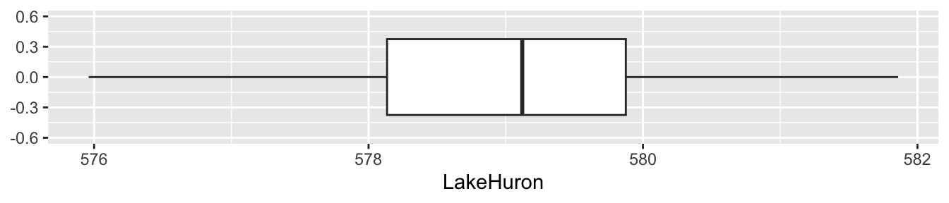
For the next set of questions consider the boxplot below, which summarizes the level of Lake Huron in feet every year from 1875 to 1972.
Q6a) The mean is roughly
Q6b) The median is roughly
Q6c) The mode is roughly
Q6d) The interquartile range is roughly
Q6e) The range is roughly
Q6f) The variance is roughly
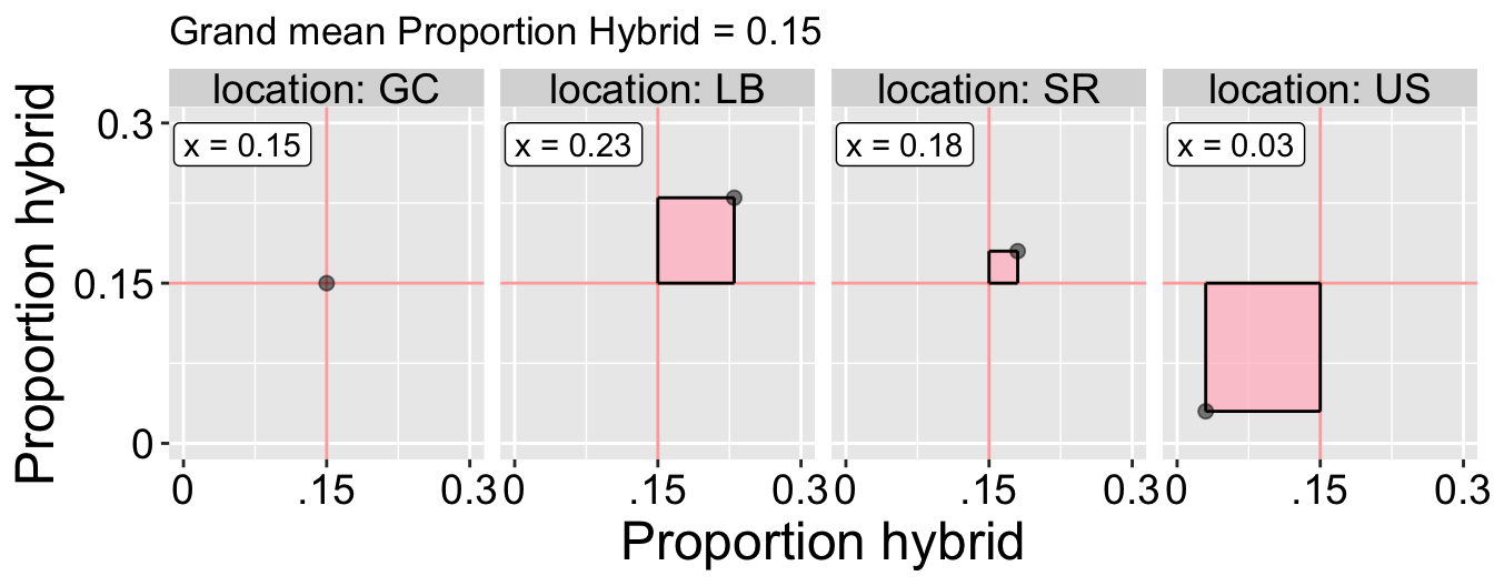
Brooke planted RILs at four different locations, and found tremendous variation in the proportion of hybrid seed across locations. The first step in quantifying this variation is to calculate the sum of squares, so let’s do it. Use the image below (Figure 1) to calculates sum of squares for proportion hybrid seeds across plants planted at four different locations.
Figure 1
Q7a) The sum of squares for differences between proportion hybrids at each location and the grand mean equals:
Q7b) So the variance is
Q7c) The standard deviation is
Q7d) Accounting for differences in their means, how does the variability in the proportion of hybrid seed across locations compare to the variability in petal area among RILs? (refer to this section for reference)
We can compare the variability of traits measured on different scales by dividing the standard deviation by the mean. This gives us the coefficient of variation (CV), a standardized measure of spread.
.
Q8) Why is it important to standardize by the mean when comparing variability between variables?
Glossary of Terms
📐 1. Shape and Distribution
Skewness: A measure of asymmetry in a distribution.
Right-skewed: Most values are small, with a long tail of large values.
Left-skewed: Most values are large, with a long tail of small values.
Mode: The most frequently occurring value (or values) in a dataset.
Unimodal / Bimodal / Multimodal: Describes the number of peaks (modes) in a distribution.
Unimodal: One peak
Bimodal: Two peaks, possibly indicating two subgroups
Multimodal: More than two peaks
🔁 2. Transformations and Data Shape
Transformation: A mathematical function applied to data to change its shape or scale. Often used to reduce skew or satisfy model assumptions.
Monotonic Transformation: A transformation that preserves the order of values (e.g., if \(x_1 > x_2\), then \(f(x_1) > f(x_2)\)). Required for valid shape-changing operations.
Log Transformation (log(), log10()): Reduces right skew by compressing large values.
✅ Use for right-skewed data (e.g., area, income, growth).
⚠️ Don’t use with zero or negative values — log is undefined in those cases. A workaround is log(x + 1) for count data.
Square Root Transformation (sqrt()): Less aggressive than log. Preserves order while compressing large values.
✅ Use for right-skewed data like enzyme activity or count data.
⚠️ Not defined for negative values.
Reciprocal / Inverse (1/x): Emphasizes small values and compresses large ones.
✅ Use for rates or time-based data (e.g., reaction time).
⚠️ Undefined for zero values; extremely sensitive to small values.
Square / Cube (x^2, x^3): Spreads data out, emphasizing large values.
✅ Can reduce left skew.
⚠️ Squaring loses sign if data contains negatives; avoid if data include both positive and negative values.
🎯 3. Summarizing the Center (Central Tendency)
Mean (mean()): The arithmetic average. Sensitive to outliers.
\(\overline{X} = \frac{1}{n} \sum_{i=1}^{n} x_i\)
Median (median()): The middle value of a sorted dataset. Robust to outliers.
Mode: Most frequent value or value bin.
Trimmed Mean: Mean after removing fixed percentages of extreme values. Balances robustness and efficiency.
Geometric Mean: The nth root of the product of values.
✅ Appropriate for multiplicative data (e.g., growth rates, ratios, log-normal data).
⚠️ Don’t use with zeros or negative values — the geometric mean is undefined.
🧠 Tip: Especially useful for right-skewed, strictly positive data that spans multiple orders of magnitude.
Harmonic Mean: The reciprocal of the mean of reciprocals.
✅ Useful when averaging ratios or rates (e.g., speed, population size in genetics).
⚠️ Very sensitive to small values and undefined for zero or negative numbers.
🧠 Tip: Use when the quantity being averaged is in the denominator (e.g., “miles per hour”).
📉 4. Summarizing Variability
Range: Difference between maximum and minimum. Sensitive to outliers.
Interquartile Range (IQR) (IQR()): Middle 50% of data. Robust and often paired with the median.
Mean Absolute Deviation (MAD) (mad()): The average absolute deviation from the mean or median. Robust and intuitive.
\(\text{MAD} = \frac{1}{n} \sum |x_i - \bar{x}|\)
Sum of Squares (SS): Total squared deviation from the mean.
\(SS = \sum (x_i - \bar{x})^2\)
Variance (var()): The average squared deviation from the mean.
\(s^2 = \frac{SS}{n - 1}\)
Standard Deviation (sd()): Square root of variance. Easier to interpret due to linear units.
\(s = \sqrt{s^2}\)
Coefficient of Variation (CV): Standard deviation divided by the mean. Unitless and good for comparing across traits or units.
\(CV = \frac{s}{\bar{x}}\)
📊 5. Visualizing Distributions
Histogram: Shows frequency of values within bins. Useful for assessing shape, skewness, and modes.
Boxplot: Summarizes median, quartiles, range, and outliers in a compact visual form.
Key R Functions
📊 Visualizing Univariate Data
geom_histogram()([ggplot2]): Makes histograms for visualizing distributions.
geom_boxplot()([ggplot2]): Visualizes the distribution using a box-and-whisker plot.
geom_col()([ggplot2]): Creates bar plots from summarized data.
geom_bar()([ggplot2]): Bar plot for raw count data.
Visualize a Boxplot: Find out how to create boxplots to summarize the distribution of a continuous variable and identify potential outliers.
Videos:
Data summaries from Calling Bullshit (Bergstrom & West, 2020). Fun video to help with thinking about various summaries of center, and when to use which.