• 9. Accessible Plots
Motivating Scenario:
You’re making a plot for your paper or presentation and you want to make sure that the entire audience can make sense of it.
Learning Goals: By the end of this subchapter, you should be able to:
Explain why accessibility matters
Spot common accessibility issues, like:
- Tiny or unreadable text.
- Poor color contrast or bad palette choices.
- Over-reliance on legends.
- Improve your figures by:
- Using direct labeling and redundant encodings (like shape + color).
- Choosing accessible color palettes.
- Resizing plot elements for readability.
- Use tools (like color vision emulators or grayscale printing) to check accessibility.
- Write effective alt text that communicates what your figure shows without needing to see it.
Good Figures Are Accessible
Making figures accessible for all tends to make them better for everyone. Consider the diversity of people who may view your figure—this could include readers with color blindness, low vision, those who rely on screen readers, or even those who print your figure in black and white. A good figure should be interpretable by all of these individuals.
We have already highlighted several good practices. For example, describing the results of a figure in words can make it accessible to blind or visually impaired readers, while direct labeling can make the content clearer to readers with color vision deficiencies. These examples illustrate the benefits of universal design - they make figures better for all audiences, regardless of specific needs. ACCESIBILITY HELPS EVERYONE!
Color

Choosing effective colors is a challenge. Ensure that your color choices are easy to distinguish, particularly if printed in grayscale or viewed by colorblind individuals. Many R tools can help with this, including the colorspace package. Toensure that your plots are accessible, I recommend:
- Testing your figures through a color vision deficiency emulator (like this one) to see how your plots appear to readers with color vision deficiencies.
- Printing your plots in black and white, to see how it looks in that format.
- And, using redundant coding and direct labeling to increase accessibility.
Try this color vision deficiency emulator at http://hclwizard.org/cvdemulator/ to see how other people might see your plot.
Redundant coding - such as mapping shape, line type, or pattern in addition to color for the same variable provides readers with multiple ways to differentiate categories. This helps because - although color is a great way to differentiate variables, many readers have color vision deficiencies or may print your work in black and white.
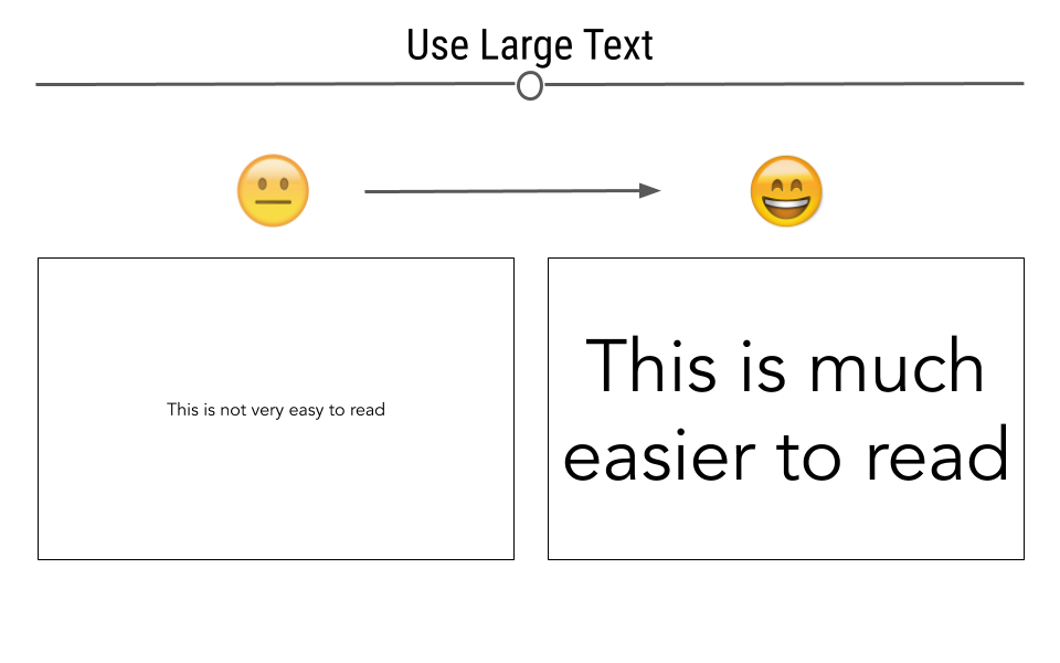
Size
Ensure that all elements in your figure, including text, axis labels, and legends, are large enough to be easily read by people with poor eyesight. Always err on the side of larger text. Small text not only diminishes accessibility but can also make figures look cluttered and unclear.
Test the size of elements in your figures by viewing them at reduced sizes or printing them. If the labels and details are still readable, they’re likely large enough.
Alt Text for Figures
When creating figures for digital use (e.g., websites, PDFs, or presentations), it’s important to include descriptive alt text for individuals who rely on screen readers. Alt text provides a textual description of the figure, ensuring that people who cannot see the image can still understand its content.
Good alt text should describe the key information the figure conveys without unnecessary detail. It’s not enough to simply say “Figure showing data”; you need to explain what the reader should take away from the visual representation.
Accessibility Checklist
Use this to quickly review your figures before sharing them with the world:
-
- Have you tested your plot in grayscale or using a color vision deficiency simulator?
- If color alone might not be distinguishable, have you used direct labeling (e.g., labels placed on the data) and/or redundant coding (e.g., shape, line type, pattern)?