library(janitor)
frogs %>%
tabyl(year, treatment)• 14. Structured Permutation
Motivating Scenario: We want to run a permutation test but you recognize that data are not-independent, and know that independence is an assumption of the standard permutation. What to do? Here we will learn to permute in a way that respects the structure of your data.
Learning Goals: By the end of this section, you should be able to:.
- Explain why a standard permutation assumes independence.
- Describe how a permutation can be modified to accommodate this non-independence.
No need to know how to do this now. Although, I have tried my best to make this easy to follow, the coding here is a bit tricky. Prioritize concepts and explanation over the execution – once you know the ideas and have this as a potential solution you can figure out implementation.
The problem of nonindependence
Permutation can solve many statistical problems. But when our data is complex (e.g., involving more than one explanatory variable), we need to carefully consider how to shuffle the data to ensure that we’re testing the hypotheses we’re interested in, and not inadvertently introducing confounding factors.
This, of course, is a standard challenge for most statistical tests. When we test a null hypothesis of ‘no association,’ we want to ensure that any effect we find is due to our main explanatory variable, not a confounding factor. Unfortunately statistical tests won’t do this for us by magic, we need to build a null sampling distribution that reflects the structure of our data.
| year | nonpreferred | preferred |
|---|---|---|
| 2010 | 15 | 15 |
| 2013 | 14 | 12 |
For example, in our frog experiment, the data were collected over two years, and the design was slightly unbalanced. That is, there were more non-preferred couples than preferred ones in 2013. This imbalance makes year a confounding factor, meaning our previous p-value might not be accurate, as the difference between years could influence our results.
Indeed, the mean number of hatched eggs differs substantially across the two years, which could confound our analysis.
Code
frogs|>
    ggplot(aes(x = treatment,
               y = hatched.eggs,
               color = treatment,
               shape = treatment)) +
    geom_jitter( size = 3, alpha = .5) +
    stat_summary(color = "black", show.legend = FALSE)+
    labs(x = "treatment", y = "hatched eggs")+
    facet_wrap(~year)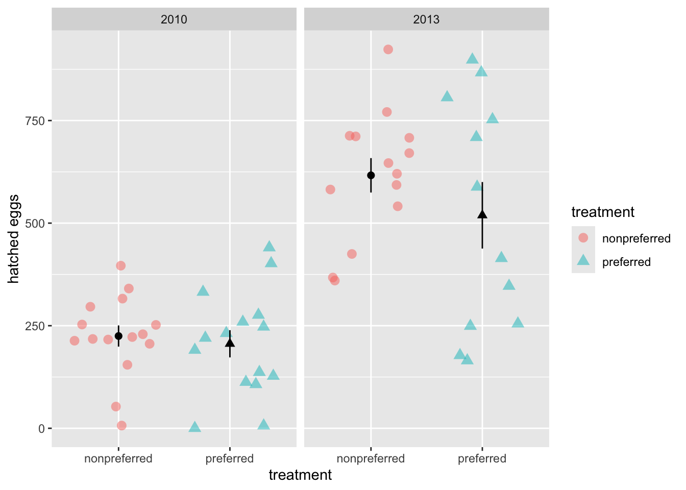
This plot reveals a classic statistical problem. It’s possible that one treatment was better within each year, but this pattern is hidden in the overall data because the treatments were not balanced across the ‘good’ and ‘bad’ years. If we permute treatment labels without considering the effect of year, our null distribution will be wrong because it won’t reflect these large differences between years.
Permuting with structure
To address this non-independence, we need to shuffle treatments within each year rather than across the entire dataset. This ensures that any differences we detect are not confounded by the year of data collection. With more complex datasets, this issue can become even trickier, but the same principle applies: you need to preserve the structure of the data by permuting within appropriate groups.
To do this, we will split our data into different years, permute within each year, and then combine the permuted data to build a null sampling distribution reflecting the structure in the data. Unfortunately infer can only get us so far. So instead I’ll take matters into our own hands!
library(dplyr)
library(tidyr)
# This code creates the structured null distribution.
# It's an advanced example; the goal is to understand the logical steps,
# not to memorize the specific syntax.

# `replicate()` runs the code inside it many times (here, 1000 times).
# We use `simplify = FALSE` so that each result is stored in a list.
structured_perm <- replicate(1000, simplify = FALSE, {
  # The code inside the curly braces is what gets repeated.
  # For each repetition, it starts with the original 'frogs' dataset.
  frogs |>
    # First, group the data by the blocking variable, 'year'.
    group_by(year) |>
    # This is the key permutation step.
    # `sample(treatment)` shuffles the treatment labels *within each year*.
    # We store these newly shuffled labels in a new column.
    mutate(permuted_treatment = sample(treatment)) |>
    # Now that the labels are shuffled correctly, we can forget the
    # 'year' grouping and re-group the whole dataset by our new
    # shuffled treatment labels to calculate the overall mean difference.
    group_by(permuted_treatment) |>
    summarise(mean_hatched = mean(hatched.eggs, na.rm = TRUE)) |>    # Calculate the mean number of eggs for each shuffled group.
    # Change data from long to wide format to a wide format, with separate columns for the 'preferred' and 'nonpreferred' means.
    pivot_wider(names_from = permuted_treatment,values_from = mean_hatched) |>
    mutate(diff_in_means = preferred - nonpreferred)}) |> # Calculate the difference in means for this single replicate.
  bind_rows() # stacks all replicates into a single, clean data frame.
Code to make the histogram below.
permuted_mean      <- summarise(structured_perm, mean(diff_in_means))|>pull()
observed_mean      <- -68.8
distance_from_null <- abs(observed_mean  - permuted_mean)
right_bound        <- permuted_mean + distance_from_null

structured_perm |>
  mutate(as_or_more_extreme = (diff_in_means < observed_mean) |(diff_in_means > right_bound))|>
  ggplot(aes(x = diff_in_means, fill = as_or_more_extreme))+
  geom_histogram()+
  scale_fill_manual(values = c("darkgrey","firebrick"))+
  geom_vline(xintercept = c(observed_mean, right_bound), color = "red",lty = 2, linewidth = 1)+
  geom_vline(xintercept = summarise(structured_perm, mean(diff_in_means))|>pull())+
  labs(x = "Difference in means", fill = "As or more extreme", title = "Structured Permuted distribution")+
  theme(axis.text.x = element_text(size = 16),
        axis.title.x = element_text(size = 16),
        axis.text.y = element_blank(),
        axis.title.y = element_blank(),
        legend.title =  element_text(size = 16),
        legend.text =  element_text(size = 16),
        title = element_text(size = 16),
        legend.position = "bottom")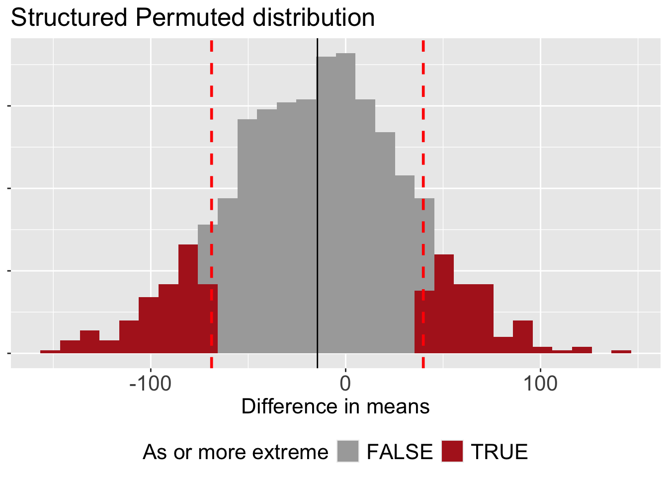
Finding the p-value
By permuting within years, we’ve controlled for the potential confounding effect of year in our analysis. Now, let’s calculate summary statistics and find the p-value. Since we permuted within year, we no longer have to worry about the confounding effect of year!
But because our null distribution is no longer centered at zero (see Figure 1), we redefine” extreme” as the distance away from the mean of the null sampling distribution (rather than the distance away from zero). We then add up the area on the right and left tail to find our p-value.
permuted_mean      <- summarise(structured_perm, mean(diff_in_means))|>pull()
observed_mean      <- -68.8
distance_from_null <- abs(observed_mean  - permuted_mean)
right_bound        <- permuted_mean + distance_from_null

structured_perm |>
  mutate(left_tail  = diff_in_means < observed_mean,
         right_tail = diff_in_means > right_bound )|>
  summarise(prop_left_tail = mean(as.numeric(left_tail)),
            prop_right_tail = mean(as.numeric(right_tail)),
            p_value = prop_left_tail + prop_right_tail ) |>
  select(p_value)
# A tibble: 1 × 1
p_value
<dbl>
1 0.212This more appropriate p-value is still greater than the conventional \(\alpha\) threshold of 0.05. This means that even after accounting for the confounding effect of year, we still do not have enough evidence to reject the null hypothesis.