• 6. Association Summary
Links to: Summary. Chatbot tutor. Questions. Glossary. R functions. R packages. More resources.
Chapter Summary
Associations reveal how variables relate to one another - e.g. if they tend to increase together, differ across groups, or cluster. Differences in conditional means (or proportions) describe how a numeric (or categorical) response variable varies across levels of a categorical explanatory variable. For two numeric variables, covariance captures how deviations from their means align, and correlation standardizes this to a unitless scale between -1 and 1. While these summaries can highlight patterns, interpretation requires care: strong associations don’t necessarily imply causation, and predictions may not hold across contexts or datasets.
Chatbot tutor
Please interact with this custom chatbot (link here) I have made to help you with this chapter. I suggest interacting with at least ten back-and-forths to ramp up and then stopping when you feel like you got what you needed from it.
Practice Questions
Try these questions! By using the R environment you can work without leaving this “book”. To help you jump right into thinking and analysis, I have loaded the ril data, cleaned it some, an have started some of the code!
Q1) Extend the analysis above to examine the association between leaf water content (lwc) and the proportion of hybrid seeds (prop_hybrid). The correlation between lwc and prop_hybrid is:
Q2) Based on the analysis above, which variable – leaf water content (lwc), or petal area (log10_petal_area_mm) is more plausibly interpreted as influencing proportion hybrid seed set (prop_hybrid)?The set of questions below focuses on comparing the association between petal color and pollinator visitation to the association between petal color and proportion hybrid seed. Use the webR console above to work through these!
Q4) The difference in conditional mean hybrid proportion between pink and white flowers is:
Q5) The pooled standard deviation of hybrid proportion between pink and white flowers is:
Q6) Which trait is more strongly associated with petal color — the proportion of hybrid seeds or visits from a pollinator (visits)?Q7 SETUP We collected 131 plants (74 parviflora, 57 xantiana) from a natural hybrid zone between xantiana and parviflora at Sawmill Road. We then genotyped these plants at a chloroplast marker that distinguishes between chloroplasts originating from parviflora and xantiana. All 74 parviflora plants had a parviflora chloroplast, while 49 of the 57 xantiana plants had a xantiana chloroplast (the remaining 8 had a parviflora chloroplast).
Q7A) If having a xantiana chloroplast and being a xantiana plant were independent, what proportion of plants would you expect to be xantiana and have a xantiana chloroplast?
If two binary variables are independent, the expected joint proportion (i.e. the probability of A and B) is the product of their proportions:
\[ P(A \text{ and } B) = P(A) \times P(B) \]
Q7B) Quantify the difference between the proportion of plants that are xantiana and have xantiana chloroplasts vs. what we expect if these two binary variables were independent.
Q7C) What is the covariance between being a xantiana plant and having a xantiana chloroplast? Hint: remember Bessel’s correction.
Q8) In the code above, I calculated the correlation and covariance between lwc and prop_hybrid using their mathematical formulas. However, my calculated values don’t match those returned by cor(). Why not?
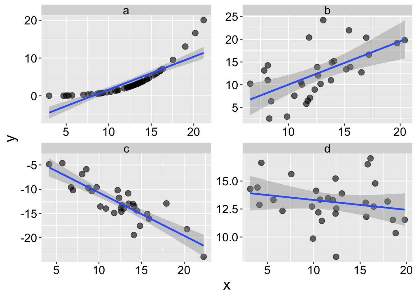
Q9 SETUP Consider the plots above
Q9A) In which plot are x and y most tightly associated?
Q9B) In which plot are x and y most tightly linearly associated?
Q9C) In which plot do x and y have the largest correlation coefficient?
Q9C) In which plot are does x do the worst job of predicting y?
📊 Glossary of Terms
🔗 1. Types of Association
- Association: A relationship or pattern between two variables, without assuming causation.
- Correlation: A numerical summary of how two variables move together.
- Positive: As one increases, the other tends to increase.
- Negative: As one increases, the other tends to decrease.
- Positive: As one increases, the other tends to increase.
- Causation: A relationship in which changes in one variable directly produce changes in another.
⚖️ 2. Categorical Associations
- Conditional Proportion: The proportion of a category (e.g., visited flowers) within levels of another variable (e.g., pink or white petals).
- Written as \(P(A|B)\), the probability of A given B.
- Multiplication Rule: If two variables are independent, then \(P(A \text{ and } B) = P(A) \times P(B)\).
- Relative Risk: The ratio of conditional proportions between two groups.
- Confounding Variable: A third variable that creates a false appearance of association between two others.
🔢 3. Numeric Associations
Covariance (
cov()): Measures how two numeric variables co-vary.- Positive: variables increase together.
- Negative: one increases as the other decreases.
- Sensitive to scale.
- Positive: variables increase together.
Cross Product: For two variables, the product of their deviations from their means:
\((X_i - \bar{X})(Y_i - \bar{Y})\)Correlation Coefficient (
cor()): A unitless summary of linear association, ranging from -1 to 1.
\(r = \frac{\text{Cov}_{X,Y}}{s_X s_Y}\)- r ≈ 0: No linear relationship
- r > 0: Positive linear relationship
- r < 0: Negative linear relationship
- r ≈ 0: No linear relationship
📏 4. Comparing Group Means
Conditional Mean: The average of a numeric variable within each group of a categorical variable.
Difference in Means: A common summary of how a numeric variable differs across groups.
Cohen’s D: Standardized difference between two group means.
\(D = \frac{\bar{X}_1 - \bar{X}_2}{s_{pooled}}\)Pooled Standard Deviation: A weighted average of within-group standard deviations, used in Cohen’s D.
📈 5. Visual Summaries of Associations
- Scatterplot: Plots individual observations for two numeric variables. Good for spotting trends and calculating correlation.
- Boxplot: Shows distributions (medians, IQRs) across groups.
- Barplot of Conditional Proportions: Visualizes proportions of one categorical variable within levels of another.
- Sina Plot: A jittered density-style plot used to show distributions of numeric values within categories, especially useful when overplotting is an issue.
Key R Functions
📊 Visualizing Associations
stat_summary(): Adds summary statistics like means and error bars to plots.geom_smooth(): Adds a trend line to scatterplots.
📈 Summarizing Associations Between Variables
group_by()([dplyr]): Groups data for grouped summaries like conditional proportions or means.summarise()([dplyr]): Summarizes multiple rows into a single value, e.g., a mean, covariance, or correlation.
mean()([base R]): Computes means (or proportions). In this chapter we combine this withgroup_by()to find conditional means (or conditional proportions).cov(): Calculates covariance between two numeric variables.cor(): Calculates the correlation coefficient.
We often combine these below with the following chain of operations.
- For conditional means: data|>group_by()|>summarize(mean()).
- For associations: data |>group_by()|>summarize(cor()).
R Packages Introduced
GGally: Extendsggplot2with convenient functions for exploring relationships among multiple variables. Theggpairs()function produces a matrix of plots showing pairwise associations, including histograms, scatterplots, and correlation coefficients.ggforce: Provides advanced geoms forggplot2. This chapter usesgeom_sina()to reduce overplotting by jittering points while preserving density.
Additional resources
Other web resources:
- Regression, Fire, and Dangerous Things (1/3): A fantastic essay about challenges in going from correlation to causation.
- Spurious correlations: A humorous collection of weird correlations from the world.
- Guess the correlation: A fun video game in which you see a plot and must guess the correlation. This is great for building an intuition about the strength of a correlation.
Videos:
Correlation Doesn’t Equal Causation: Crash Course Statistics #8.
Calling Bullshit has a fantastic set of videos on correlation and causation.
- Correlation and Causation: “Correlations are often used to make claims about causation. Be careful about the direction in which causality goes. For example: do food stamps cause poverty?”
- What are Correlations? :“Jevin providers an informal introduction to linear correlations.”
- Spurious Correlations?: “We look at Tyler Vigen’s silly examples of quantities appear to be correlated over time), and note that scientific studies may accidentally pick up on similarly meaningless relationships.”
- Correlation Exercise” “When is correlation all you need, and causation is beside the point? Can you figure out which way causality goes for each of several correlations?”
- Common Causes: “We explain how common causes can generate correlations between otherwise unrelated variables, and look at the correlational evidence that storks bring babies. We look at the need to think about multiple contributing causes. The fallacy of post hoc propter ergo hoc: the mistaken belief that if two events happen sequentially, the first must have caused the second.”
- Manipulative Experiments: “We look at how manipulative experiments can be used to work out the direction of causation in correlated variables, and sum up the questions one should ask when presented with a correlation.
- Correlation and Causation: “Correlations are often used to make claims about causation. Be careful about the direction in which causality goes. For example: do food stamps cause poverty?”