• 9. Transparent plots
Here’s a motivating scenario and learning goals section that fits your tone and structure:
Motivating Scenario: You are in the middle of making your plot and have conflicting impulses – should I show all of my data or is a summary sufficient?
Learning Goals: By the end of this subchapter, you should be able to:.
- Explain why visualizing raw data can be more transparent than summaries alone.
- Recognize overplotting and how it “showing all the data” can at times hide the message.
- Choose plotting strategies (e.g., jitter, alpha, sina plots) that balance transparency and clarity.
- Describe why transparently showing your data is generally a good idea.
Good plots are transparent
Transparency is a great way to communicate honestly and encourage active engagement. Transparently presenting our data empowers our readers to evaluate our claims, critique them, test them for themselves, and even uncover new insights in our data. As such, showing the data is a critical step toward building trust with a skeptical audience and invites them to engage with the data themselves.
Showing Your Data
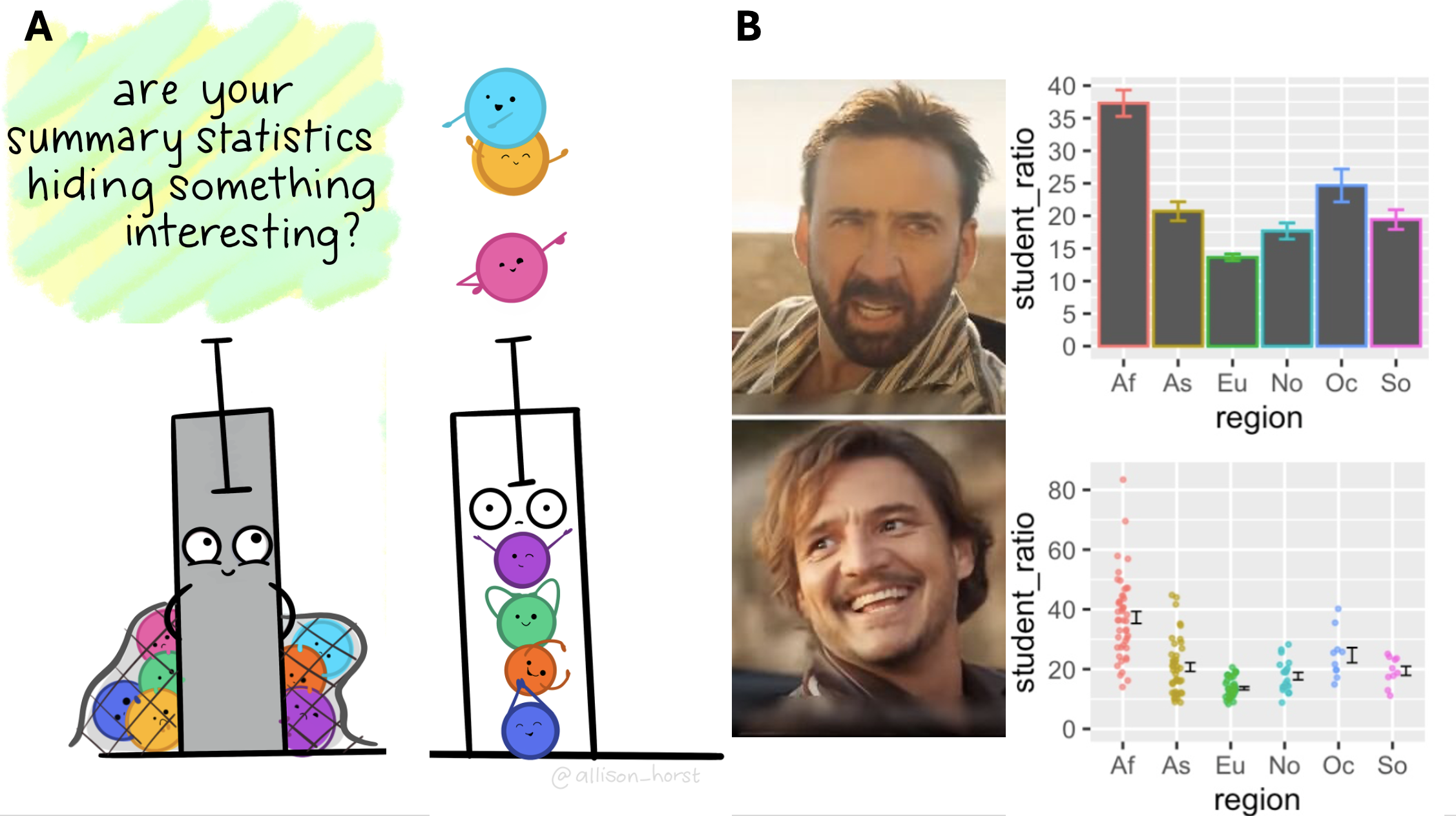
As we saw in the datasauRus example (revisited in Figure 1), relying on summary statistics can obscure important patterns. Similarly, plots that only show summaries (e.g., barplots of means) fail to provide the full picture. Whenever possible, show all of your data.
Barplots aren’t inherently bad. While barplots should not be used to report means, they are effective for presenting proportions or count data.
When I say: “Show your data”,
I mean: “Show your F***NG data! All of it. Not a mean, not a trendline. SHOW ALL OF YOUR DATA!”
Is it ever OK to not show all the data?
Despite my emphatic cursing above, there are rare cases where showing all your data is actually less honest than showing a summary. This usually happens when overplotting becomes a problem - when there’s so much data, or so many points stacked at a single value, that showing every data point hides the overall pattern instead of revealing it. Below, we’ll walk through examples where showing the full data might be misleading and what to do instead.
Transparency Avoids Overplotting
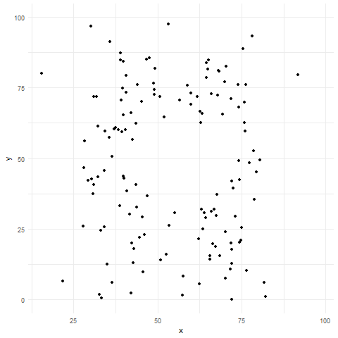
Sometimes, showing all your data can actually obscure patterns—a problem known as overplotting. Overplotting occurs when data points in a plot overlap or cluster so densely that it’s difficult or impossible to discern individual values or patterns in the data. This typically happens when you have a large number of data points, or when the range of data values is narrow, causing points to pile on top of each other. Overplotting can obscure the underlying distribution, relationships, or trends, making it hard to interpret the data accurately.
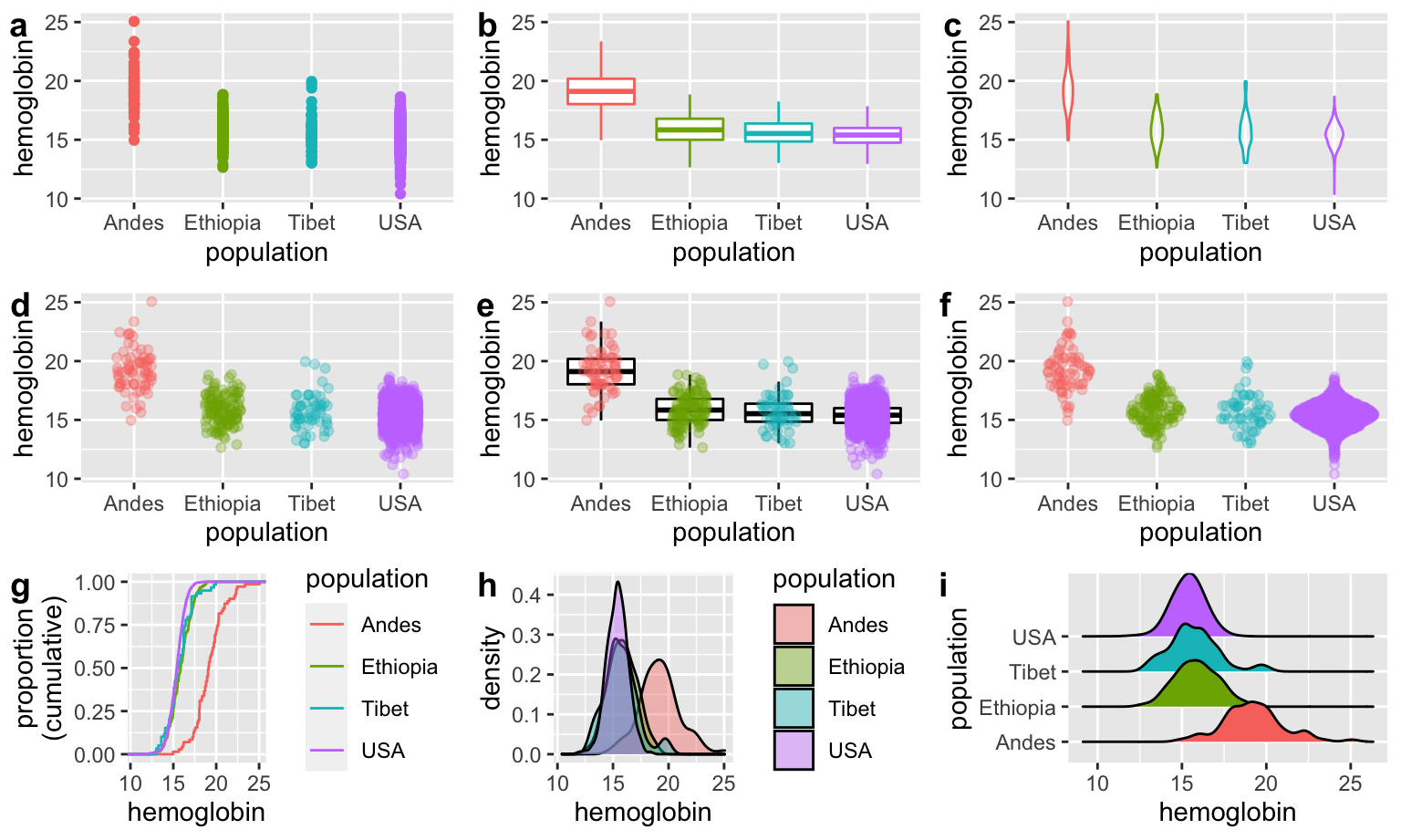
Figure 3 shows several techniques (like jittering, using transparency, etc.), and alternative plots (e.g., density plots, box plots, or sina plots) that we can use to reveal patterns that would otherwise be hidden.
geom_sina() to create a sina plot. Data from Beall (2006). Download the data here.
Transparency Links Data, Code, and Results
The most transparent data are fully reproducible. Readers should be able to download your code and data, replicate your analysis, and understand the dataset well enough to perform their own analysis. As discussed in our previous sections on reproducible science, this level of transparency is becoming the standard in scientific research.