• 9. Writing about plots
Motivating Scenario:
You (think you’ve) just made a get figure. Now it’s time to write about it. What do we do now?
Learning Goals: By the end of this subchapter, you should be able to:
- Distinguish between helpful and unhelpful figure captions
- Identify when captions add value versus when they merely restate what’s already visual
- Write concise, informative figure captions that add useful context.
Write meaningful alt text that conveys the core message of a figure to non-visual readers.
Describe figures effectively in text by:
- Referencing specific visual features that support your claims
- Framing visual evidence as part of a broader biological or statistical interpretation
Writing About Figures
Good figures should be clear enough to allow readers to interpret them on their own. Ideally, a reader should be able to examine your figure and draw a reasonable conclusion. But figures do not exist on their own, they exist in the in some broader context – a paper, a poster, a book, a presentation, etc… So, although good figures should stand alone, we can enhance the reader’s understanding by guiding their interpretation and emphasizing key takeaways.
People read papers differently.
Some readers barely glance at figures. Others skim the figures first, then dip into the text. Some go back and forth. Because we can’t control how people engage with our work, we need to make sure that both our figures and our writing about them are clear, complementary, and accessible to all readers.
Writing Figure Captions
Although well-designed figures should be interpretable without a figure captions, a good caption adds value by surfacing key takeaways and helpful context. A good caption does not merely restate the figure but rather presents additional context, support and background for the point clearly conveyed visually.
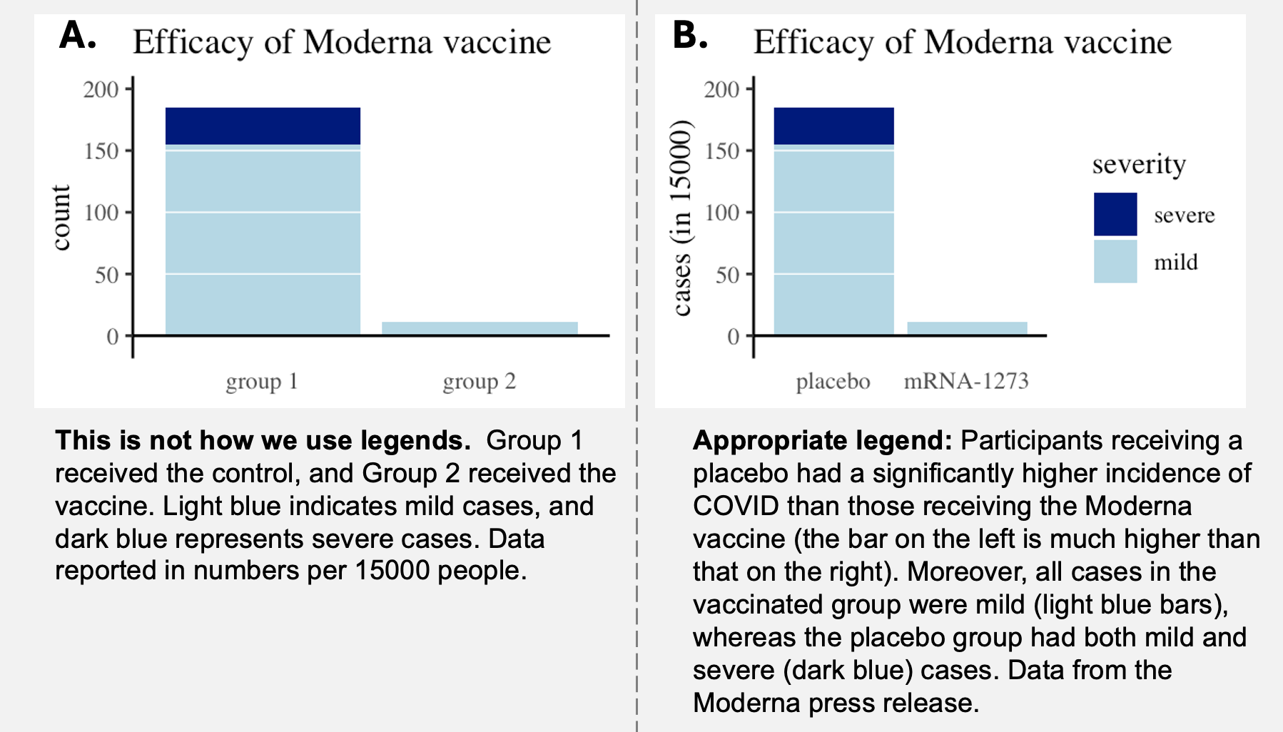
Figure 1 shows an example of a bad (a) and good (b) figure and legend combination.
Figure 1 A fails because it treats the legend as a crutch. The reader has to consult it just to figure out what the axes, groups, and colors mean - basic information that a figure should make obvious. This shortcoming forces readers to hold too much in memory, shifting their focus from interpreting the results to decoding the design.
Figure 1 B succeeds because it adds helpful detail to a figure that is interpretable without a caption. Once you’ve taken in the visual message, the caption deepens your understanding by adding nuance and context.
Writing “Alt text”
Alt text should help readers who can’t see your figure still grasp its message. Think of alt text like narrating your figure to someone over the phone: what would you say so they could understand it? Below is an example of bad and good alt text for Figure 1 B:
| 😞Bad alt text for Figure 1 B😞 | ☺️Good alt text for Figure 1 B☺️ |
|---|---|
| “Stacked bar plot showing the the COVID vaccine works.” | “Stacked bar plot showing COVID cases by severity for placebo and mRNA-1273 groups. The placebo group has many more cases, including severe ones (dark blue), while the vaccinated group has only a few mild cases (light blue).” |
Writing About Figures in Text
Writing up results is one of the most important parts of doing science - if your work is not clearly communicated, it’s unlikely to make a lasting impact. When describing results, be explicit about what in a figure supports your conclusion. Rather than writing “Figure X shows that Group A grows faster,” aim for something more specific, like: “The steeper increase of Y in Group A than in Group B (Figure X) suggests that…” This style helps the reader connect your interpretation directly to visual evidence.
When reading (or writing) text that discusses a figure, first look at the figure and think about its message. Then, consider:
- What features of the figure support the claims in the paper?
- Are there parts of the figure that challenge or complicate the interpretation in the paper?
Below is a comparison of weak vs. effective writing about the same figure. The second version goes beyond describing the visual and emphasizes the figure’s statistical and biological meaning.
| 😞 A bad write-up Figure 1 B 😞 | ☺️ A better write-up for Figure 1 B ☺️ |
|---|---|
| “Figure 1 B compares COVID cases and severity of these cases for treatments and controls.” | “Figure 1 B shows a significant difference in COVID case incidence between the placebo group and those vaccinated with Moderna’s mRNA-1273 vaccine. Of the 15,000 individuals in the placebo group, 185 contracted COVID, while only 11 of the 15,000 vaccinated individuals did. Additionally, none of the vaccinated participants who became infected developed severe COVID, whereas 30 of the 185 infected placebo recipients had severe cases (compare the dark blue bar above the control group and its absence above the mRNA-1273 group).” |