• 9. Honest plots
Motivating Scenario:
You’re making a plot to share with the world (or you are reading someone else’s plot) and you want to make sure that you are not misleading (or being misled) with this visual.
Learning Goals: By the end of this subchapter, you should be able to:
Recognize how visual choices can mislead viewers by asking the following questions:
- Is the y-axis truncated, and when and y does this matter?
- Is there enough context to appropriately interpret the y-correctly?
- Is the order of the x-axis or the color palette appropriate?
- Does bin size (or other smoothing decisions) allow for an accurate interpretation of the data?
Improve misleading plots by making suggestions about how make choices that promote clarity.
Evaluate plots for potential misinterpretation by
- Going over the ways figures can accidentally mislead, and making sure you avoided those common pitfalls.
- Showing your plot to a friend and asking them for their superficial first reaction. This is the best thing you can do.
Good Plots Are Honest
Plots should clearly convey points without misleading or distorting the truth. A misleading exploratory plot can lead to confusion and wasted time, while a misleading explanatory plot can erode the reader’s trust. Honesty in plots builds credibility and helps ensure that both you and your audience stay on track.
Importantly, honest people with good intentions can still create misleading plots - often due to default settings in R or other visualization tools. So, simply not intending to deceive isn’t enough. After we make a plot, we should take a step back and examine it - better yet, show it to naive peers to see what conclusions they draw from it. This practice can ensure that our plots are not unintentionally misleading.
(Dis-)Honest Axes
(Dis-)Honest Y-Axes
DishonestY: truncating the axis. When people see a filled area in a plot, they naturally interpret it in terms of proportions. This can be a problem when the baseline of a filled bar is hidden or cropped, making modest differences look dramatic. Compare Figure 1, Figure 2 and Figure 3 in the three tabs below to see how a truncated y-axis can mislead a reader.
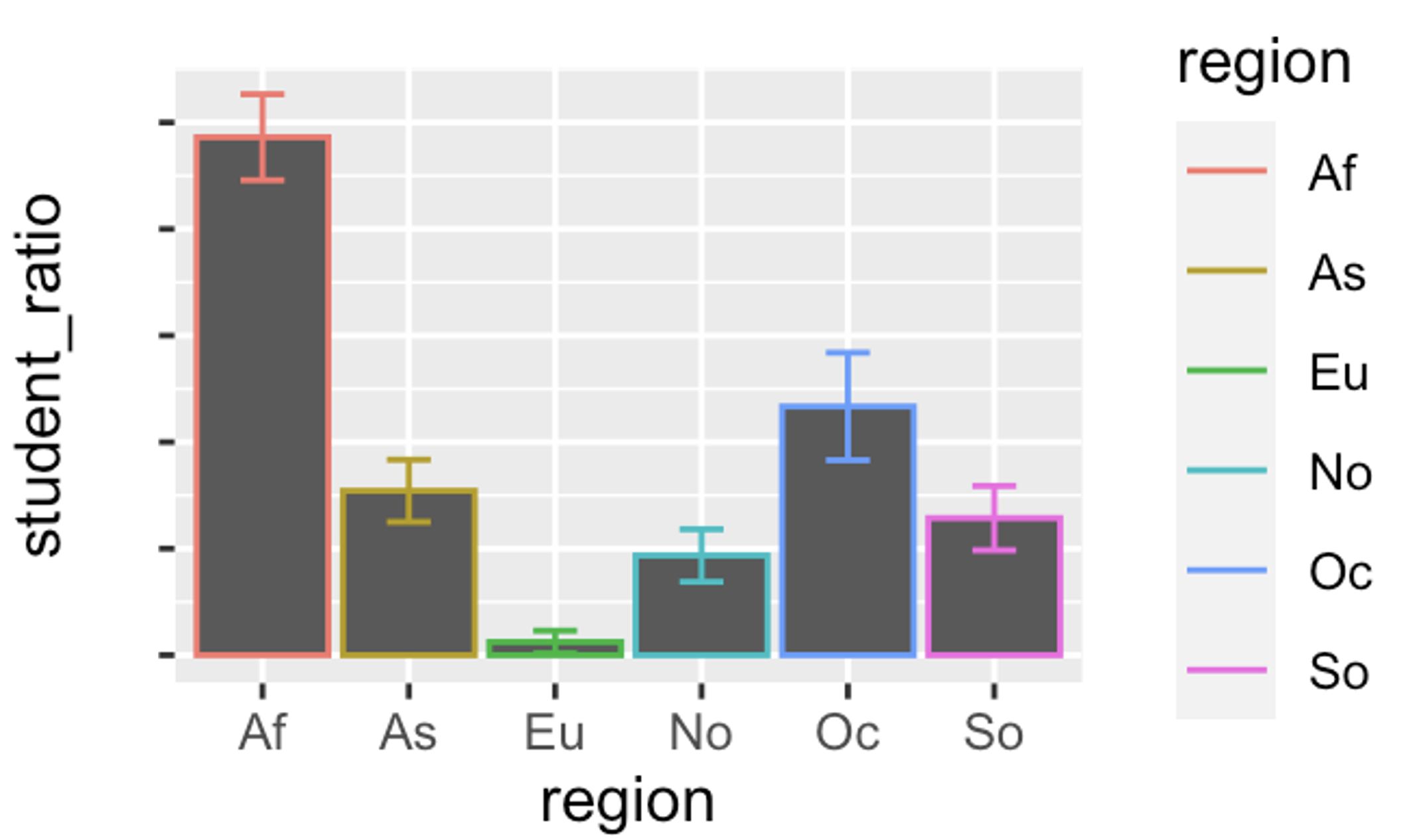
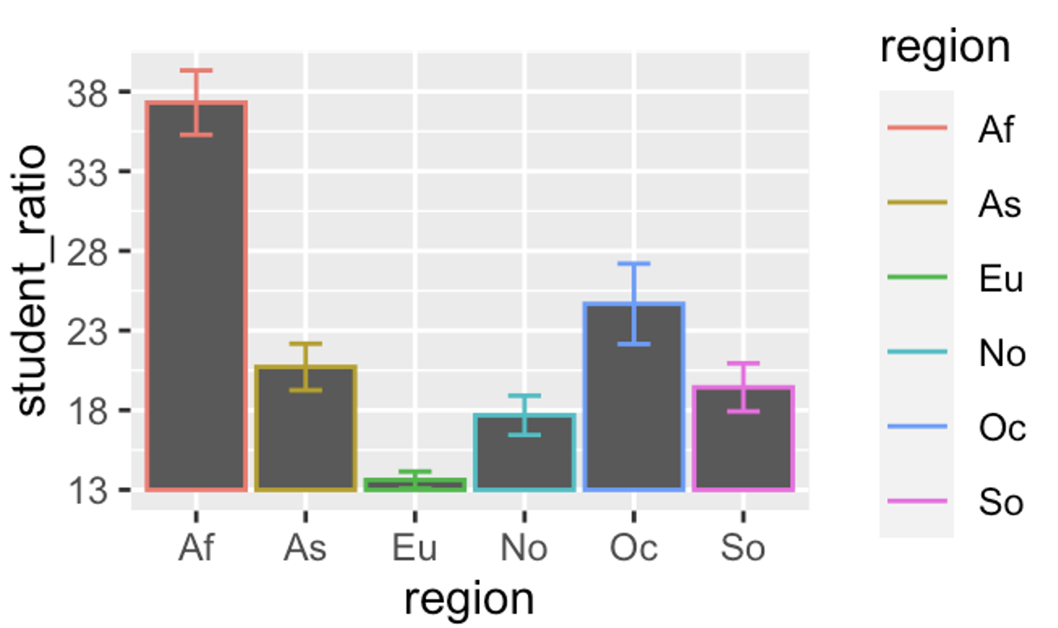
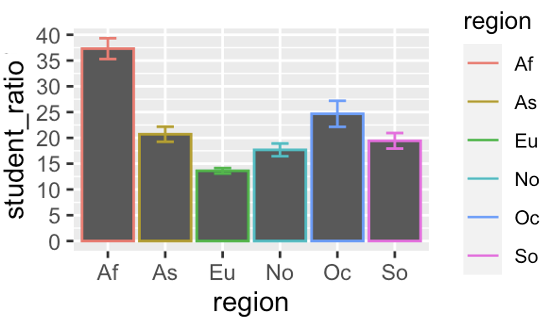
If you don’t see any plots here, click on any of the tabs. Then browse through all of them by changing between tabs.
From these plots we can see that:
- Figure 1 leads a reader to believe that student-to-teacher ratios in Africa are four times higher than in Asia, even though the actual difference is closer to two-fold.
- Figure 2 illustrates that adding y-labels does little to fix this, as our eyes are still driven to the magnitude of difference in bars, not the few letters that try to override this visual message.
- Figure 3 solves this by honestly displaying the full y-axis.
Not all y-axes need to start at zero:
Truncating the y-axis is most misleading for filled plots, but it’s not always necessary to start at zero.
- Scatterplots: These don’t typically trick the eye the way bar plots do, so it’s less important to start the y-axis at zero. If you want to emphasize absolute differences, show the data as points and worry less about truncating the y-axis.
- Non-zero baselines: For variables like temperature, starting the y-axis at zero may be arbitrary.
DishonestY: sneaky scales
We have previously discussed how common data transformations that can aid in modeling and visualizing our data. For example, log-transformation can be helpful for variables that grow exponentially. When such transformations are necessary be sure to clearly communicate the transformed scale. For example, if you use a log scale, but your readers don’t notice it, they will misinterpret the plot – a straight line on a log-log plot suggests a power-law relationship, while a straight line on a semi-log plot suggests exponential growth. A straight line on a log scale means exponential growth, not a steady increase.
If you’re displaying your data on a log scale, be loud about it: label the axes clearly. I particularly like the annotation_logticks() function to in the ggplot2 package to communicate the scale (as in Figure 4 B)
Code for making a logscale two-panel figure and adding logticks.
library(patchwork)

a<- ggplot(msleep, aes(bodywt, brainwt, label = name)) +
    geom_point(na.rm = TRUE) +
    scale_x_log10(
        breaks = scales::trans_breaks("log10", function(x) 10^x),
        labels = scales::trans_format("log10", scales::math_format(10^.x))
    ) +
    scale_y_log10(
        breaks = scales::trans_breaks("log10", function(x) 10^x),
        labels = scales::trans_format("log10", scales::math_format(10^.x))
    )


b <- a +
  annotation_logticks() +
  labs(title = "Mammalian brain weight as a function of body weight",
       subtitle = "Both axes are plotted on a log10 scale.")

a <- a + labs(title = "Mammalian brain weight as a function of body weight",
              subtitle = " ")

a+b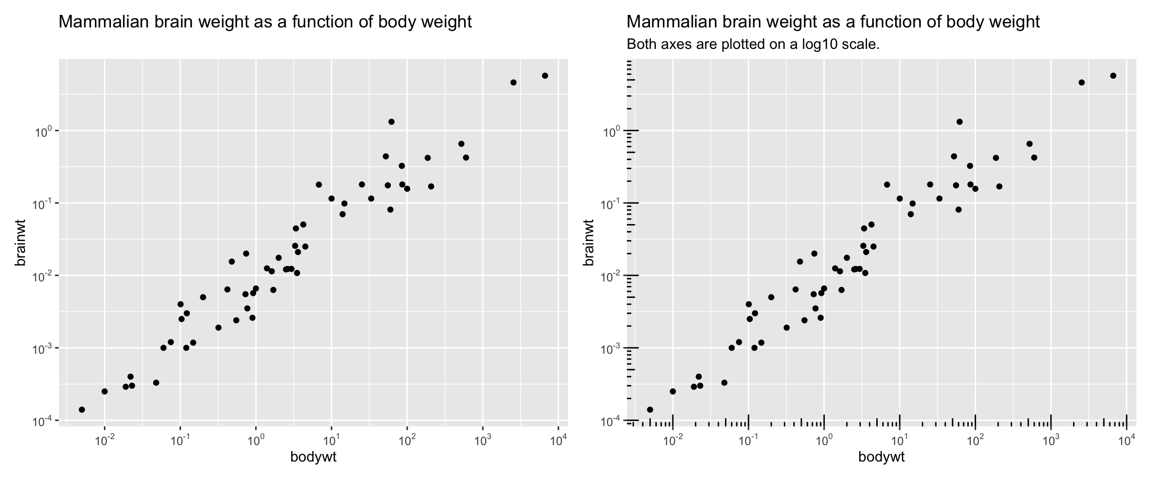
annotation_logticks(), making the scale more visually explicit.
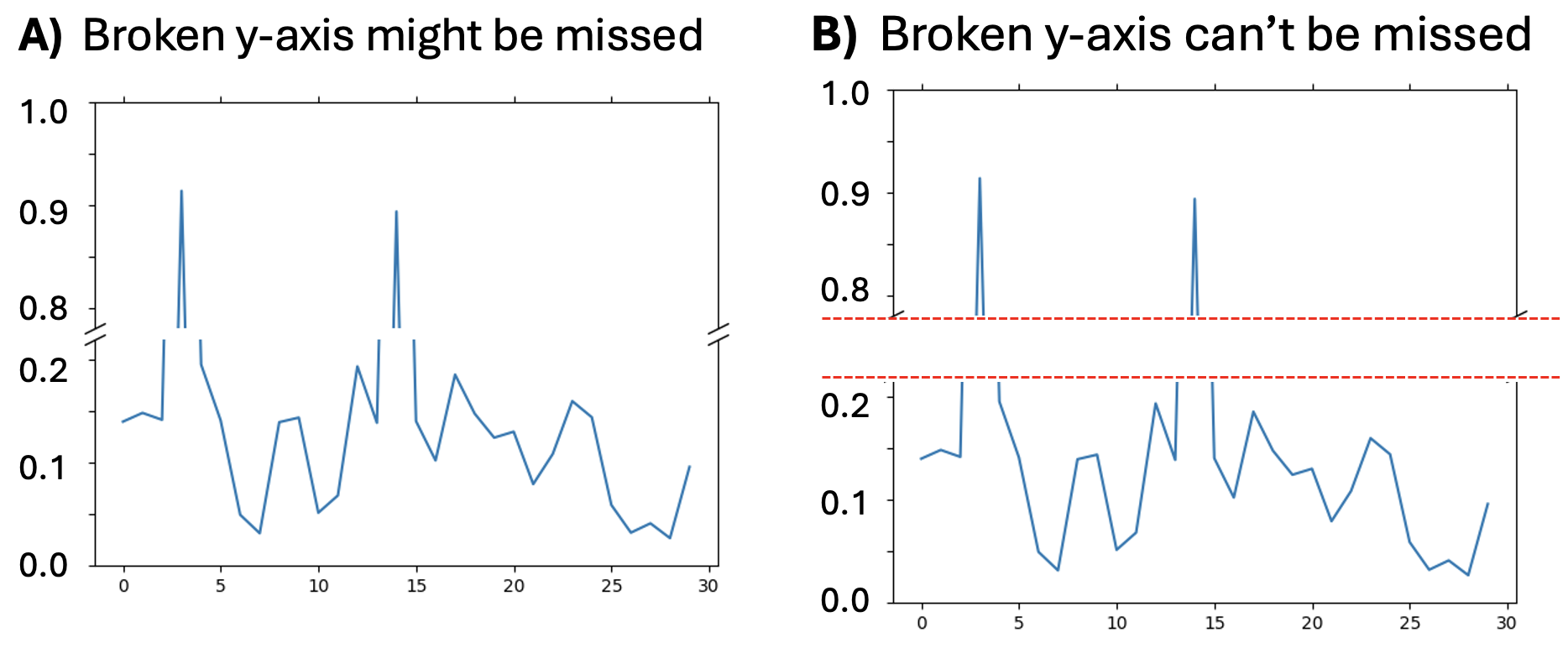
DishonestY: broken axes
Sometimes extreme values on the y-axis make it hard to see meaningful variability for lower values. In some cases this situation is so extreme that the data cannot be plotted on a continuous without the bulk of the data being squished flat. One solution is a broken axis – a literal break to show the two different ranges of the data. I hesitate to recommend such an approach because it so often misleads the reader by distorting the relative distances. If you must use a “broken axis” be very explicit that you are doing so.
A simple break as shown in Figure 5 A is insufficient. Rather something more extreme, like a large break marked by bright lines (e.g. Figure 5 B) is needed to ensure that the reader does not process the data without considering the axis break.
DishonestY: Unfair comparisons
Fewer babies are born in the U.S. on Sundays than any other day — with Saturdays close behind. When I first heard this I was amazed, but then I realized it makes sense – many births are scheduled C-sections, or induced in some other way, and doctors would prefer to take weekends off. But there is also a seasonality to births which cannot be explained by doctor’s schedules. Let’s look at this plot of the number of babies born each month of 2023 in Canada. While doing so, pay careful attention to the axes – as you will find that truncation isn’t the only way a y-axis can mislead
Rather than me telling you what’s wrong here I want you to figure out what’s wrong and fix it. But you won’t be on your own, this chatbot tutor is here to help! Prompt available here if you want to make your own gem.
Not all months are have the same number of days.
babies |>
  mutate(days_per_month = (c(31,28,31,30,31,30,31,31,30,31,30,31)),
  births_per_day  = births /days_per_month)|>
  ggplot(aes(x=month, y=births_per_day, group=1))+
  geom_point(size = 3)+
  geom_line(lty = 2)+
  theme(axis.text.x = element_text(angle = 90, size=12))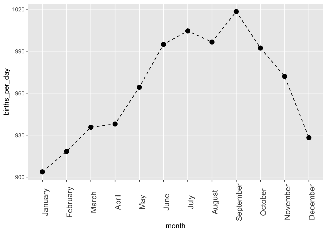
DishonestY: Y’s meaning depends on X: Sometimes values on the y-axis have different meanings for different values on the x-axis. For example, inflation tends to push prices up over time, and more people are born—or die—in larger populations. In these cases, showing raw values can mislead. It’s better to standardize the y-axis so it has a consistent meaning across x (like deaths per 1,000 people or inflation-adjusted cost), or to give viewers some point of reference so they can make fair comparisons.
(Dis-)Honest X-Axes
It’s not just the y-axis that can mislead, there is plenty of opportunity for the x-axis to mislead as well. Common ways that the x-axis can mislead include:
Order that runs counter to expectations: Say we were plotting survival of Clarkia in four different temperatures – “Freezing”, “Cold”, “Warm”, and “Hot”. We would expect the x-axis to be in that order, but unless you tell it otherwise, R puts categorical variables in alphabetical order (i.e. “Cold”, “Freezing”, “Hot”, “Warm”). This will likely lead to patterns that surprise and confuse readers, as we explore in Figure 6.
Arbitrary spacing: Sometimes our categories suggest an order but not equal intervals — like “Control”, “Low”, “Medium”, and “Super High”. Plotting them on a linear x-axis makes the steps look evenly spaced, even if the treatment jump from “Medium” to “Super High” is much larger than from “Low” to “Medium”. This can trick readers into seeing a much sharper trend than is really there (e.g. Figure 7).
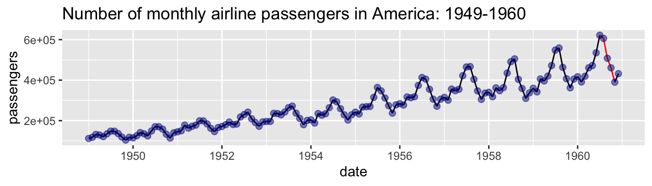
Insufficient context: Seasonal ups and downs can be misused to make claims about long-term trends. For example, employment often drops in January as seasonal jobs disappear. But that doesn’t mean we should be reading headlines every year like “The year is off to a bad start.” That’s why it’s standard to present seasonally adjusted unemployment rates. Similar issues show up all over the biological world too - if you don’t consider seasonal or cyclical patterns, it’s easy to mislead or be misled.
With these ideas in mind, lets look at two plots (Figure 6 and Figure 7) showing trends in the temperature in Minnesota across the year:
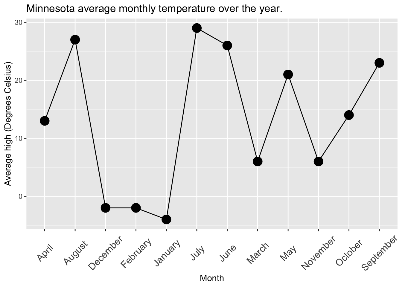
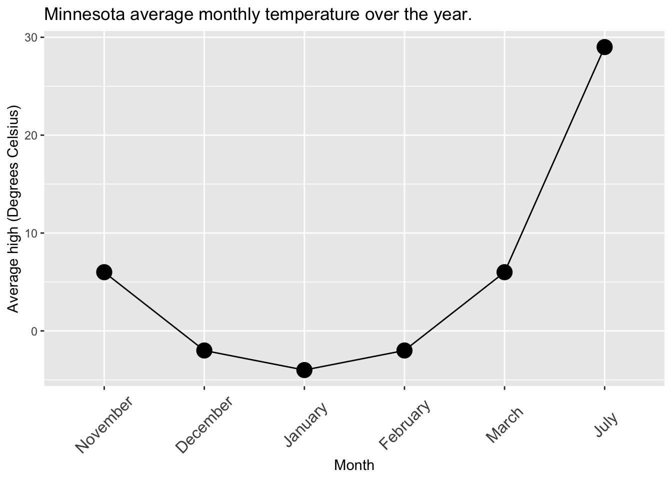
If you don’t see any plots here, click on any of the tabs. Then browse through all of them by changing between tabs.
From these plots we can see that:
By having an order that runs counter to expectations, Figure 6 leads a reader to believe that temperature swings up and down many times dramatically across the year. This is because months are in alphabetical instead of sequential order.
- Fix this by changing the order of categories (but this is harder than it sounds, we will work on that in the next chapter).
Because of the arbitrary spacing in Figure 7’s x-axis it looks like a sudden jump in July, but the jump is artificial - we’re just missing spring months.
- Fix this by leaving a space on the x-axis where those categories should be (but make sure the missingness is not mistaken for zero).
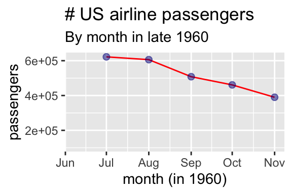
- Because it does not provide sufficient context Figure 8 misleads readers into thinking that the airline industry was crashing in late 1960.
Honest Bin Sizes
The video above explains how bin sizes can mislead. This issue comes up when using histograms to explore the shape of a distribution. The problem is that bin size is a smoothing decision, and smoothing decisions always involve trade-offs:
Smoothing decisions aren’t unique to histograms - similar issues arise when choosing a kernel bandwidth in a density plot, set a bin width for a bar chart, or even a zoom in on a map.
- Too few bins oversmooths the data—you might miss real structure like bimodality or skew.
- Too many bins adds visual noise—random variation starts to look like meaningful bumps and wiggles.
To get a better sense for this, play with the bin number in the interactive salmon body size example above. Watch how the story changes as you try all values from 3 to 10, then try a few larger values. As you explore, ask yourself: Which bin size gives a clear picture without hiding or exaggerating the structure in the data? while recognizing there not always a single “right” answer.
#| '!! shinylive warning !!': |
#|   shinylive does not work in self-contained HTML documents.
#|   Please set `embed-resources: false` in your metadata.
#| column: page-right
#| standalone: true
#| viewerHeight: 600
library(shiny)
library(munsell)
library(bslib)
library(readr)

# Define UI for app that draws a histogram ----

ui <- fluidPage(
  titlePanel("Bin size can mislead!"),

  fluidRow(
    column(4),  # Empty column for spacing
    column(4,
           numericInput("bins", "Number of bins", value = 3,
                        min = 2, max = 200, step = 1,width = "22%")
    ),
    column(4)   # Empty column for spacing
  ),

  fluidRow(
    column(12,
      plotOutput("plot", width = "100%", height = "430px")
    )
  )
)

server <- function(input, output, session) {
      salmon <- read.csv('https://raw.githubusercontent.com/ybrandvain/datasets/refs/heads/master/salmon_body_size.csv')
  output$plot <- renderPlot({
    library(ggplot2)

    # Create ggplot histogram
    ggplot(salmon, aes(x = mass_kg)) +
      geom_histogram(bins = as.numeric(input$bins)+2,
                     fill = "salmon",
                     color = "black",
                     alpha = 0.7) +
      labs(title = "Distribution of Body Mass in Salmon",
           x = "Body Mass (kg)",
           y = "Count") +
      scale_x_continuous(limits = c(0.9,3.6))
  }, res = 150)
}
# Create Shiny app ----
shinyApp(ui = ui, server = server)
After exploring this for a while try these short questions:
Q1) Which bin number makes the reader think this distribution is unimodal and right-skewed? .
With 3 bins, the histogram oversmooths the data and there is no dip between peaks, but it’s not clear if the data are symmetric or skewed.
The histogram still oversmooths the data with 4 bins. But in this case the data appears more obviously right-skewed.
Q2) Which is the smallest bin number that allows the reader to see that the data are clearly bimodal? .
I accepted either six or seven. At six it seems like something is likely going on (counts seem to increase as x increases), and once you get to seven two obvious modes emerge.
Q3) Which statement best describes the tradeoff in choosing the number of bins in a histogram?
What about density plots?
Concerns about bin size apply to smoothing in density plots. In ggplot, you can control the smoothing of a density plot using the adjust argument in the geom_density() function.
Another plotting option.
If no bin size seems to work well, you can display the cumulative frequency distribution using stat_ecdf(). This method avoids the binning issue altogether. The y-axis shows the proportion of data with values less than x, and bimodality is revealed by the two steep slopes in the plot. However, these plots can be harder for inexperienced readers to interpret.
(Dis-)Honest color choice
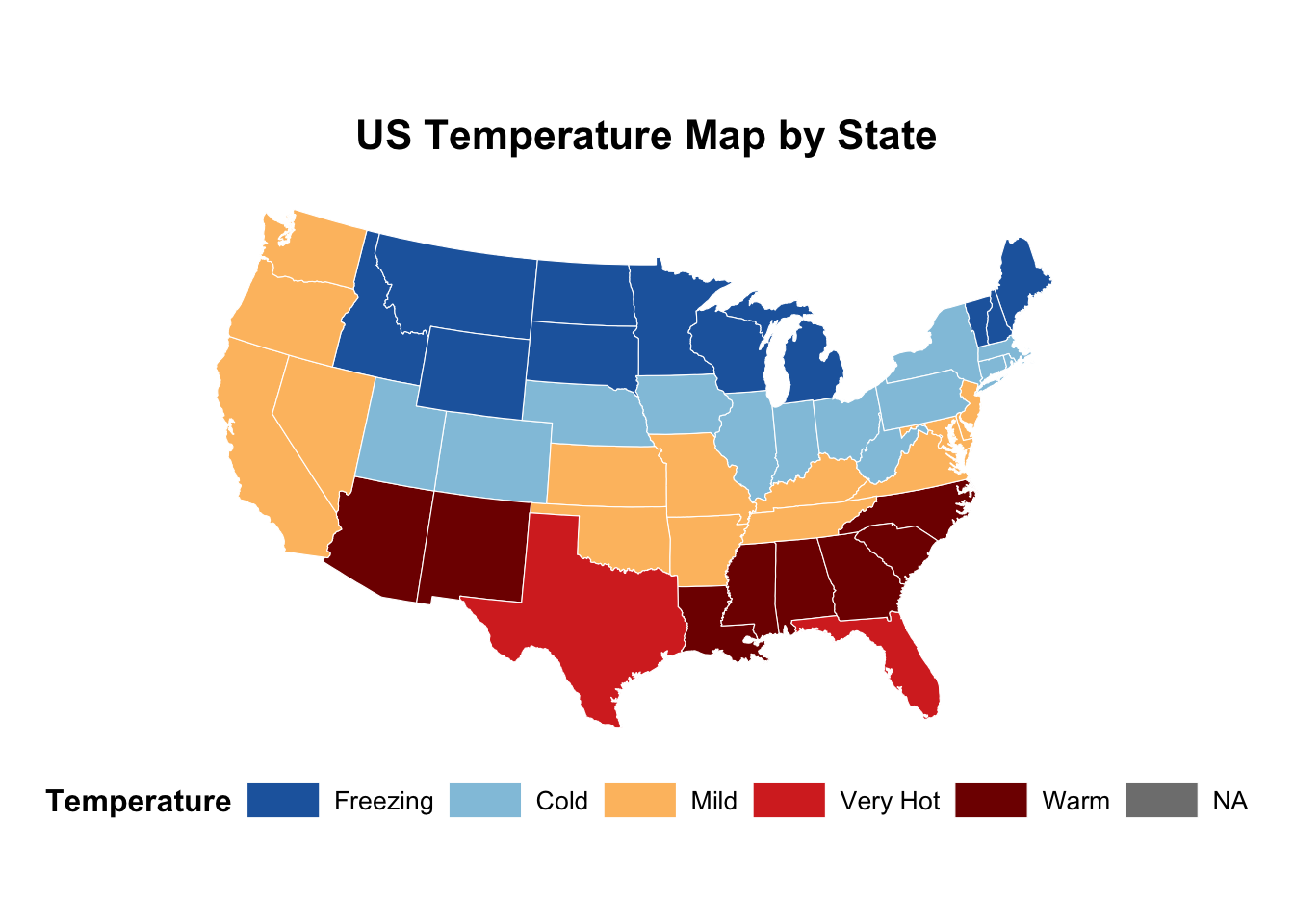
Even color can mislead. If colors imply an order (e.g., light to dark) but the categories don’t follow a logical sequence, viewers may misinterpret the pattern. Figure 10 shows temperature across America, but “warm” has a darker red than “Very hot”. This could mislead readers into thinking North Carolina is hotter than Texas. This is made even worse because “Warm” comes after “Very hot” in the legend. Fix this by making sure the order of colors (and color keys) make some sense and follow the reader’s expectations.
Section summary
Even honest people can make dishonest plots. Truncated y-axes, weird or uneven x-axes, misleading bin sizes, and unstandardized values can all distort what your audience sees—especially when viewed quickly or from a distance. A good plot doesn’t just show the data; it helps readers reach the right conclusion without extra mental gymnastics. After you make a plot, show it to someone—fast, far away, or with minimal labels—and ask what they think it says. If they walk away with a different takeaway than you intended, your plot needs work.