Motivating Scenario: You are continuing your exploration of a fresh dataset. You have examined its shape and applied any necessary transformations. Now, you want to obtain numerical summaries that describe the variability in your data.
Learning Goals: By the end of this subchapter, you should be able to:
Explain why variability in a dataset is biologically important.
Differentiate between parametric and nonparametric summaries and understand which data shapes make one more appropriate than the other.
Visualize variability and connect numerical summaries to plots. You should be able to read the interquartile range off of a boxplot.
Distinguish between biased and unbiased estimators.
Calculate and interpret standard summaries of variability in R, including:
Interquartile range (IQR): The difference between the 25th and 75th percentiles, summarizing the middle 50% of the data.
Standard deviation and variance: The standard deviation quantifies how far, on average, data points are from the mean. Variance is the square of the standard deviation.
Coefficient of variation (CV): A standardized measure of variability that allows for fair comparisons across datasets with different means.
In a world where everything was the same every day (See video above), describing the center would be enough — luckily our world is more exciting than that. In the real world, the extent to which a measure of center is sufficient to understand a population depends on the extent and nature of variability. Not only is understanding variability essential to interpreting measures of central tendency, but in many cases, describing variability is as or even more important than describing the center. For example, the amount of genetic variance in a population determines how effectively it can respond to natural selection. Similarly, in ecological studies, two populations of the same species may have similar average survival rates, but greater variability in survival in one population might indicate environmental instability, predation pressure, or developmental noise.
Nonparametric measures of variability
Perhaps the most intuitive summary of variation in a dataset is the range—the difference between the largest and smallest values. While the range is often worth reporting, it is a pretty poor summary of variability because it is highly sensitive to outliers (a single unexpectedly extreme observation can strongly influence the range) and is biased with respect to sample size (the more samples you collect, the greater the expected difference between the smallest and largest values).
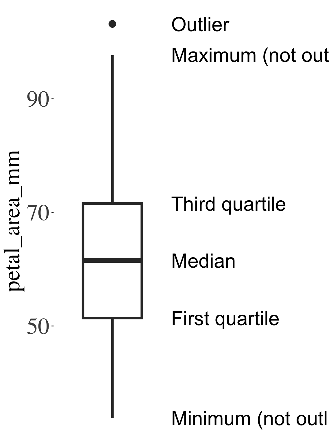
As such, the interquartile range (IQR)—the difference between the 75th and 25th percentiles (i.e., the third and first quartiles)—is a more robust, traditional nonparametric summary of variability. We can read off the interquartile range from a boxplot. A boxplot shows a box around the first and third quartiles, a line at the median, and “whiskers” that extend to the minimum and maximum values (excluding outliers, which are shown as black dots).
Figure 1: Anatomy of a boxplot. This boxplot displays the distribution of petal area in the Clarkia RIL dataset. The box spans from the first quartile (25th percentile) to the third quartile (75th percentile), highlighting the interquartile range (IQR). The line inside the box marks the median (50th percentile). The “whiskers” extend to the smallest and largest non-outlier values, and individual outliers are shown as separate points.
Figure 1 shows that the third quartile for petal area is a bit above seventy, and the first quartile is a bit above fifty, so the interquartile range is approximately twenty. Or with the IQR() function:
Mathematical summaries of variability aim to describe how far we expect an observation to deviate from the mean. Such summaries start by finding the sum of squared deviations, \(SS_X\) (i.e. the sum of squared differences between each observation and the mean). We square deviations rather than taking their absolute value because squared deviations (1) are mathematically tractable, (2) emphasize large deviations, and (3) allow the mean to be the value that minimizes them — which ties directly into least squares methods we’ll use later in regression. We find \(SS_X\), know as “the sum of squares” as: \[\text{Sum of Squares} = SS_X = \Sigma{(X_i-\overline{X})^2}\]
From the sum of squares we can easily find three common summaries of variability:
Why divide by \(n-1\)? When we calculate how far values are from the mean, we might think to average the squared deviations by dividing by the number of values, \(n\). But, by calculating the mean, we’ve used up a little bit of information. Because the mean pulls the values toward itself, numbers aren’t totally free to vary anymore. Because of that, we divide the sum of squares by \((n-1)\) rather than \(n\). This gives us a more accurate sense of how spread out the values really are, based on how much they can still vary around the mean.
The variance, \(s^2\) is roughly the average squared deviation, but we divide the sum of squares by our sample size minus 1. That is the \(\text{variance} = s^2 = \frac{SS_x}{n-1} = \frac{\Sigma{(X_i-\overline{X})^2}}{n-1}\). The variance is mathematically quite handy, and is in squared units relative to the initial observations.
The standard deviation, \(s\) is simply the square root of the variance. The standard deviation is often easier to think about because it lies on the same (linear) scale as the initial data (as opposed to the squared scale of the variance).
The coefficient of variation, CV allows us to compare variance between variables with different means. In general variability increases with the mean, so you cannot meaningful compare the variance in petal area (which equals 203.399) with the variance in anther stigma distance (which equals 0.134). But it’s still biologically meaningful to ask: “Which trait is more variable, relative to its mean?” We answer this question by finding the coefficient of variation which equals the standard deviations divided by the mean: CV = \(\frac{s_x}{\overline{X}}\). Doing so, we find that anther–stigma distance is nearly twice as variable as petal area.
It’s ok to be MAD. The mean absolute difference (aka MAD, which equals \(\frac{\Sigma{|x_i-\bar{x}|}}{n}\)) is a valid, and robust, but non-standard summary of variation. The MAD is most relevant when presenting the median as the median minimizes the sum of absolute deviations, while the mean minimizes the sum of squared deviations.
Parametric summaries of variability: Example
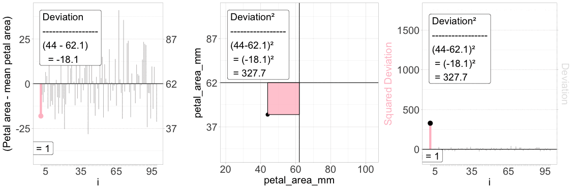
Figure 2: Understanding the squared deviation. The “Sum of Squared Deviations” is critical to understanding standard summaries of variability. The animation above aims to explain a “squared deviation.” Left panel: Each individual’s deviation from the mean petal area is visualized as a vertical line, with the iᵗʰ value highlighted in pink. Middle panel: The same individual is plotted in a 2D space – the squared deviation is shown as the area of a pink rectangle. Right panel: The squared deviation is shown for all individuals, with the same focal individual highlighted.
To make these ideas clear, let’s revisit the distribution of petal area in parviflora RILs planted in GC. Figure 1 shows how we calculate the Squared Deviation for each data point.
The left panel shows the difference between each observed value and its mean.
The middle panel shows this as a box (or square) away from the overall, “grand” mean.
The right panel shows the squared deviation.
We find the sum of squares by summing these values, and then use this to find the variance, standard deviation and coefficient of variation, following the formulae above: