Motivating Scenario: We want to understand the idea of bootstrapping - how we can just use our sample and a computer to approximate the sampling distribution. Here, we will learn a powerful computational approach called the bootstrap to do exactly that, using only the sample we already have!
Learning Goals: By the end of this subsection, you should be able to:
Know the difference between sampling with and without replacement.
Understand how the bootstrap distribution approximates the sampling distribution
Explain this conceptually.
Make one bootstrap sample with slice_sample(), and understand how lapply() can generate the bootstrap distribution.
It is important to understand this conceptually but don’t sweat the coding!
Visualize the bootstrap distribution as a histogram.
Use the bootstrap distribution to quantify uncertainty for example, as the standard error.
Code for selecting data from a few columns from RILs planted at GC
A major question in evolution is how often to recently diverged species hybridize. If they almost never hybridize we don’t need to consider how gene flow impacts the process of speciation. If hybridization is frequent, we must wrestle with how populations can maintain their divergence despite ongoing hybridization.
How frequent is hybridization? It differs by species-pair, field site, individual phenotypes etc. For example \(\approx 15\%\) of seeds on Clarkia xantiana ssp parviflora RILs plants at site GC were actually hybrids. This estimate comes from averaging across all individuals in our sample. We know by now that we could have sampled other individuals from the population, and we must quantify uncertainty in this estimate.
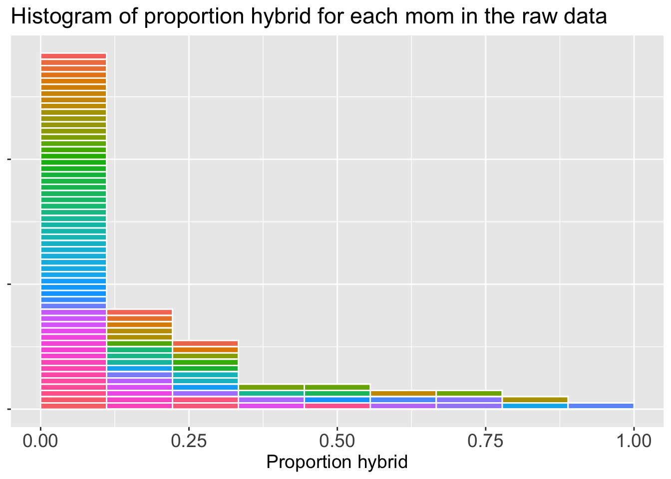
ggplot(gc_rils, aes(x = prop_hybrid,fill = id))+geom_histogram(breaks =seq(0,1,length.out=10), color ="white",show.legend =FALSE)+labs(title ="Histogram of proportion hybrid for each mom in the raw data",x ="Proportion hybrid")+theme(axis.title.x =element_text(size =14),axis.text.x =element_text(size =14),title =element_text(size =14),axis.title.y =element_blank(),axis.text.y =element_blank())
Figure 1: A histogram showing the distribution of the proportion of hybrid offspring for each parviflora mother at site GC. Each individual mom is represented once and is shown by color. This allows us to track which individuals are selected when we create a bootstrap sample in the next step.
Introducing the bootstrap
If you don’t know anything about statistics, learn the bootstrap. Seriously, think of it as a “statistical pain reliever”!! My new favorite term for the approach that underlies almost everything I do... https://t.co/jCHozq80oM
When we take a statistical sample from a population, we do so without replacement. That, is we do not select the same individual twice – rather we sample n distinct individuals. This is how we get our sample. Conceptually we build sampling distributions by repeating this amny times (but of course in the real world we usually only have one sample).
Bootstrapping allows us to approximate the sampling distribution by choosing n individuals from our sample with replacement (i.e. we might pick the same sample more than once) as follows:
Pick an observation from your sample at random.
Note its value.
Put it back in the pool.
Go back to (1) until you have as many resampled observations as initial observations.
Calculate an estimate from this collection of observations.
After completing this you have one bootstrap replicate! We simply repeat this a bunch of times to get the bootstrap distribution.
Let’s get started by generating one bootstrap replicate from our GC data! As in the sampling chapter, we use dplyr’s slice_sample() function, but this time we set prop (it defaults to our sample size) and we do need to specify replace = TRUE to sample with replacement:
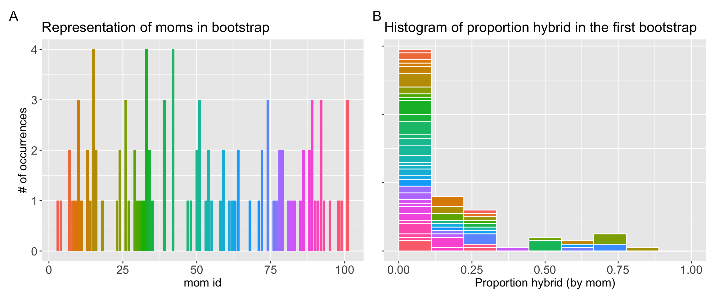
This new mean of 0.136 is different from our original 0.151. Figure 2 shows that in this bootstrap replicate we happened to only select one of the three moms with the greatest proportion hybrid seed. This difference is the essence of sampling variability. The bootstrap allows us to recreate this variability computationally to see how much our estimate might have changed by chance.
By repeating this process thousands of times, we can see the full range of estimates we might have gotten, which is the key to measuring our uncertainty.
Code for making the histogram below
library(patchwork)plot_count <-ggplot(boot_rep1, aes(x =as.numeric(id), fill = id))+geom_bar(show.legend =FALSE)+labs(title ="Representation of moms in bootstrap",x ="mom id", y ="# of occurrences")+theme(axis.title.x =element_text(size =14),axis.text.x =element_text(size =14),title =element_text(size =14),axis.title.y =element_text(size =14),axis.text.y =element_text(size =14))plot_hist <-ggplot(boot_rep1 , aes(x = prop_hybrid,fill = id))+geom_histogram(breaks =seq(0,1,length.out=10), color ="white",show.legend =FALSE)+labs(title ="Histogram of proportion hybrid in the first bootstrap",x ="Proportion hybrid (by mom)")+theme(axis.title.x =element_text(size =14),axis.text.x =element_text(size =14),title =element_text(size =14),axis.title.y =element_blank(),axis.text.y =element_blank())plot_count + plot_hist +plot_annotation(tag_levels ='A')
Figure 2: A visualization of a single bootstrap replicate derived from the original sample. (A) The result of sampling with replacement – The y-axis represents the number of times each original mother (identified by mom id and a unique color) was selected for the bootstrap sample. Many mothers from the original data were not selected, while others were selected two or more times. (B) A histogram of the proportion hybrid variable for this new bootstrap sample. The colors correspond to the individuals in Panel A, illustrating the composition of the new sample. If a single color is taller, it’s because that specific mother was selected multiple times. This visualizes how some mothers (colors) contribute multiple times to the overall bootstrap sample, which is the key feature of sampling with replacement.
Building a bootstrap distribution
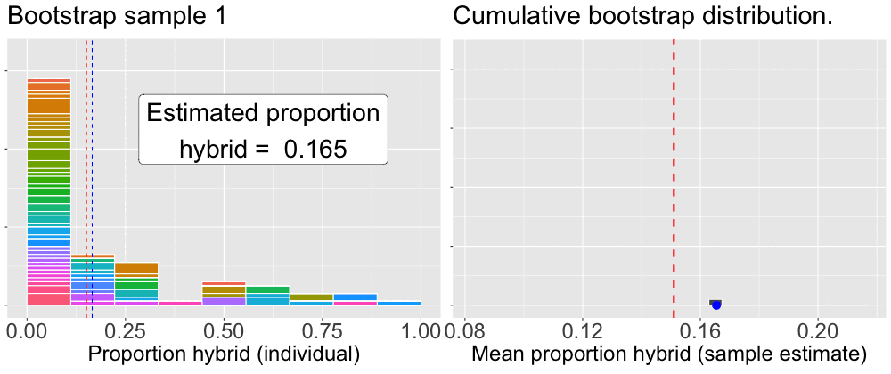
To build a bootstrap distribution, we (not so) simply repeat this process many times. Figure 3 provides an animation of how we build up a bootstrap distribution.
Figure 3: An animation illustrating the bootstrap procedure for estimating uncertainty. The left panel loops through individual bootstrap samples. The histogram shows the data for the current sample, with colors indicating which ‘mom’ was selected, the height of which shows how many times the mom was sampled. The blue dashed line marks this bootstrap sample’s mean. The right panel shows the mean from the left panel added as a single blue dot to the distribution on the right. This panel is cumulative, showing the distribution of all bootstrap sample means calculated so far. In both panels the red dashed line represents the mean of the original sample, providing a constant point of reference.
The code to do this is a bit tricky – in fact I will show you an R package to make this easier in the next subsection – so there is no need to carefully follow this code. But here’s one way to build up a bootstrap distribution:
lapply() is one of R’s ways of just doing the same thing a lot of times.
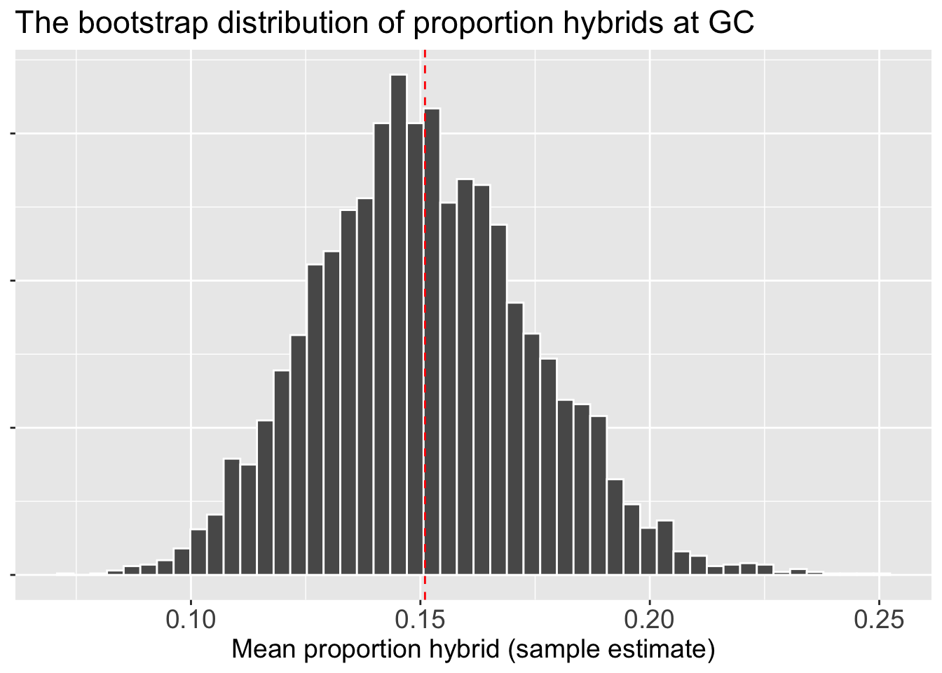
Now that we have the bootstrap distribution we can visualize it!Figure 4 shows the bootstrap distribution as a histogram. We can see that estimates are centered around our sample mean of 0.15, but that by chance, some bootstrap replicates are as low as 0.08 or as high as 0.24. This spread is the uncertainty we were looking for, made visible. Now we can move from visualizing it to summarizing it with a single number: the standard error.
Code for making a histogram of the bootstrap distribution
boot_dist |>ggplot(aes(x = est_prop_hybrid))+geom_histogram(bins =50, color="white")+labs(title ="The bootstrap distribution of proportion hybrids at GC",x ="Mean proportion hybrid (sample estimate)")+theme(axis.title.x =element_text(size =14),axis.text.x =element_text(size =14),title =element_text(size =14),axis.title.y =element_blank(),axis.text.y =element_blank())+geom_vline(xintercept =0.151, color ="red", lty =2)
Figure 4: The bootstrap distribution for the mean proportion of hybrids. This histogram was generated by repeatedly resampling from the original data, calculating the mean of each new bootstrap sample, and plotting those means. The resulting distribution is approximately normal and is centered on the mean from the original sample (indicated by the red dashed line at 0.151). The spread of this distribution is a measure of the uncertainty in that original estimate.
Quantifying uncertainty: The bootstrap standard error
We can simply calculate the bootstrap standard error as the standard deviation of the bootstrap distribution.
boot_dist |>summarise(se =sd(est_prop_hybrid))
# A tibble: 1 × 1
      se
   <dbl>
1 0.0237
The bootstrap standard error of 0.024 means that the average distance between an estimate from the bootstrap distribution and the actual sample estimate is roughly 0.024.