Motivating Scenario:
You have measurements for many traits or environmental variables and want to summarize how individuals vary across all traits, not just one at a time. You’ve heard PCA can reduce complexity and reveal structure in multivariate data, but you’re not quite sure how it works, what the output means, or how to interpret the results biologically.
Learning Goals: By the end of this subchapter, you should be able to:
Understand the goals of PCA.
Describe how PCA summarizes multivariate variation into fewer dimensions.
Explain why PCA is useful for exploring structure in biological data.
Make the aspect ratio proportional to percent variance explained.
Interpret PCs biologically by looking into patterns and connecting trait loadings to underlying processes of interest.
One reason biologists are so interested in associations between variables is that very little in this world is independent. Take our parviflora RILs, for example. If you recall, these recombinant inbred lines were made to disentangle correlations between traits by mixing up genomes from two populations and allowing for multiple generations of recombination. Although this effort was largely successful – trait correlations persist in our RILs because traits are tightly linked on a chromosome or are physiologically connected. As such, for example, petal area is strongly positively related to anther stigma distance, and negatively correlated with leaf water content.
PCA summarizes variability into major axes of variation in a sample by finding combinations of traits that explain the most variability in the data, and are independent of each other. PCA first find principal component 1 (PC1) as the linear combination of all traits that explain the most variability in our sample. It goes on to do the same for PC2, and so on. We are left with as many principal components as original traits — but all are independent and the first few principal components explain more of the variance than the last few.
Now let’s run a quick PCA and then unpack what it’s doing. We run a PCA in R following these steps:
PCA requires complete data. If you have missing observations for individuals, you can either 1. Drop these individuals. 2. Impute (a fancy word for informed guessing) missing values with tools like missMDA. 3. Use more advanced PCA methods that can handle missing data directly, such as probabilistic PCA.
We usually want to “center” and “scale” the data (i.e. subtract off the mean and divide by the standard deviation). We discuss why we do (or do not) choose to do this later. For now, know that you can center and scale within prcomp(center = TRUE, scale = TRUE), or before running the PCA with the scale() function.
scaled_gc_rils_4pca <- gc_rils_4pca |>select(-made_hybrid)|># Remove categorical variablesmutate_all(scale) # Subtract mean and divide by SD
This is the easy part – if your data are centered and scaled, and there are no NA’s just give your data as an argument to the prcomp() function:
gc_ril_pca <-prcomp(scaled_gc_rils_4pca) # Run the pca
Interpreting PCA output
Because a PCA returns numerous things we want to know about (percent variance explained by each PC, trait loadings onto PCs, individual values on each PC), prcomp() returns something with an awkward structure (known as an S3 object in R). To make this easier to deal with, we will use the tidy() and augment() functions from the broom package introduced earlier.
Looking into proportion variance explained
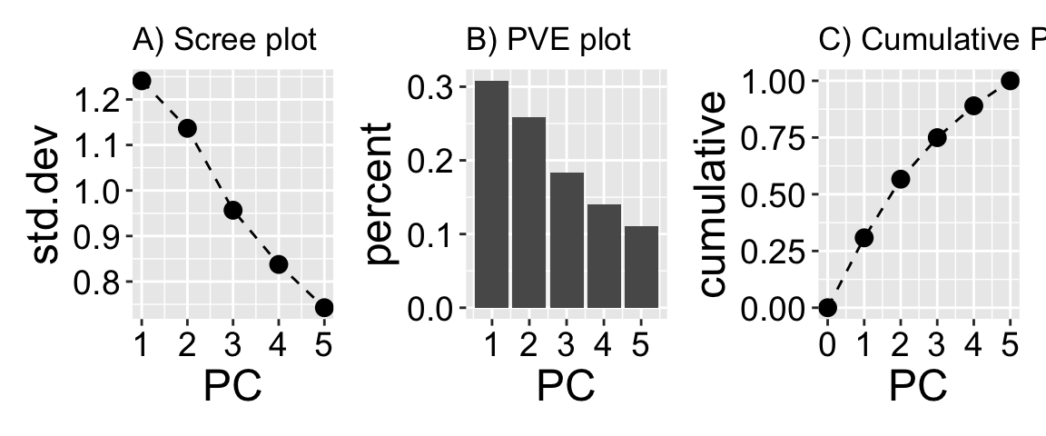
It is too easy to fool ourselves into looking at something very interesting that explains relatively little of the variation in our dataset. Remember that principal components sequentially explain less and less of the overall variability in our dataset. So it is always worth reporting the proportion variance captured by focal principal components. Here we see that PC1 captures roughly 30% of the variability in our data, while PC5 captures about 11% of the overall variability.
library(broom) # Load the broom librarytidy(gc_ril_pca, matrix ="pcs") # Extract percent variance explained from pc object
PC
std.dev
percent
cumulative
1
1.241
0.308
0.308
2
1.137
0.258
0.566
3
0.957
0.183
0.749
4
0.838
0.140
0.890
5
0.742
0.110
1.000
There are a few common visualizations of the proportion of variance explained by each PC.
A scree plot (Figure 1 A) shows the amount of variation soaked up by the principal component on the y-axis. Scree plots usually have points for the standard deviation attributable to each PC, and those points are connected by lines.
A proportion variance explained plot (Figure 1 B) is very similar, but the y-axis is the proportion variance explained by each PC (that is the variance (i.e. std.dev\(^2\)) explained by each PC divided by the sum of standard variances), and is shown as a bar plot.
A cumulative proportion variance explained plot (Figure 1 C) shows the cumulative sum of a proportion variance explained plot and is shown with points and lines. In this case, the value for PC2 equals the sum of the proportions of variance explained by PC1 and PC2.
Figure 1: Visualizing percent variance explained by PCs. Principal component analysis (PCA) reduces dimensionality by compressing variance into the first principal components. The plots above show how much variability is explained by each PC. A is a scree plot showing the standard deviation of each principal component, reflecting how much variation each one captures from the original data. B displays a bar plot of the proportion of total variance explained by each component. C shows the cumulative proportion of variance explained, beginning at zero and increasing with each additional PC, reaching 100% by the fifth component.
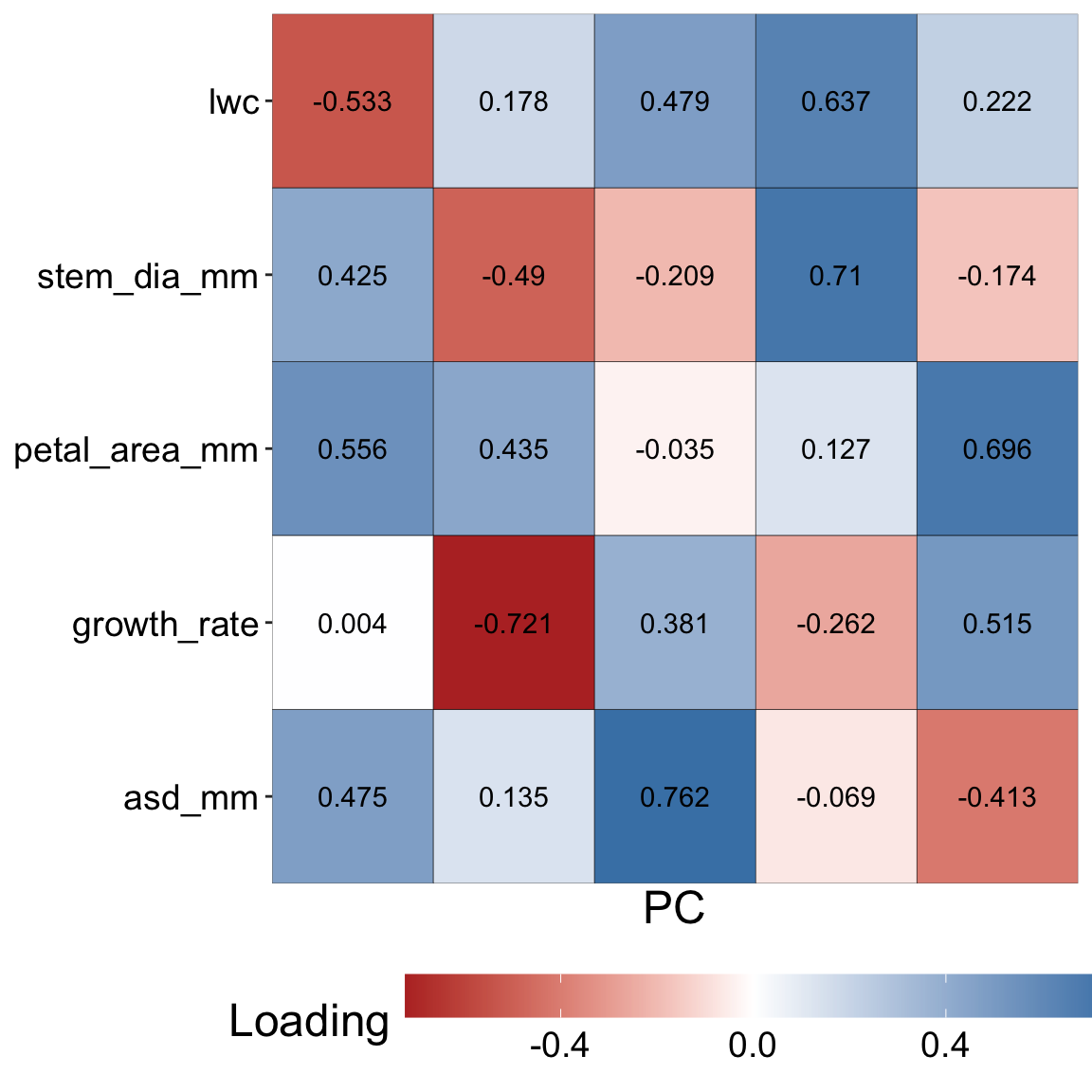
Looking into trait loading
Loading of each trait onto each PC
So about 30% of the variability is captured by PC1, but what even is PC1? I’m glad you asked this question! PC1 (like all principal components) is a combination of variables each weighted by a certain amount. For PC1, this combination point in the direction of the most variability in the (scaled and centered) data set. In this case, the value of PC1 in individual, \(i\), equals:
petal_area x 0.56 + asd x 0.48 + growth_rate x 0 + stem_dia x 0.43 + lwc x -0.53.
Here each trait refers to the scaled and centered value in individual \(i\). Similarly, “loadings” of traits on each PCA are presented in the table to the right and in Figure 2.
library(broom) # load broom packagetidy(gc_ril_pca, matrix ="loadings") |># Get trait loadingsarrange(PC) # Sort the data so we see PC1 first
We can now find each individual’s value on each PC1. To do so, we
Take the scaled and centered values of each trait,
Multiply this by the trait loading on a given PC,
Take the sum.
Rinse and repeat for all individuals on all PCs
So individual 1’s value for PC1 is:
(0.56 x -1.26) + (0.48 x -1.09) + (0 x 0.54) + (0.43 x -0.65) + (-0.53 x -0.31).
This equals -1.33. Rather than repeating this for all individuals and all PCs, we can find these values with the augment() function in the broom package:
augment(gc_ril_pca)
Visualizing PCs
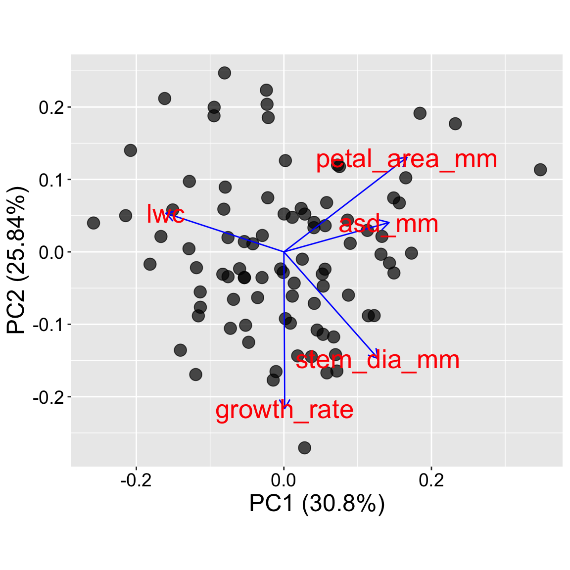
Now that we know what our PCA means, let’s have a look at our results. Below, I show how to use the autoplot() function in the ggfortify package. I present four plots:
All find the proportion variance explained by PCs on the x and y axes, and set the “aspect ratio” as \(\text{pve}_\text{y}/\text{pve}_\text{x}\).
Why mess with aspect ratio? In PCA, each axis (e.g., PC1 and PC2) explains a different amount of variance, so an honest plot presents axes proportional to their importance. Otherwise, distances and angles in the plot can be misleading. Setting the aspect ratio as the ratio of proportion of variance explained, to prevent such misinterpretation.
The plot in tab two (Trait loadings) generates a classic “pca biplot” by adding trait loadings.
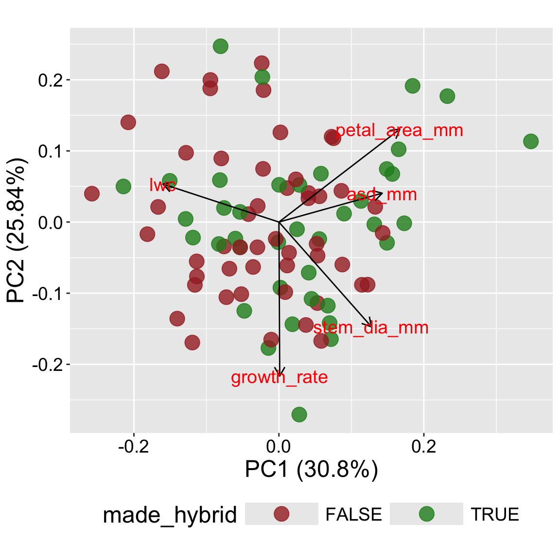
The plot in tab three (+ categories) uses color to add a categorical variable to the plot. This allows us to see if some categorical variable e.g., species (or in this case, if a flower made at least one hybrid) is associated with some part of PC space.
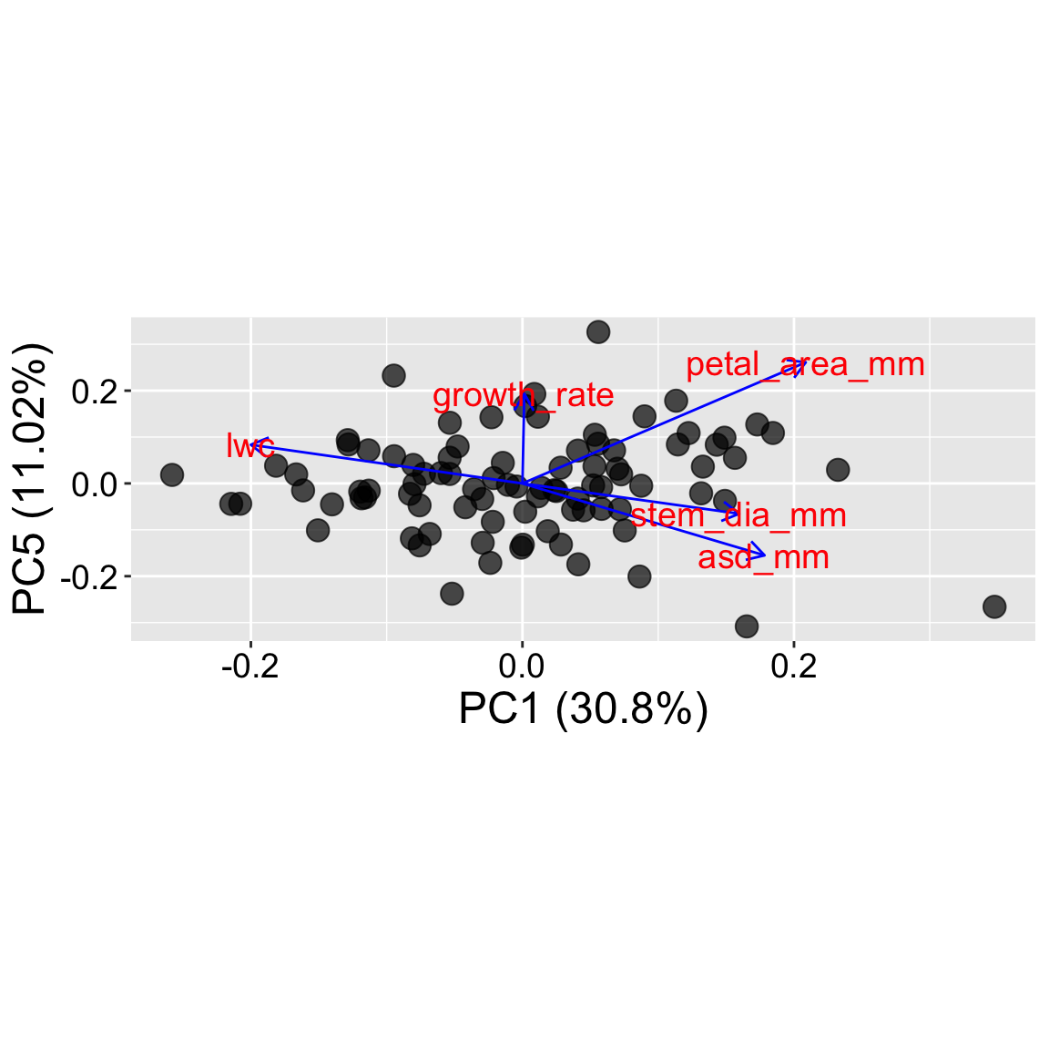
The plot in tab four (PC1 v PC5) shows that we can use x and y arguments in autoplot() to show other PCs.
Now that we can create and interpret PCA plots, let’s return to the underlying biological questions they can address. Some common questions to ask are:
Are individuals clustered or spread out?
In our case individuals are quite spread out. This lets us know that recombination during the creation of our RILs did a reasonable job of dissecting the underlying traits.
Clustering would suggest that there is some underlying structure in the data. If clustering was noticeable, we would want to know which traits are driving that structure.
Which traits influence the main axes? In the biplot, look at the arrows:
Which traits are most aligned with PC1 or PC2?
Are any traits opposing each other?
Do categories separate in PCA space? In our case we see that nearly all observations in the bottom left of our plot set no hybrid seeds, while the top right (aligned with large petal area) seemed to have a lot of hybrids.
Is anything interesting happening beyond PC1 and PC2? Check out other PCs (like PC5) to see if subtle patterns or groupings emerge that aren’t visible on the first two axes. But beware, do not overinterpret patterns in PCs that explain very little variability.
Do you notice a “horseshoe” shape? Sometimes points a PCA plot form a curved or arched pattern. This is a known artifact that often shows up when PCA tries to fit a curved pattern using straight-line axes. This can be misleading – samples at the two ends of the gradient may appear close together even though they’re quite different. When you see a horseshoe, consider transforming key variables or using an alternative ordination approach less sensitive to this issue.
Now that we can make and interpret PCA plots, let’s look under the hood and see how they work.