You’re proud of yourself for successfully creating a plot with ggplot2. But looking at it, you realize it’s not particularly good, and that the plot breaks many of the dataviz guidelines we went over in the last chapter. Now you want to go from this basic plot to a good which clearly and honestly shows your results.
Learning Goals: By the end of this subchapter, you should be able to:
Diagnose the flaws in a default plot by identifying common problems like unreadable labels, cryptic names, and poorly chosen visual representations.
Ensure labels are clear and informative by:
Flipping coordinates to handle long category names.
Using labs() to provide descriptive axis and legend titles.
Using scale_*_manual() to rename shorthand categories in a legend.
Represent data points honestly and guide the reader’s eye with:
Controlled geom_jitter() to avoid overplotting without distorting the data’s meaning.
stat_summary() to add visual summaries like means and error bars.
Arrange plot elements to reveal patterns by using functions from the forcats package to order categorical data meaningfully (e.g., by value or in a specific manual order).
Explore alternative views of your data by:
Using faceting to create small multiples that highlight different comparisons.
Applying direct labeling as a powerful alternative to legends.
Making Clear Plots in R
In the previous chapter we discussed that clear plots (1) Have Informative and Readable Labels (2) Minimize cognitive burden, (3) Make points obvious, and (4) Avoid distractions. In this subsection, we focus on how to accomplish these goals in ggplot.
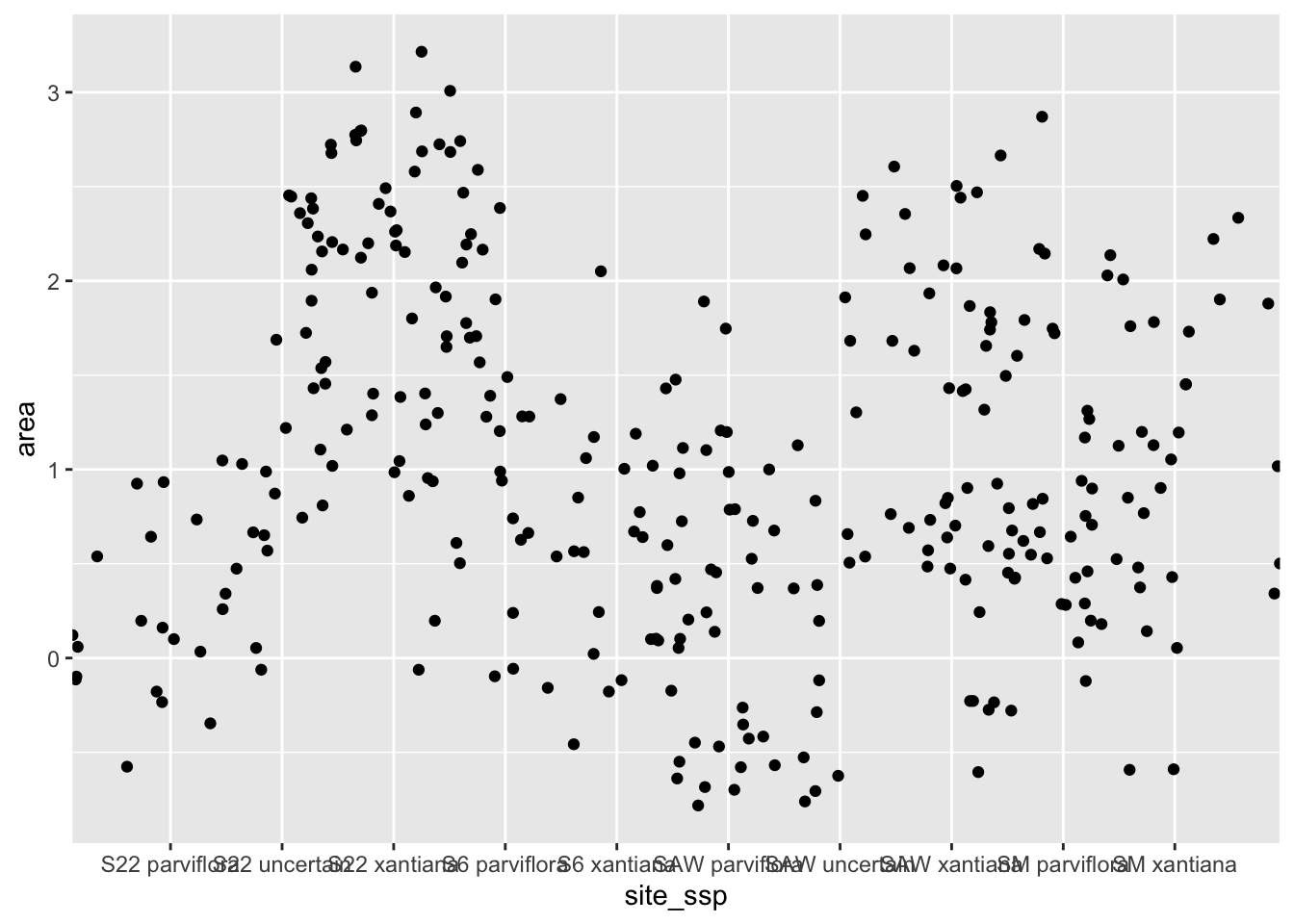
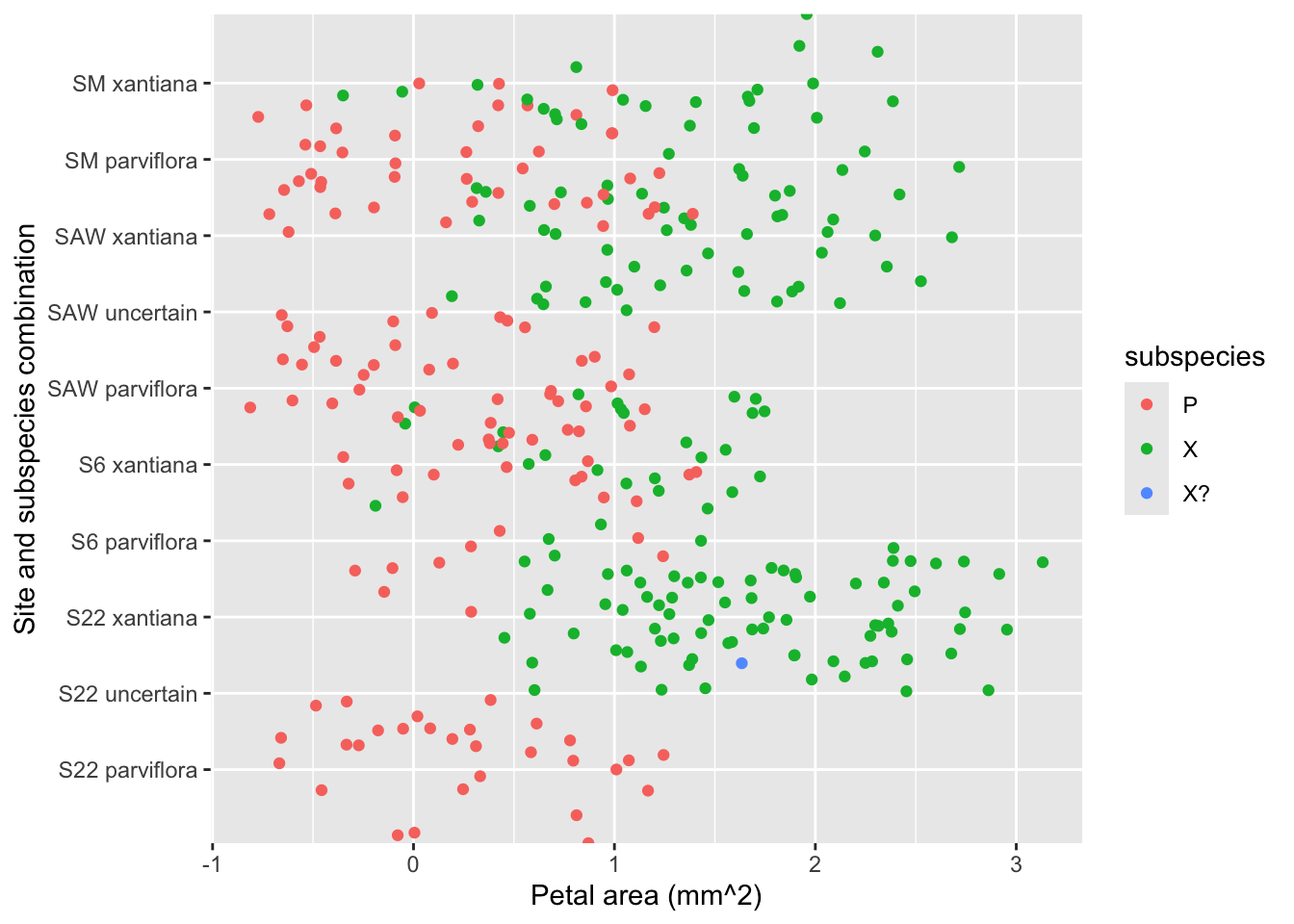
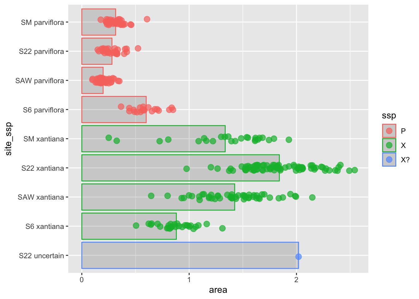
To do so, we initially focus on a truly heinous plot, which aims to compare petal area across field sites and subspecies. We can see that Figure 1 is basically unreadable:
We can’t tell which data point is associated with which category.
The x-axis labels bump into each other, so we can’t read them anyway.
How are there negative values for area?
The meaning of areasite_ssp, ssp, P, X, and X? are unclear.
It’s hard to follow patterns (but there are some bigger things and lower things)!
So, we give it a “makeover” to turn it into a solid explanatory plot.
Figure 1: Our starting plot. The x-axis labels are unreadable, and the legend labels are unclear, data points are all over the place.
After improving this plot and considering alternatives, we conclude by introducing a few other data sets to cover additional topics in how to go from a solid exploratory plot to a good explanatory plot!
Ensuring Labels Are Readable and Informative
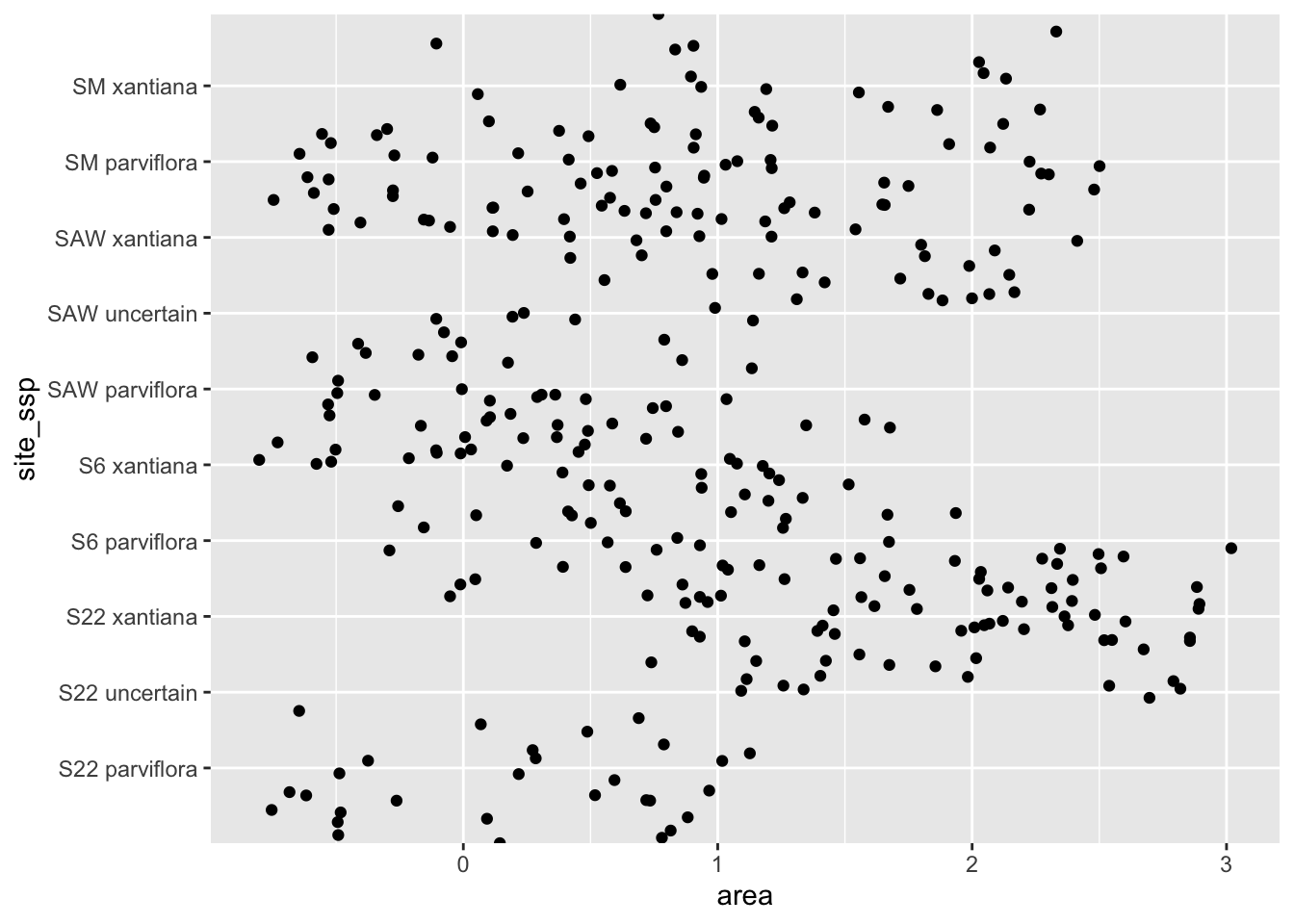
Step 1: Making Labels Readable by Flipping Coordinates
The first problem to solve is the overlapping text. There are two possible solutions:
Flipping the x and y axes is my favorite solution because so the long labels have room to breathe on the y-axis (Panel: Switch x & y).
Rotating the labels on the x-axis is also acceptable, but can be a pain in the neck (Panel: Rotate X label).
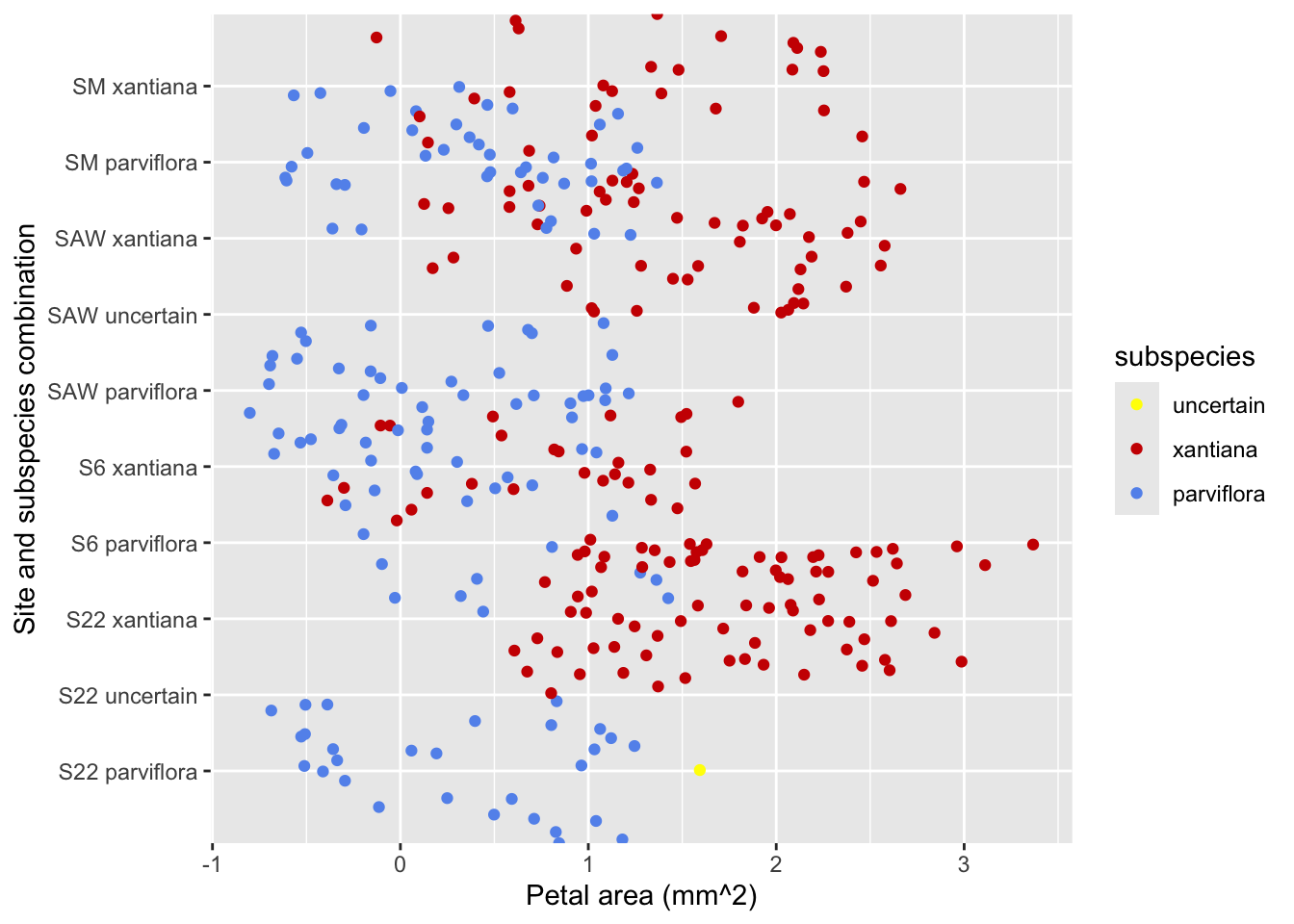
Figure 2: Our starting plot - now with flipped axes. The legend labels are unclear, data points are all over the place, but now we can read the categories, so that’s something.
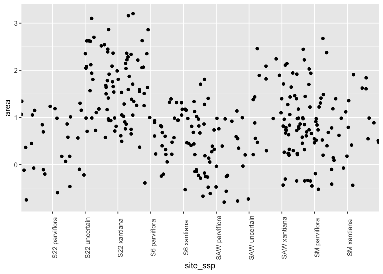
Here is the alternative solution in which we can rotate the x-axis labels, which we accomplish through the theme function:
Figure 3: Our starting plot - now with rotated x-labels. The legend labels are unclear, data points are all over the place, but now we can read the categories, so that’s something.
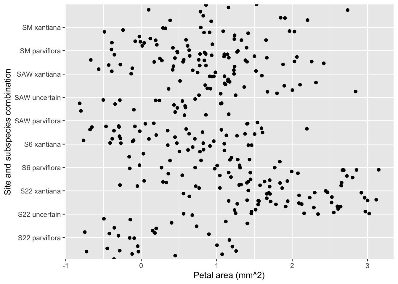
Step 2: Making Labels Informative by Changing Labels
Spreadsheets and datasets often use shorthand for column names or categories. Such shorthand can make data analysis more efficient, but makes figures unclear to an outside audience. We could maybe guess that area referred to petal area, and that site_ssp meant the combination of site and species, but that’s not fully clear.
Replace <ADD A GOOD X LABEL HERE> and <ADD A GOOD Y LABEL HERE> in the labs() function of the code below to make a clearly labelled figure (See my answer in Figure 4).
ggplot(hz_phenos, aes(x = area, y = site_ssp)) +geom_jitter(width =1, height =1)+labs(x ="Petal area (mm^2)", y ="Site and subspecies combination")
Figure 4: Our starting plot - now with flipped axesand better labels. The legend labels are unclear, data points are all over the place, but now we can read the categories and know what X and Y mean, so that’s something.
Step 3: Picking Colors to Make Labels Informative
Although the Y axis (now) should provide enough information to understand the plot, associating color with a variable can make patterns stick out.
Figure 5 (in Panel: Default colors) does this by mapping subspecies onto color.
Figure 6 (in Panel: Color choice + better labels + choose order) takes further control by picking colors ourselves or using a fun and informative color palette.
ggplot(hz_phenos, aes(x = area, y = site_ssp, color = ssp)) +geom_jitter(width =1, height =1)+labs(x ="Petal area (mm^2)", y ="Site and subspecies combination", color ="subspecies")
Figure 5: This plot improves on previous figures by using color to show which data point came from which subspecies.
Here we have taken control of defaults, using scale_color_manual() to rename the categories within the legend.
values = c(...) sets the colors for the categories.
breaks = c("X?", "X", "P") specifies the original shorthand values from the data and sets the order they should appear in the legend.
labels = c("uncertain", "xantiana", "parviflora") provides the new, descriptive labels that correspond to the items listed in breaks.
ggplot(hz_phenos, aes(x = area, y = site_ssp, color = ssp)) +geom_jitter(width =1, height =1)+labs(x ="Petal area (mm^2)", y ="Site and subspecies combination", color ="subspecies")+scale_color_manual(values =c("yellow", "red3", "cornflowerblue"),breaks =c("X?", "X", "P"), labels =c("uncertain", "xantiana", "parviflora"))
Figure 6: This plot improves on previous figures by using color to show which data point came from which subspecies. Colors are chosen intentionally and default category names are replaced with legible names.
Choosing Your ggplot2 Colors
There are many “color palettes” available in R to add some fun to you figures. Check out these options, but be sure to check for accessibility (the colorblindcheck package can help).
RColorBrewer: This option comes with ggplot2. Use scale_fill_brewer() or scale_color_brewer() for a wide range of well-designed sequential, qualitative, and diverging palettes.
viridis: The most commonly used palette for scientific plots is also built into ggplot2. Its palettes are perceptually uniform and friendly to viewers with color vision deficiency. Use scale_color_viridis_d() (for discrete data) or scale_color_viridis_c() (for continuous data). Change color to fill as necessary.
Themed & Fun Palettes: Add personality to your plots with packages like wesanderson, or the artistically-inspired MetBrewer. These typically provide a vector of colors to use with scale_color_manual(). See this link for an extensive list of options.
The colorspace package: This package is great for creating your own high-quality, color-blind safe custom palettes (based on perceptually-uniform color models).
Making Patterns Clear
We’ve come a long way from Figure 1 – Figure 6 is much improved, and we can now see the xantiana likely has larger petals than parviflora. But it’s still hard to make much sense of these data. Let’s further clarify this plot.
Step 4: Choosing the Appropriate jitter
A huge problem with this plot are that data points are spread all over the place, because we used the geom_jitter() function. At times jittering points is a good way to prevent over-plotting - but it can be a problem when jittered points change our data or make patterns unclear. In our case jittering introduces both issues:
Because of the large jitter height, data points aren’t lined up with their category.
Because of the large jitter width, data points are wrong (notice the negative values for petal area.)
There are two solutions:
1. Use geom_point(): I always use geom_point when x, and y are continuous variables. In such cases using jitter actually changes our data, and should be avoided.
2. Choose appropriate jitter sizes: When an axis is categorical, jittering points along the axis makes sense, but
Be sure that points don’t run across categories (jitter should be small) for the categorical variable.
Be sure that points aren’t jittered for the axis with the continuous variable.
ggplot(hz_phenos, aes(x = area, y = site_ssp, color = ssp)) +geom_jitter(width =0, height =.25, size=3, slpha = .7)+labs(x ="Petal area (mm^2)", y ="Site and subspecies combination", color ="subspecies")+scale_color_manual(values =c("yellow", "red3", "cornflowerblue"),breaks =c("X?", "X", "P"), labels =c("uncertain", "xantiana", "parviflora"))
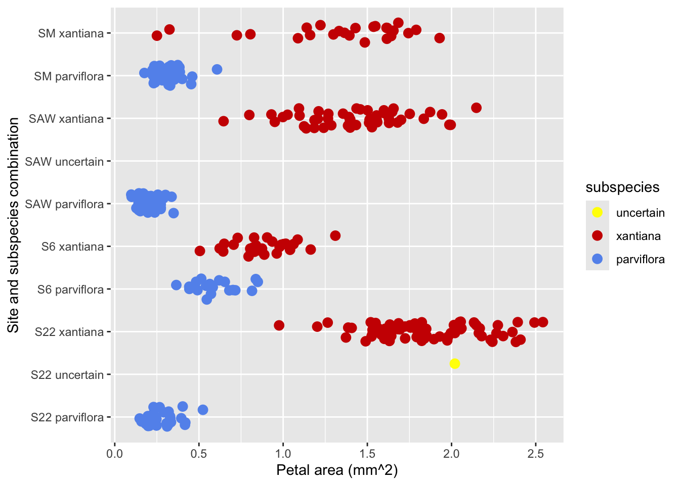
Figure 7: This plot improves on previous figures by using color to show which data point came from which subspecies. Colors are chosen intentionally and default category names are replaced with legible names. We can now see the true petal area, and unambiguously determine which category a datpoint came from (while avoiding overplotting)
Step 5: Showing Data Summaries
We are really getting there! The previous plot shows the raw data clearly, but it’s still hard to precisely estimate the mean petal area for each group or see the uncertainty in that estimate. Summary statistics can guide the reader’s eye and make the main patterns more obvious.
The stat_summary() function computes summaries for us and add them to our plot. We’ll explore two common approaches:
Adding bars to show the mean (Panel: Adding a bar).
Adding points and error bars to show the mean and its uncertainty.(Panel: Adding errorbars).
Bars allow for effective and rapid estimation of group means, and differences among groups. But adding bars to a plot without care can cover up our raw data. Three tricks to avoid this are:
Add the stat_summary() layer before geom_jitter(). to ensures the raw data points are plotted on top of the bars.
Making bars semi-transparent (via the alpha argument).
Making the bars a different color than the data points (e.g. fill = "black").
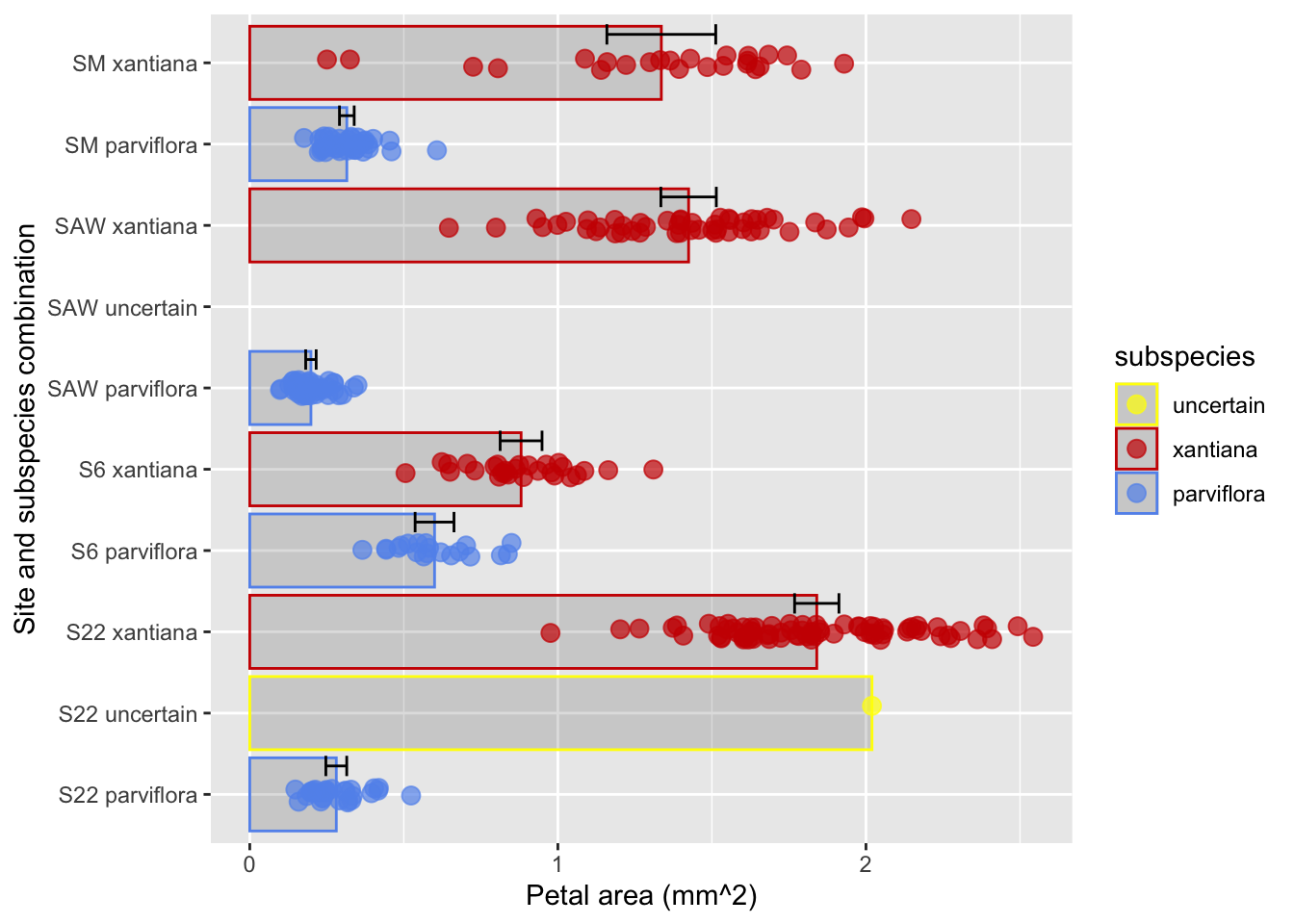
ggplot(hz_phenos, aes(x = area, y = site_ssp, color = ssp)) +stat_summary(geom ="bar",alpha = .1)+geom_jitter(width =0, height =.25, size=3, alpha = .7)+labs(x ="Petal area (mm^2)", y ="Site and subspecies combination", color ="subspecies")+scale_color_manual(values =c("yellow", "red3", "cornflowerblue"),breaks =c("X?", "X", "P"), labels =c("uncertain", "xantiana", "parviflora"))
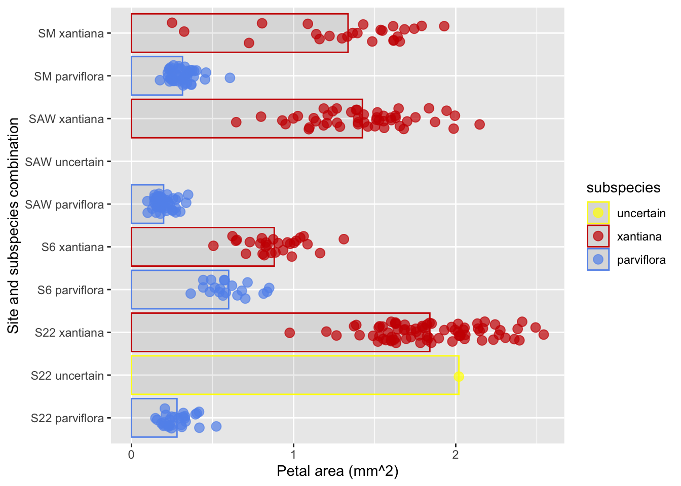
Figure 8: This plot improves on previous figures by adding a bar going from zero to each sample’s mean.
An alternative to bars is to show the mean and its uncertainty with a point and error bars. Here, we use stat_summary() again, we need to make some additional choices:
What the bars should show I usually choose 95% Confidence intervals (more on that in a later chapter) withfun.data = "mean_cl_normal".
NOTE: Standard errors,standard deviations, 95% confidence intervals and the like all different, and can be shown with bars. So you must communicate what the bars represent. I usually do this in the figure legend.
How to display the uncertainty I usually choose error bars geom = "errorbar" of modest width (width = 0.25), but geom = pointrange can work too.
ggplot(hz_phenos, aes(x = area, y = site_ssp, color = ssp)) +stat_summary(fun ="mean", geom ="bar", alpha =0.2) +geom_jitter(width =0.0, height =0.1, size =3, alpha =0.7) +stat_summary(fun.data ="mean_cl_normal", geom ="errorbar", color ="black", width =0.25, position =position_nudge(x =0, y=.35))+labs(x ="Petal area (mm^2)", y ="Site and subspecies combination", color ="subspecies")+scale_color_manual(values =c("yellow", "red3", "cornflowerblue"),breaks =c("X?", "X", "P"), labels =c("uncertain", "xantiana", "parviflora"))
Figure 9: This plot improves on previous figures by showing both means and 95% confidence intervals for each category.
Facilitate Key Comparisons
We have previously seen that the way we arrange our data can highlight key comparisons and make trends obvious.
Step 6: Arrange Categories In A Sensible Order
By default, R orders categorical variables alphabetically, which is rarely the most insightful arrangement. To make patterns stand out, you should order categories based on a meaningful value. Two such meaningful values are:
The order of categories If categories are ordinal show them in their natural order. (e.g. Months should go in order). Some things aren’t exactly ordinal but they may have an order that makes trends clear – for example our Clarkia field sites go (roughly) from south to north, so that order makes sense.
The order of values If categories cannot be sensibly arranged by something about them, it often helps to arrange them by a summary statistic, like the mean or median of the numeric response variable you are plotting. This makes patterns easiest to spot.
We can achieve either of these aims with functions in the forcats package. This pdf explains all the functions in the package, but most often I use:
NOTE There is no connection between the order categories appear in a tibble and the order they are displayed in a plot. Changing the order of factors in a tibble will not change the way they are displayed in the tibble, and reordering observations in a tibble (e.g. with arrange()) will not change their order in a plot.
Let’s give this a shot in our Clarkia hybrid zone dataset.
We can use fct_relevel() to reorder categories “by hand.”
Below, I place "S22 uncertain" last (i.e. at the top). I do this by listing all variables in the order I want them. But if you just want to move one variable (as in this case), we can alternatively use the after argument:
To place it first "MYVAR", after = 0
To place it last "MYVAR", after = Inf
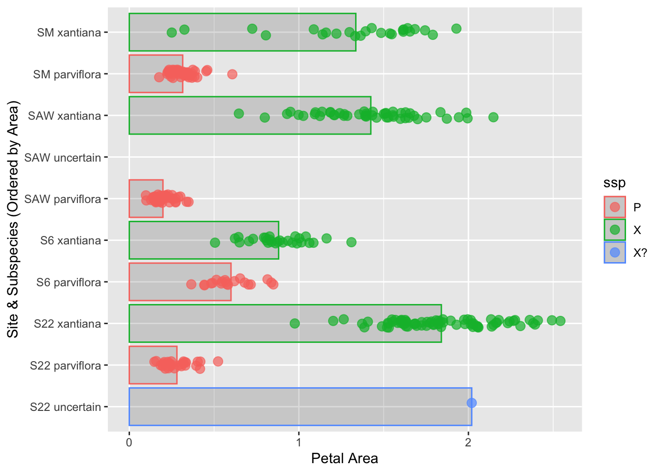
Challenge: Change the code to place "S22 uncertain" first (i.e. at the bottom as in Figure 10).
Note: Due to space considerations, this plot does not include all the best practices from above. Feel free to add them!
To place S22 uncertain first, use fct_relevel(site_ssp, "S22 uncertain", after = 0)
library(dplyr)library(forcats)library(ggplot2)# Reorder site_ssp placing S22 uncertain firsthz_phenos <- hz_phenos |>mutate(site_ssp =fct_relevel(site_ssp, "S22 uncertain", after =0))# Plot the reordered dataggplot(hz_phenos, aes(x = area, y = site_ssp, color = ssp)) +stat_summary(fun ="mean", geom ="bar", alpha =0.2) +geom_jitter(width =0.0, height =0.1, size =3, alpha =0.7) +labs(y ="Site & Subspecies (Ordered by Area)", x ="Petal Area")
Figure 10: A plot showing site and subspecies combinations with S22 uncertain last.
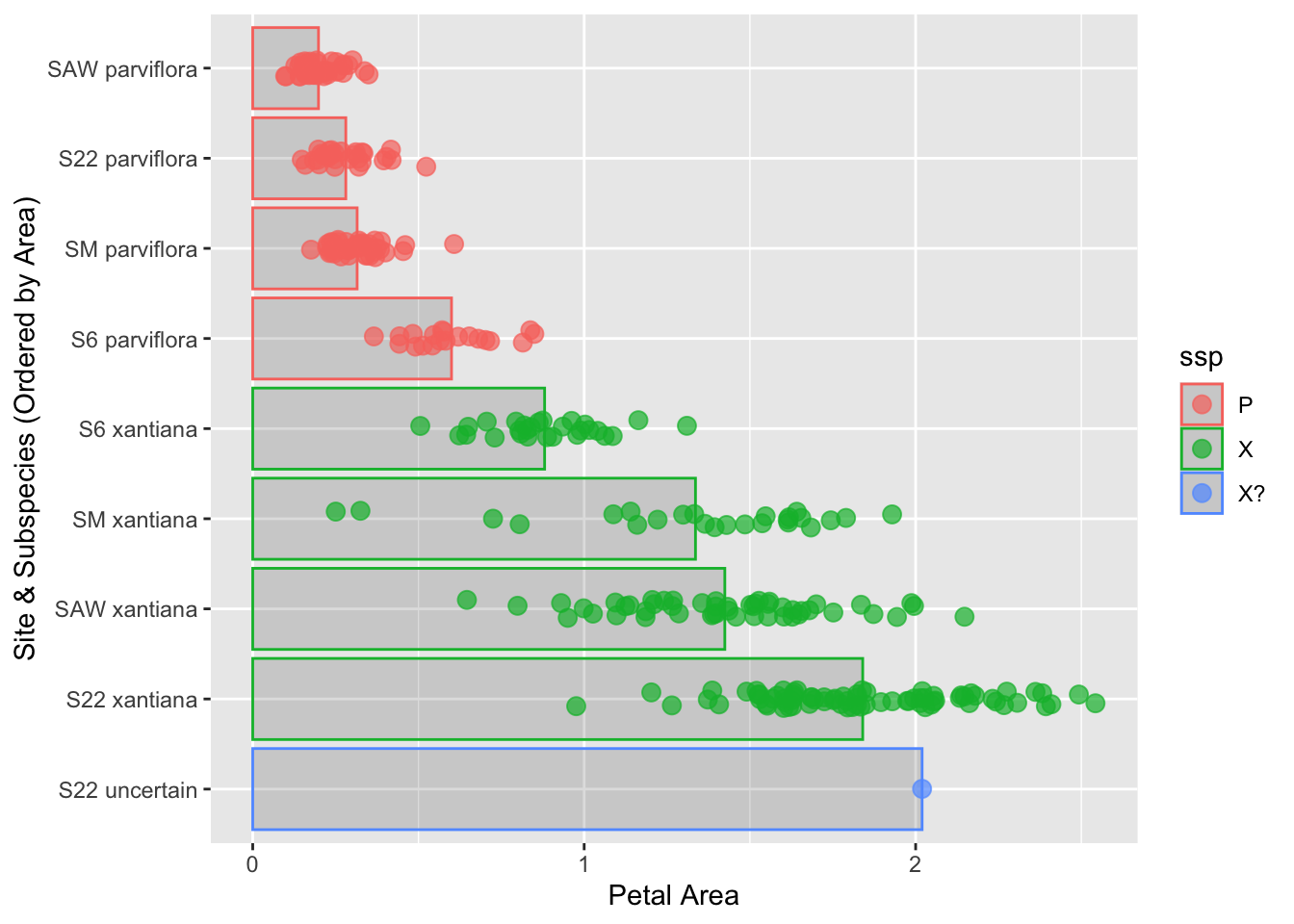
We can use fct_reorder() to reorder categories by the area of some variable. Below, I include the code to reoder from smallest to largest petal area. To get better with this approach, try the following challenges:
Reorder from biggest to smallest petal area by including .desc = TRUE in fct_reorder().
Note: Due to space considerations, this plot does not include all the best practices from above. Feel free to add them!
To reorder the categories from the largest mean petal area to the smallest, we use fct_reorder() and set the .desc = TRUE argument. This flips the default ascending order.
library(dplyr)library(forcats)library(ggplot2)# Reorder site_ssp by area, in descending orderhz_phenos <- hz_phenos |>filter(!is.na(area))|>mutate(site_ssp =fct_reorder(site_ssp, area, .desc =TRUE,.na_rm =TRUE))# Plot the reordered dataggplot(hz_phenos, aes(x = area, y = site_ssp, color = ssp)) +stat_summary(fun ="mean", geom ="bar", alpha =0.2) +geom_jitter(width =0.0, height =0.1, size =3, alpha =0.7) +labs(y ="Site & Subspecies (Ordered by Area)", x ="Petal Area")
Figure 11: A plot showing site and subspecies combinations ordered by mean petal area, from largest (bottom) to smallest (top).
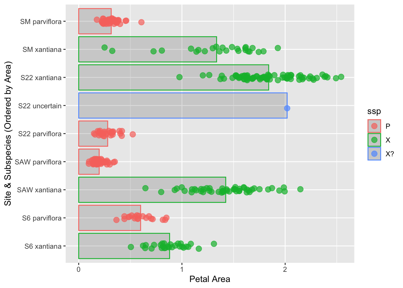
To reorder by longitude, let’s put that variable in!
library(dplyr)library(forcats)library(ggplot2)# Reorder site_ssp by area, in descending orderhz_phenos <- hz_phenos |>mutate(site_ssp =fct_reorder(site_ssp, lon))# Plot the reordered dataggplot(hz_phenos, aes(x = area,y = site_ssp, color = ssp)) +stat_summary(fun ="mean", geom ="bar", alpha =0.2) +geom_jitter(width =0.0, height =0.1, size =3, alpha =0.7) +labs(y ="Site & Subspecies (Ordered by Area)", x ="Petal Area")
Figure 12: A plot showing site and subspecies combinations ordered by mean longitude, from smallest (bottom) to largest (top).
We can order by more than one thing with fct_reorder2(). Below I order, first by longitude and then by subspecies, but strangely to do so, we type ssp first and then lon.
Challenge: Change the code order first by subspecies and then by longitude..
To reorder by subspecies and the longitude, try fct_reorder2(site_ssp, lon, ssp).
library(dplyr)library(forcats)library(ggplot2)# Reorder site_ssp by subspecies and then by longitude.hz_phenos <- hz_phenos |>mutate(site_ssp =fct_reorder2(site_ssp, lon, ssp))# PLOT **Don't change this** ggplot(hz_phenos, aes(x = area, y = site_ssp, color = ssp)) +stat_summary(fun ="mean", geom ="bar", alpha =0.2) +geom_jitter(width =0.0, height =0.1, size =3, alpha =0.7)
Figure 13: A plot showing site and subspecies combinations ordered by subspecies and the mean longitude.
Summary Improving a Plot
We’ve come a long way from that first “heinous” plot! Let’s take a moment to appreciate the journey. We started with a plot that was confusing and basically unreadable. Step-by-step, we identified problems and applied targeted fixes:
We made labels readable by flipping the axes.
We made them informative by replacing shorthand with clear names.
We controlled the jitter to present the data’s position honestly.
We added summary bars and error bars to guide the reader’s eye to the key patterns.
We reordered the categories to make the comparison between groups clear and intuitive.
The big takeaway is that making a great explanatory plot is an iterative process. You don’t have to get it perfect on the first try. The key is to critically look at your plot, identify what’s confusing or unclear, and then use the tools at your disposal to fix it. Our final plot isn’t just “prettier”, it’s more honest, more informative, and a clearer story.
Bonus: Explore Alternative Visualizations
It’s always worthwhile to consider alternative visualizations of the same dataset to see which best reveals the key patterns in the data. I usually do this earlier in the figure-making process, but better late than never!
Here, let’s use “small multiples” - a series of small plots that use the same scales and axes to explore two additional approaches to gaining insight from these data. In my view both of these represent improvements over their analogues in the previous plots because the facets separate the data to clearly highlight specific comparisons of interest.
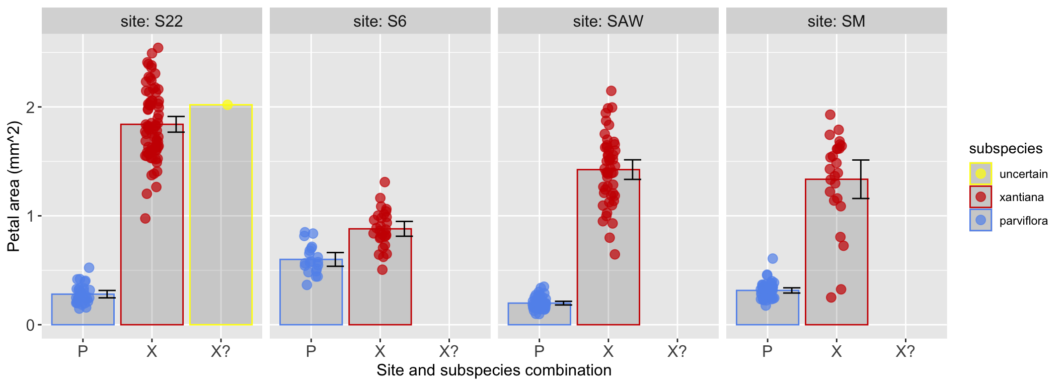
OPTION 1 Facet by site
The plot below “facets” data by site. I really like Figure 14 because it allows us to visually compare the petal area of different subspecies when they are found at the same site. This makes it easy to see that the difference in petal area between subspecies is largest at “Site 22” and smallest at “Site 6”.
ggplot(hz_phenos, aes(x = ssp, y = area, color = ssp)) +stat_summary(fun ="mean", geom ="bar", alpha =0.2) +geom_jitter(width =0.1, height =0.0, size =3, alpha =0.7) +stat_summary(fun.data ="mean_cl_normal", geom ="errorbar", color ="black", width =0.25, position =position_nudge(x = .35, y=0))+labs(y ="Petal area (mm^2)", x ="Site and subspecies combination", color ="subspecies")+facet_wrap(~site, nrow =1, labeller ="label_both")+scale_color_manual(values =c("yellow", "red3", "cornflowerblue"),breaks =c("X?", "X", "P"), labels =c("uncertain", "xantiana", "parviflora"))+theme(axis.text =element_text(size =12), axis.title =element_text(size =12),strip.text =element_text(size =12))
Figure 14: A faceted plot showing the petal area of each subspecies, broken down by site. Each panel represents a different field site, allowing for a direct comparison of subspecies within that site. This highlights the differences in petal area between subspecies across sites.
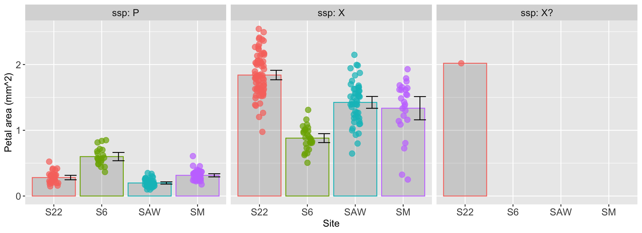
OPTION 2 Facet by subspecies
The plot below “facets” data by subspecies. I really like Figure 15 because it allows us to visually compare how the petal area for a given subspecies changes across sites. This makes it easy to see that, for example, parviflora plants have their largest petals at Site 6, while xantiana plants have their largest at Site 22 and smallest at Site 6.
ggplot(hz_phenos, aes(x = site, y = area, color = site)) +stat_summary(fun ="mean", geom ="bar", alpha =0.2) +geom_jitter(width =0.1, height =0.0, size =3, alpha =0.7) +stat_summary(fun.data ="mean_cl_normal", geom ="errorbar", color ="black", width =0.25, position =position_nudge(x = .35, y=0))+labs(y ="Petal area (mm^2)", x ="Site and subspecies combination", color ="subspecies")+facet_wrap(~ssp, nrow =1, labeller ="label_both")+theme(axis.text =element_text(size =12), axis.title =element_text(size =12),strip.text =element_text(size =12),legend.position ="none")
Figure 15: A faceted plot comparing petal area across sites, with each panel dedicated to a single subspecies. This view makes it easy to assess how the petal area of a specific subspecies changes from one geographic site to another.
BONUS: Direct labeling
Sometimes, a legend can feel like a detour for your reader’s eyes. Forcing them to look back and forth between the data and the key adds cognitive load. A great alternative is direct labeling, where you place labels right next to the data they describe.
There are two main tools for this in ggplot2:
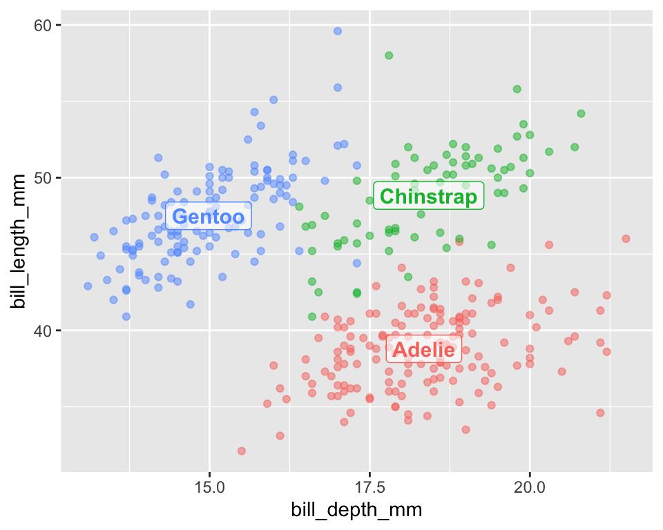
Method 1: The “ggplot Way” with geom_label(): This approach uses the same aes() aesthetic mapping you’re already familiar with. You can map variables from your data to the label, x, and y aesthetics. It’s best when the position of your label depends on the data itself (e.g., placing a label at the mean of a group).
In the example below, we calculate the mean position for each penguin species on the fly and use that to place the labels.
ggplot(penguins, aes(x = bill_depth_mm, y = bill_length_mm, color = species)) +geom_point(alpha =0.5) +# Add labels using a summarized data framegeom_label(data = penguins |>group_by(species) |>summarise_at(c("bill_depth_mm", "bill_length_mm"), mean, na.rm =TRUE),aes(label = species), fontface ="bold", size =4, alpha=.6) +# Remove the redundant legendtheme(legend.position ="none")
Figure 16: A scatter plot of penguin bill dimensions that uses direct labeling. The geom_label() layer calculates the mean position for each species and places the label directly on the plot, making it easier to identify the groups without a legend.
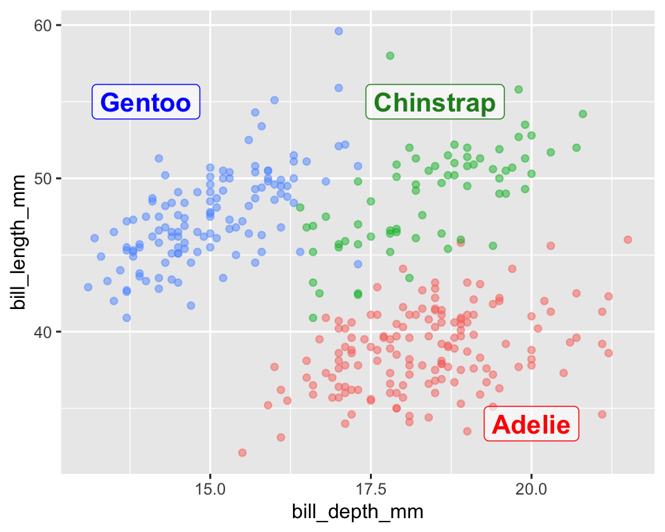
The annotate() function is for adding “one-off” plot elements. It does not use aesthetic mappings. Instead, you give it the exact coordinates and attributes for the thing you want to add.
This gives you precise control over label placement, but it comes at a price: it’s not linked to your data and won’t update automatically. It’s best for adding a single title, an arrow, or manually placing a few labels where the position is fixed. I often choose this at the very last step of making an explanatory plot when there is a specific space I can see is best for such labels.
ggplot(penguins, aes(x = bill_depth_mm, y = bill_length_mm, color = species)) +geom_point(alpha =0.5) +# Add labels using a summarized data frameannotate(geom ="label", label =c("Gentoo", "Chinstrap", "Adelie"), x =c(14, 18.5,20), y =c(55,55,34), color =c("blue","forestgreen","red"), fontface ="bold", size =5, alpha=.6)+theme(legend.position ="none")
Figure 17: This plot demonstrates direct labeling using the annotate() function. This method provides precise control by requiring the user to manually specify the exact coordinates, text, and color for each label, independent of the data mapping.