• 13. P Values
Motivating Scenario: You understand the null hypothesis and the sampling distribution, and you’ve heard of a p-value. Now you’re ready to understand what this means!
Learning Goals: By the end of this section, you should be able to:
- Understand the idea of a “test statistic”
- And why we calculate one.
- Understand that a null sampling distribution is a histogram of test statistics generated under the null hypothesis.
- And understand why the “null hypothesis must be specific”.
- Correctly present, explain, and interpret p-values.
- And know how to compute them from a test statistic and a null sampling distribution.
NOTE: We will not learn how to generate the null sampling distribution yet. But as with bootstrapping we can use brute force computation (the next chapter), math tricks, (Section IV of the book), or simulation.
In null hypothesis significance testing we ask how unusual our observation would be if it came from the null model. To do this we must
Decide on a single value (known as the test statistic) that summarizes our observation.
Find the sampling distribution of this test statistic under the null model.
Compare the observed value of this test statistic to its sampling distribution under the null.
Summarize how “unusual” or “surprising” our observation would be if it was in fact generated by the null model.
In this subsection we work through this!
The Test Statistic
When we get into doing stats with math tricks, we will run into set of test statistics that you may have heard of already (e.g. t, F, \(\chi^2\), Z etc.) But, using computational tools allows us to come up with whatever test statistic we deem most appropriate. For example, in our motivating example about setting at least one hybrid seed, we are comparing two proportions (the proportion of pink-flowered plants with at least one hybrid and the proportion of white-flowered plants with at least one hybrid). Let’s summarize that as the difference in proportions, and have this be our test statistic.
The Sampling Distribution Under the Null
Because the null model is specific, we can generate the expected distribution of the test statistic by creating a sampling distribution from the null model. For now, I will provide you with sampling distributions of test statistics under the null. Later, we’ll learn more about how to generate these distributions ourselves.
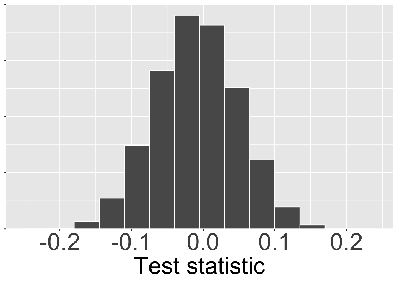
We can visualize the sampling distribution under the null as a histogram, just like any other sampling distribution (Figure 1).
Comparing Observation to the Null
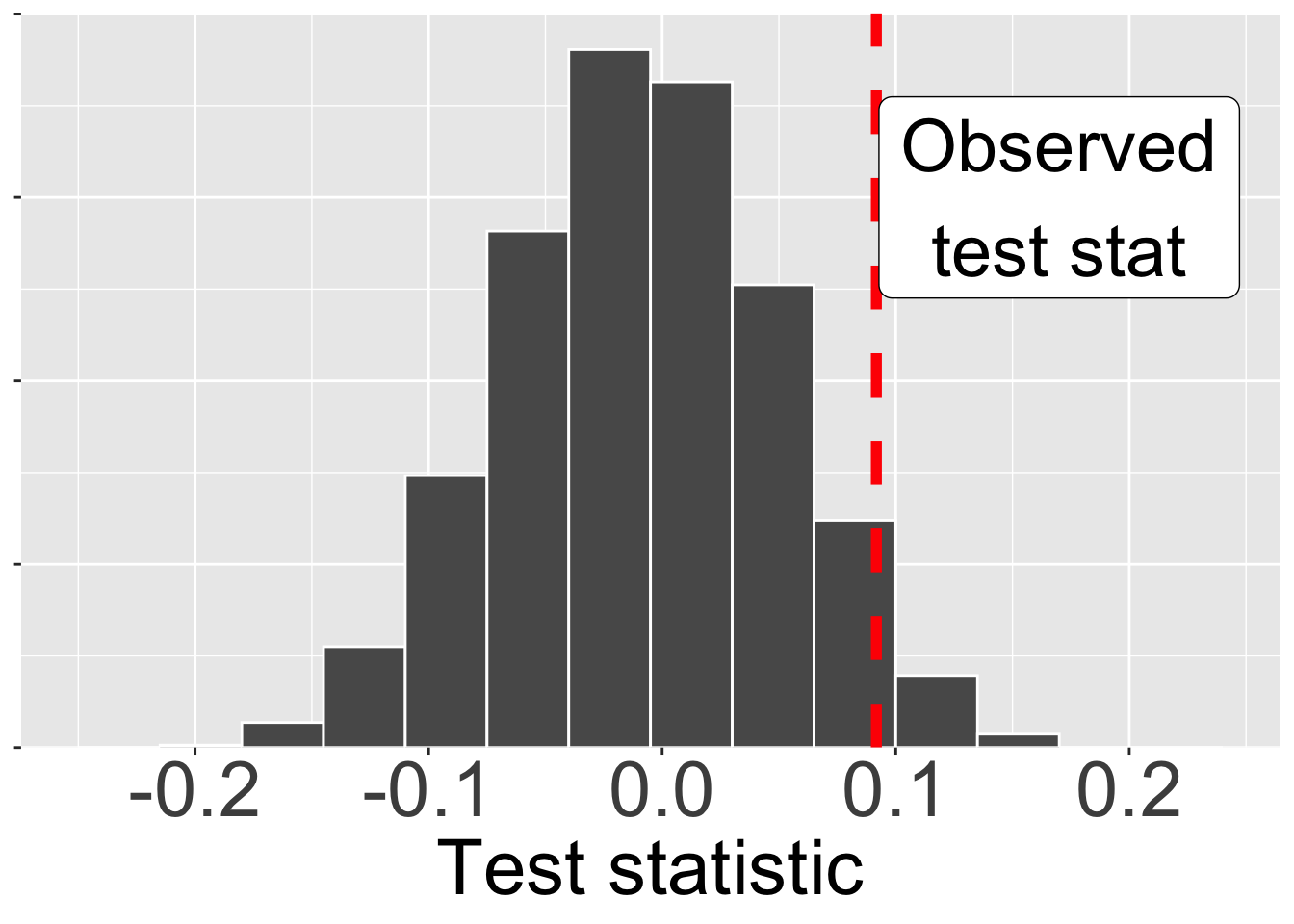
Next, we compare our actual test statistic to its sampling distribution under the null hypothesis (Figure 2). Recall that we found that 9 of the 56 pink-petaled RIL and 4 of the 58 white-petaled RILs set at least one hybrid seed. SO our test statistic is \(\frac{9}{56}- \frac{4}{58}= 0.0917\)
Summarizing surprise as a P-value
The observed test statistic shown in figure @fig-null2 is a bit right of the mode of the null sampling distribution – it’s not the most common value the null would generate, but it (to my eye at least) not shocking.
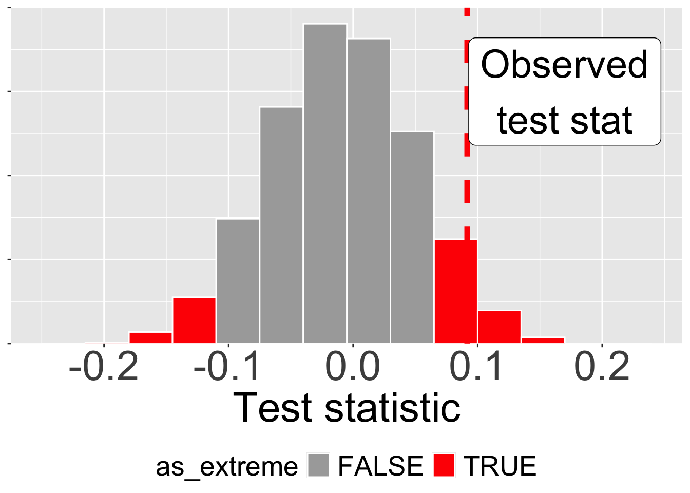
We use the P-value to quantify how surprising it would be to observe a test statistic as extreme (or more extreme) under the null model. To calculate the P-value, we sum (or integrate) the area under the curve from our observation outward to the tails of the distribution. Since we are equally surprised by extreme values on both the lower (left) and upper (right) tails, we typically sum the extremes on both sides.
In Figure 3, we sum the areas as or more extreme than our observation on both the lower and upper tails. Because (roughly) 0.108 of the distribution larger than 0.0917 and roughly 0.041 of the distribution is less than -0.0917, our P-value is 0.108 + 0.041 = 0.149. This means that if there were truly no difference between the groups (the null hypothesis was true), we’d get a test statistic this extreme or more extreme in about 14.9% of experiments in which pink and white did not differ due to sampling alone.
If you have read carefully you may have noticed that the area to be more extreme on the left is not the same as the area to be more extreme on the right. You might expect these two tail areas to be identical (and they usually are), but in this example it is not. Here, the unevenness of sample sizes of pink and white flowered parviflora RILs leads to an asymmetric null sampling distribution.
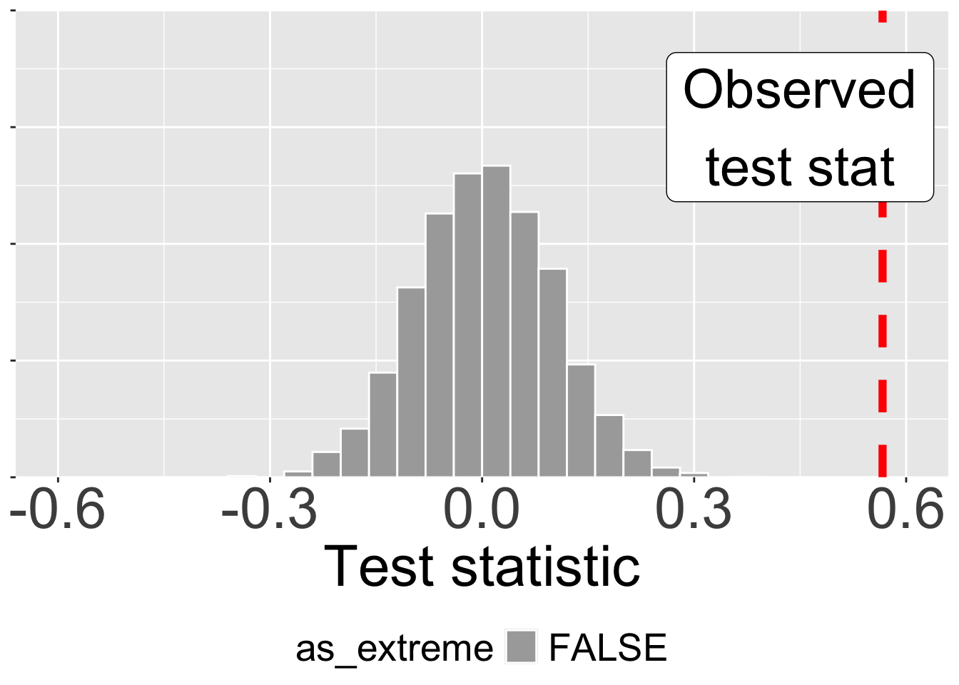
Let’s contrast this observation with what we see at site GC where 35 of 50 pink flowered plants and 6 of 45 white flowered plants set at least one hybrid seed. Our test statistic equals \(\frac{35}{50} - \frac{6}{45} = 0.567\). Figure 4 shows that the null model almost never generates a test statistic as extreme as we see in our data. This p-value would therefore be pretty close to zero (p < 0.001). This means we would be quite shocked to see such a result come from the null model of no associateion between petal color and setting hybrid seed.