10. Better Figures in R
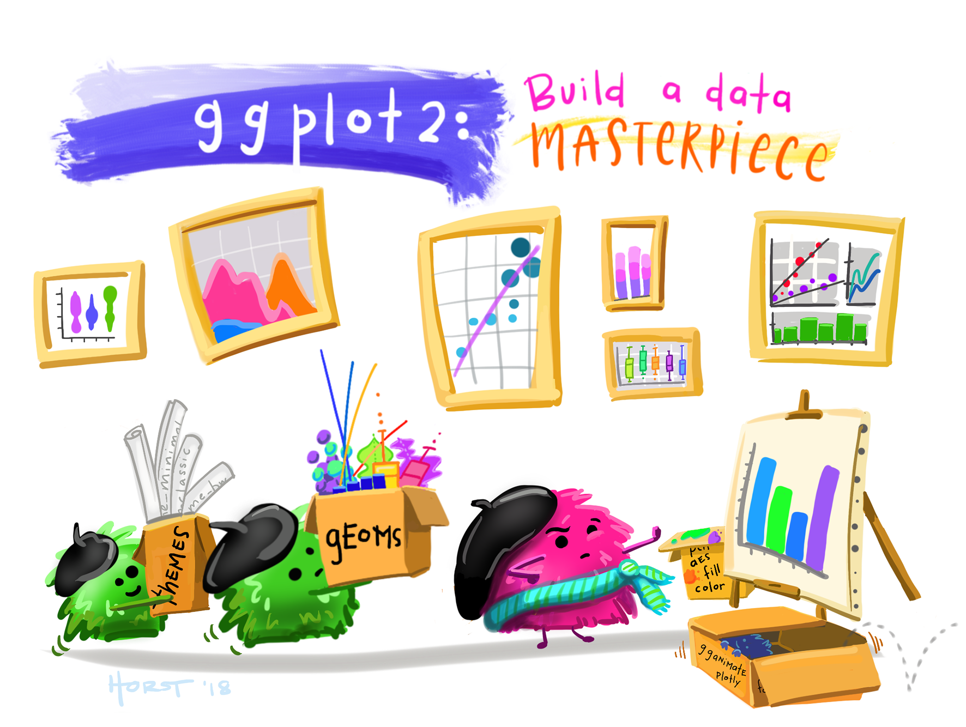
@allison_horst CC-BY.Creating Engaging, Attractive Plots in R
You’ve already been introduced to the basics of ggplot and explored the key elements that make for effective figures. But at this point, you might be feeling a bit frustrated. You know how to generate plots in R, and you understand what makes a plot good, yet creating polished, impactful visuals in R still seems challenging. My advice is threefold:
Start with the right plot for your data. For most exploratory plots—which will make up about 95% of what you create—this is key. Often, a well-chosen plot paired with a couple of quick R tricks can make your visuals clear and informative.
This chapter is here to guide you through the rest. For more advanced plotting and customization, take a look at these excellent resources: The R Graphics Cookbook (Chang, 2020), ggplot2: Elegant Graphics for Data Analysis (Wickham, 2016), Data Visualization: A Practical Introduction (Healy, 2018), and Modern Data Visualization with R (Kabacoff, 2024).
| Data Type | Suggested Plot(s) | Likely geom | What It Shows |
|---|---|---|---|
| One numeric variable | Histogram, Density plot | geom_histogram, geom_density |
Distribution shape, spread, skew, outliers |
| One categorical + one numeric variable | Boxplot, Violin plot, Sina plot | geom_boxplot, geom_violin, geom_sina |
Group comparisons, spread, outliers |
| Two numeric variables | Scatterplot | geom_point + geom_smooth |
Trends, clusters, correlation, outliers |
| Categorical counts or proportions | Bar plot, Stacked bar plot, Mosaic plot | geom_bar, geom_col, geom_mosaic |
Frequencies, relative proportions |
| Time series (numeric over time) | Line plot | geom_line |
Trends over time |
Review: What Makes a Good Plot
- Good plots tell the story of the data.
- Good plots are tailored to the audience and the method of presentation.
- Good plots are Honest, Transparent, Clear, and Accessible.
We’ll explore these concepts in this chapter, with a particular focus on creating honest, transparent, and clear plots, as this is where R offers the most opportunities for customization.
Review: Avoiding data viz time sinks
Making and critiquing plots is one of my favorite parts of science — I absolutely love it! However, I know it can be a major time sink, and we want to avoid that. We already discussed this once.
Here are my tips for preventing yourself from getting bogged down by every figure:
- Know your goal: Determine whether you’re creating an exploratory or explanatory figure. Don’t waste time perfecting an exploratory plot — it is meant for quick insights, not for publication.
- Standardize your process: Develop a few go-to themes and color schemes that you use frequently. Save and reuse these templates so you can produce attractive plots without customizing each one from scratch.
- Master the basics: Get comfortable with the most common tasks you’ll perform in
ggplot2. Keep the ggplot cheat sheet handy, and bookmark additional resources that suit your workflow. - Premature optimization is the root of all evil: Save detailed customizations (e.g., annotations, special formatting) for last. This way, you can focus on the essential elements of the plot first without getting bogged down in complex code prematurely.
- Get help: Reach out to friends, use Google, consult books, or turn to Generative AI and other resources to solve problems quickly. Remember, the more specific your question, the better the help you’ll receive!
What’s ahead and how to thrive
In this chapter, we’ll tackle the challenge of creating great plots by breaking it down into three key parts.
First, in Tools for BetteR Plots, we’ll build a problem-solving toolkit. You’ll learn how to find answers, use help files, and leverage modern resources to help you make the plots you want to make.
Next, in Making cleaR Plots, we’ll put that toolkit to use in a detailed, step-by-step ‘makeover’ of a messy plot, transforming it into a clear, publication-ready figure.
Finally, in Plots for the Medium, we’ll learn how to adapt our visualizations for specific contexts like scientific papers, talks, and posters, because a great plot is always tailored to its audience.
Ass usual, we conclude with a chapter summary.