| chosen | 1 | 2 | 3 | 4 | 5 | 6 | 7 | 8 | 9 | 10 |
|---|---|---|---|---|---|---|---|---|---|---|
| expected | 4.1 | 4.1 | 4.1 | 4.1 | 4.1 | 4.1 | 4.1 | 4.1 | 4.1 | 4.1 |
| observed | 1.0 | 4.0 | 6.0 | 3.0 | 3.0 | 8.0 | 7.0 | 3.0 | 3.0 | 3.0 |
• 14B. \(\chi^2\) distribution
Motivating scenario: I dont wanna permute!
Learning goals: By the end of this chapter you should be able to:
Use pchisq() to find p-values for observed χ² statistics with appropriate degrees of freedom.
Use
chisq.test()to run chi-square goodness-of-fit and contingency tests in R.**Understand the mathematical \(\chi^2\) distribution relates to a permutation based approach, and when you can (or cannot) use this distribution for a \(|chi^2\) test.
There are two reasons why I chose to add this chapter on the \(\chi^2\) tests:
- The \(\chi^2\) statistic is a common tool across the biological sciences, so students are naturally curious about what it means, how to calculate it, and how to interpret it.
- The \(\chi^2\) test has a mathematically derived sampling distribution. This means we can use that distribution—rather than relying on permutation—to test the null hypothesis. This idea is important because the next part of this book relies on analytical tools for null hypothesis significance testing (NHST) and for estimating uncertainty.
Here, I (reassuringly) show that our permutation-based and analytical approaches to NHST for the \(\chi^2\) lead to the same conclusions.
The \(\chi^2\) “Goodness of fit” test
We previously evaluated the null hypothesis that students choose an integer between one and ten at random. To do so, we:
Calculated the expected counts: the number of students we would expect to choose each number if choices were truly random. Since we had 41 observations for 10 categories with a null of “each is equally likely”, our expectation was 4.1 for each category (above).
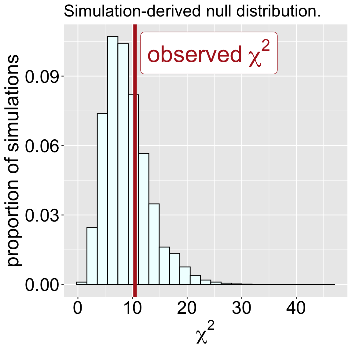
Computed the \(\chi^2\) statistic as the sum of squared differences between observed and expected counts, divided by the expected count. In this case this equalled 10.46.
Simulated the null distribution by repeatedly generating random choices and calculating the resulting \(\chi^2\) values (Figure 1)
Compared our observed \(\chi^2\) to this simulated null distribution to obtain a p-value and conduct a null hypothesis significance test (NHST). Approximately 29.4% of our null simulation-based \(\chi^2\) values were greater than or equal to our observed value of 10.46. Because the \(\chi^2\) encompasses all types of deviations from null expectations, this is one-tailed test. Our p-value is 0.294, and we fail to reject the null hypothesis.
library(dplyr)
chi2_per_sample |>
  mutate(as_or_more_extreme = chi2 >= 10.462)|>
  summarise(p.val = mean(as_or_more_extreme))
# A tibble: 1 × 1
p.val
<dbl>
1 0.329No need to simulate!
The null distribution of the \(\chi^2\) test-statistic is known! This means we already have a null sampling distribution, so we could have skipped simulation. To use this null you simply need to know the “degrees of freedom” – the number of values you must know before you can guess the rest. The degrees of freedom for a goodness of fit test is the number of categories minus one. Once we have that number (in this case, 9) we can use the pchisq() in R to find the p value (Make sure to only consider the upper tail of the \(\chi^2\) distribution).
Degrees of freedom for a \(\chi^2\) “goodness of fit” test equals the number of categories minus one.
pchisq(q = 10.462, lower.tail = FALSE, df = 9)[1] 0.3143933Not only are these p-values basically identical, but the sampling distributions are (more or less) the same (Figure 2).
Code
library(patchwork)


chi2_per_sample<- read_csv( "../../data/chi2_for_sim.csv")

plot_a <- ggplot(chi2_per_sample, aes(x = chi2))+
  geom_histogram(color = "black", bins = 25, aes(y = ..density..), fill = "azure1")+
  theme(axis.text = element_text(size = 16), axis.title = element_text(size = 18),
      title = element_text(size =16))+
  labs(x = expression(chi^2), y ="probability", title = expression(chi^2~~~df==9) )+
 stat_function(fun = dchisq, args = list(df = 9), color = "red", linewidth =2,alpha = .4)


plot_b <- chi2_per_sample|>arrange(chi2)|>
    mutate(pval = rank(-chi2) / max(rank(-chi2)))|>
    ggplot(aes(x = chi2, y= pval))+
    labs(x = expression(chi^2), y ="p-value", title = expression(chi^2~~~df==9) )+
    geom_line(size = 1.5)+
geom_line(data = tibble(chi2 = seq(0,46,.01), pval = pchisq(chi2,9,lower.tail = FALSE)), color = "red", alpha = .3,linewidth = 3.5)+
  theme(axis.text = element_text(size = 16), axis.title = element_text(size = 18),
      title = element_text(size =16))

plot_a +plot_b+plot_annotation(tag_levels = "A")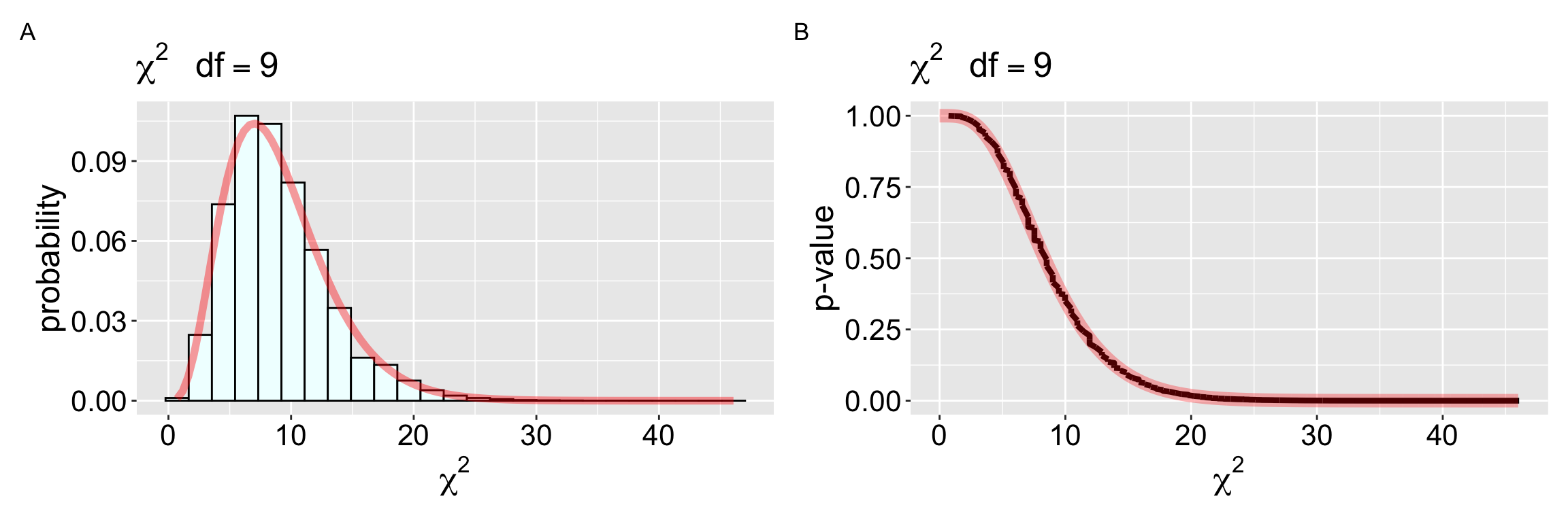
No need to calculate!
But wait, it gets even easier. We don’t even need to calculate \(\chi^2\), just give it our observations and the expected proportions and R will find our \(\chi^2\) value, the degrees of freedom, and the associated p-value!
In our case, the expected proportions were all the same, so we actually didn’t even need to type them. But some cases (e.g. if you’re testing to see if data meet Hardy Weinberg expectations) the proportion of expected observations differs for each category.
number_data<- tibble(number = 1:10,
                    times_picked= c(1,4,6,3,3,8,7,3,3,3),
                    expected_proportion = c(0.1, 0.1, 0.1, 0.1, 0.1, 0.1, 0.1, 0.1, 0.1, 0.1))

chisq.test(x = pull(number_data, times_picked),
           p=  pull(number_data, expected_proportion))
    Chi-squared test for given probabilities

data:  pull(number_data, times_picked)
X-squared = 10.463, df = 9, p-value = 0.3143
The \(\chi^2\) “contingency” test
| visited | pink | white |
|---|---|---|
| FALSE | 1 | 11 |
| TRUE | 52 | 39 |
We also used a simulation approach (in this case a permutation) to test the null hypothesis that two categorical variables are independent. We used the relationship between petal color and if a flower was visited from our RIL data from Sawmill Road for that example. As above, we calculated the \(\chi^2\) values from expectations and simulated to generate the null distribution, which in this case, equaled 10.11. We then compared this to the null distribution (obtained by permutation) and rejected the null (\(p \approx 0.0017\)).
As above, we skip permutation and just compare our observed \(\chi^2\) value directly to the theoretical \(\chi^2\) distribution (we just need to know the degrees of freedom). A 2×2 contingency table has just one degree of freedom because, once we know the overall proportions of pink flowers and of those receiving visits (needed to calculate expectations), we just need to know the value in one cell to correctly guess the rest.
While the \(\chi^2\) example provided here considered binary outcomes, the \(\chi^2\) contingency tests can be applied to categories with any number of levels. More broadly, the degrees of freedom for a \(chi^2\) contingency test equals (the number of rows - 1) \(\times\) (the number of columns - 1).
So we can again use the pchisq() function to find the p value, being sure to set lower.tail = FALSE. Reassuringly, the permutation-based and analytically derived p-values align closely.
pchisq(10.11, df = 1, lower.tail = FALSE)[1] 0.00147467Comparing the p-values for specific (attainable) \(\chi^2\) values in this study (Figure 3), we see that the null sampling distributions for the permutation and mathematical approaches are nearly identical.
Code
all_perms_table_chi2 <- read_csv( "../../data/chi2_for_perm.csv")


all_perms_table_chi2|>arrange(chi2)|>
    mutate(pval = rank(-chi2) / max(rank(-chi2)))|>
    ggplot(aes(x = chi2, y= pval))+
    labs(x = expression(chi^2), y ="p-value", title = expression(chi^2~~~df==1) )+
  geom_step(size = 1, lty =2, alpha = .5)+
    geom_point(size =4)+
geom_line(data = tibble(chi2 = seq(0,11,.01), pval = pchisq(chi2,1,lower.tail = FALSE)), color = "red", alpha = .3,linewidth = 3.5)+
  theme(axis.text = element_text(size = 16), axis.title = element_text(size = 18),
      title = element_text(size =16))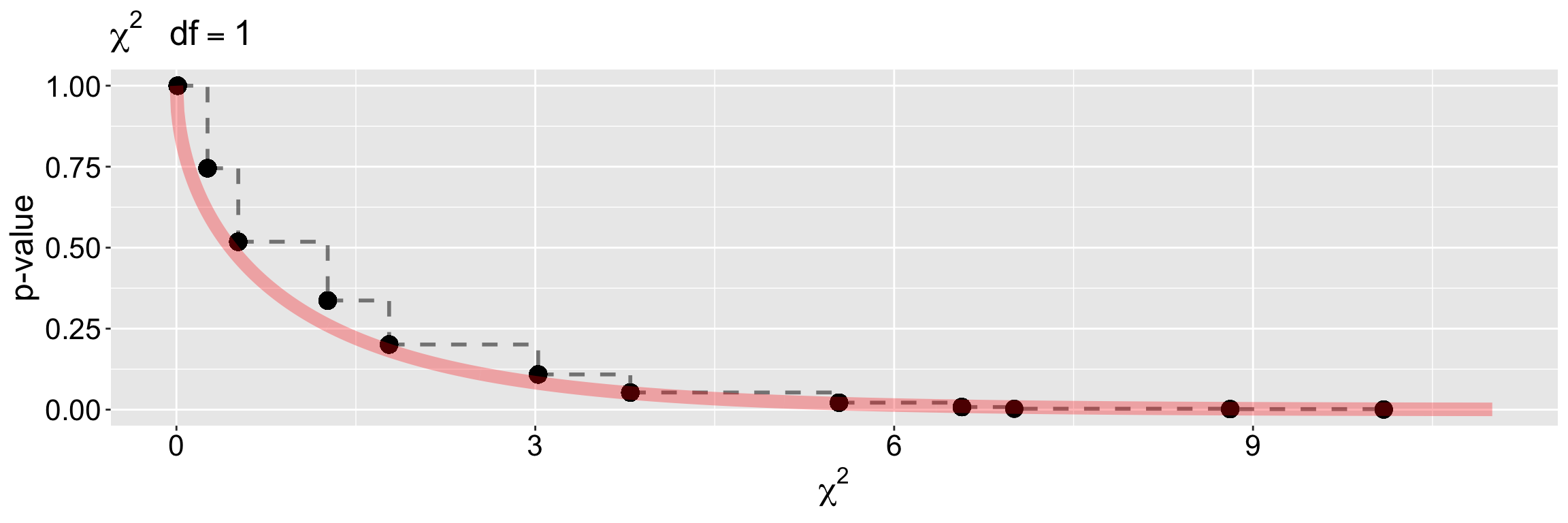
THINK”: Both our \(\chi2\) values were approximately 10. Why did we comfortably reject the null in this case and fail to reject it in the other?
The answer is because they have different degrees of freedom!
Assumptions of the \(\chi^2\) test
The \(\chi^2\) test (based on its mathematical distribution) make a set of standard assumptions (i.e. random and independent sampling in each group) shared with permutation-based tests. Additionally, the \(\chi^2\) test assumes
- All categories have an expected count greater than one, and
- No more than 20% of categories have an expected count of less than five.
The “sawtoothed” nature of Figure 3 hints at the basis for these assumptions. Once the expected counts become small, there are only a limited number of distinct ways to rearrange observations among categories. This discreteness leads to a step-like sampling distribution, rather than the smooth curve predicted by the continuous \(\chi^2\) approximation. When expected counts are too low, the approximation breaks down. Not to worry,… you can always permute 😉.