library(datasauRus); library(ggplot2); library(dplyr)
summary_stats <- datasaurus_dozen                      |>
  group_by(dataset)                                    |>
  summarize(mean_x =  mean(x),   mean_y = mean(y),
            stdev_x = sd(x),     stdev_y = sd(y),
cor_xy = cor(x, y)) 9. Better Figures
Motivating Scenario: You’re thinking about how to communicate your results effectively through figures, or you’re concerned that someone may be misleading you with their figures.
Learning Goals: By the end of this chapter, you should be able to:
- Explain the principles behind creating an effective figure and identify the specific elements that contribute to it.
- Critique figures to recognize when and how they may be manipulated.
“Letting the data speak for themselves … is, of course, absurd: inanimate data can never speak for themselves, and we always bring to bear some conceptual framework, either intuitive and ill-formed, or tightly and formally structured, to the task of investigation, analysis, and interpretation.” Peter Gould (1981).
To make these abstract ideas concrete, lets return to our parviflora RILs. A quick glance suggests that the probability of setting hybrid seed goes up as leaf water content goes down. While this observation is true, it is not the real story – the real story is that parviflora RILs with smaller petals make fewer hybrids. The initial observation is a red herring that arises because of the negative assocaition between leaf water content and petal area.
Why Make a Plot?
It’s nearly impossible to look at raw numbers in a dataset and come away with a holistic understanding. Communicating results by listing numbers is inefficient and overwhelming. While summaries of single variables, associations between variables can efficiently convey certain aspects of your data, they often hide important details. On their own, summary statistics can mislead, overlook critical patterns, and fail to provide readers with an intuitive way to evaluate your claims.
A good plot is more than a condensed and efficient presentation of the data. Rather, making a plot is literally our opportunity to shape how the reader sees the data, and is therefore a critical medium by which we tell our scientific story. Because a plot is a crafted story with a purpose, we must think about this as we build our plots. Ask yourself:
Graphs exist to communicate clear points. Together, a set of plots should form a cohesive narrative. When creating an explanatory plot, ask yourself:
- What’s the key story that the data are telling?
- What point am I trying to make?
- How does this plot support that story?
- Can someone skeptical follow and verify it?
- How can a plot be improved to clearly communicate this message?
- How does this point fit into the larger story I want to tell?
As we work through this checklist, consider that at the extremes there are two types of plots.
- Exploratory plots are plots we make to make sense of the story in the data.
- Explanatory plots tell this story to a broader audience.
Why Make Exploratory Plots?
The first principle is that you must not fool yourself – and you are the easiest person to fool.
Before telling a story, we must know the story we aim to tell. This includes understanding the overall message we aim to convey, recognizing the extent to which the data support this message, and not missing key elements of the data. As an example of the importance of looking at our data, lets look into datasaurus a more elaborate version of Anscombe’s quartet.
The plots below highlight the importance of looking at your data.
After exploring these data, answer the following questions:
Which dataset has no y values between 45 and 55?
Which shape is made by one of the datasets in datasaurus?
As see looking at histograms of x and y reveals some differences between the datasets, but examining a scatterplot is truly revealing!
Why make explanatory plots?
An explanatory plot effectively communicates results while giving skeptical readers the chance to evaluate our claims. Plots are such a critical tool in scientific communication that, in many lab meetings, papers are often discussed by focusing on the figures. Crafting a good explanatory plot is much like craft a good story. As you watch the video below, consider how the components of telling a good story can be mapped onto the idea of making a good plot.
Watch this video on what makes a good story, and consider how this applies to storytelling with data visualization.
Example of Telling a Story With Plots:
In basketball, most shots are worth two points, while distant shots beyond the three-point line are worth three points. Around 2008, the NBA began embracing analytics, and analysts discovered that three-point shots provide more value than most two-point shots. As a result, teams shifted their strategy to prioritize three-pointers or high-percentage two-point shots close to the basket (podcast for the curious).
1 A compares shot selection before and after the rise of analytics in the NBA. It demonstrates that before this shift, teams had no obvious trends in shot selection, while afterward, most teams focused on three-pointers and close-range shots. 1 B shows the dramatic rise in three-point attempts from 2006 to the present, providing historical context. Together, they tell the story of the NBA’s analytics revolution.
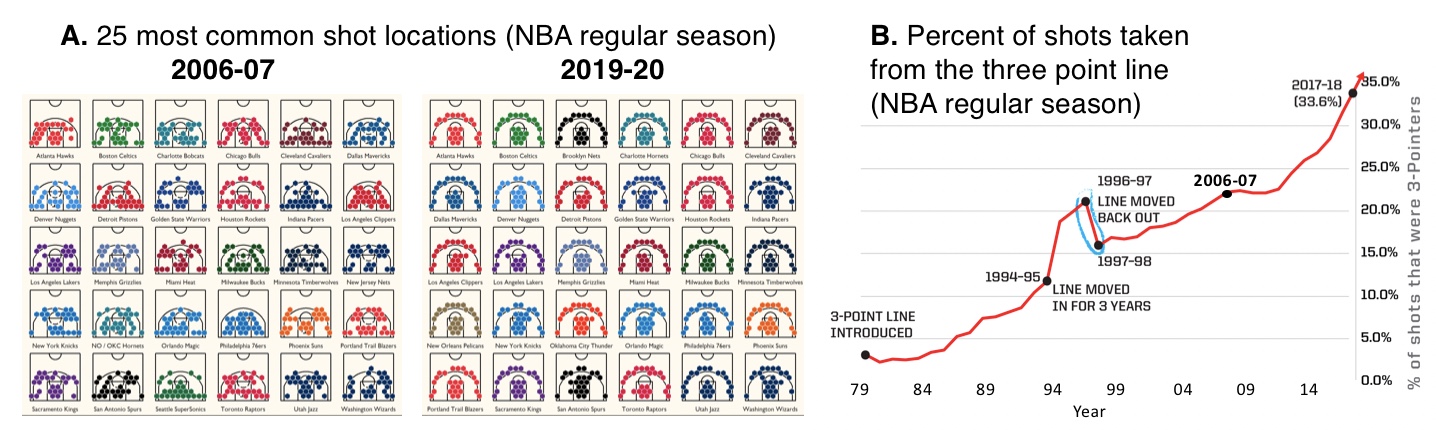
- is not perfect. For example, the team names are too small to read. But fixing this would be unnecessary—the team names don’t significantly contribute to the story we’re telling.
After you create your plot, take a moment to reflect. How well does your figure make its intended point? How could it detract from your message? Then brainstorm ways to improve your plot to more clearly and honestly convey your point.
The Process
Computational tools like ggplot2 are great for making good plots, but remember they are tools to help you, not constrain you. Many experts (and the internet) suggest that before jumping into ggplot, you should first:
My approach to figure-making in #ggplot ALWAYS begins with sketching out what I want the final product to look like. It feels a bit analog but helps me determine which #geom or #theme I need, what arrangement will look best, & what illustrations/images will spice it up. #rstats pic.twitter.com/GUjeEgqZxj
— Shasta E. Webb, PhD (@webbshasta) May 22, 2020
- Sketch your desired plot to conceptualize it.
- Be cautious of defaults and common plots, as they might not always serve your needs.
Creating a good plot is an iterative process. You will likely go back and forth between pencil-and-paper sketches and ggplot until you reach a design you’re happy with.
Let’s jump into key concepts in data viz!
While bad plots can be bad in various ways, all good plots share certain characteristics. Specifically, all good plots are: Honest, Transparent, Clear, Accessible, and avoid distractions. This chapter provide specific practices you can use to make such good plots, and then introduces the idea of understanding your audience and mode of presentation, and how to write about plots. As always, I conclude with a chapter summary.
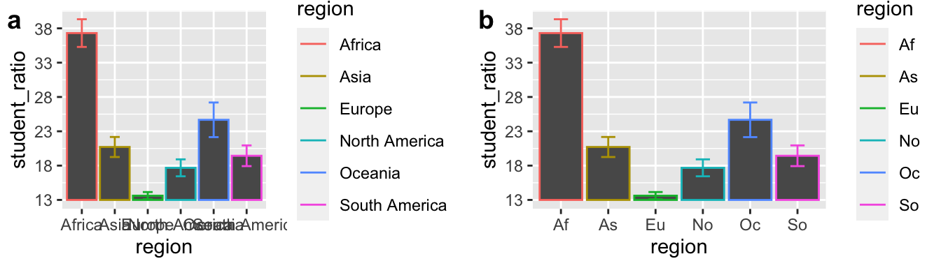
But before moving along, let’s take a break from Clarkia and focus on the distribution of student-to-teacher ratios across continents. We will use Figure 2 to exemplify how we can make good plots.
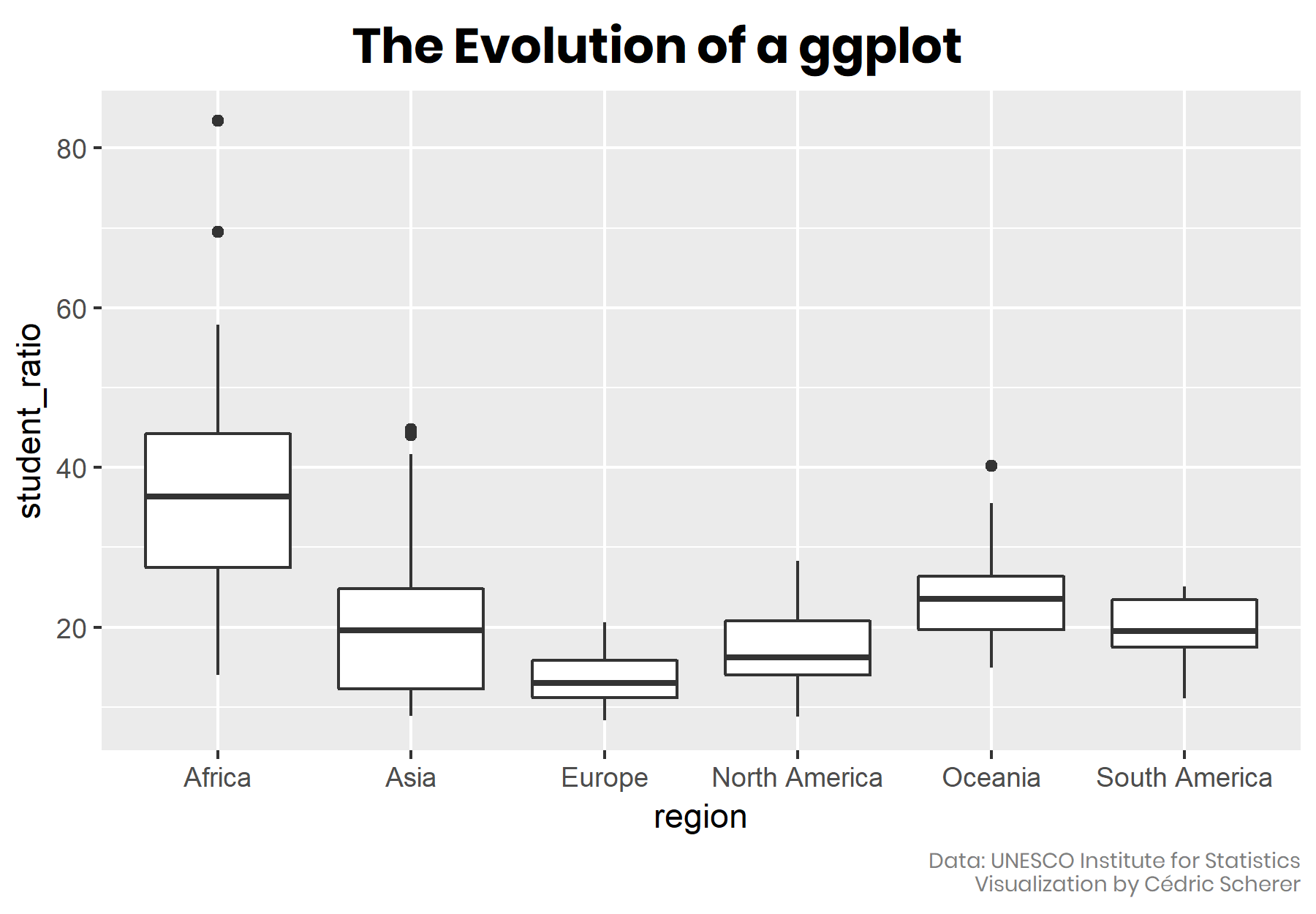
Note that improving a figure is an iterative process, so we slowly get better, and may take some wrong turns along the way. Figure 3 shows one path throght this process.
Looking ahead
There are two distinct challenges to making a good plot goal:
- Understanding the ideas behind making a good plot (this chapter).
- The technical process of creating the plot in R (next chapter).
These are separate tasks. If you focus too early on the mechanics of R, you risk creating poorly designed visuals. Once you have a clear vision of the plot, implementing it in R becomes more straightforward (especially with the help of generative AI tools like ChatGPT, Claude, Gemini etc..)