• 11. Sampling Error
Motivating Scenario:
You’ve collected data and have a sample estimate, and avoided sampling bias, but you know it’s not the whole story. Because of sampling error, your estimate is almost certainly not the exact true value, and a different sample would give a different estimate. You want to know how to think about and quantify such uncertainty?
Learning Goals: By the end of this chapter, you should be able to:
- Define sampling error and explain why it is an unavoidable aspect of working with samples.
- Describe the sampling distribution and explain its role as the foundation for quantifying uncertainty.
- Understand the to most common measure of uncertainty, the standard error.
- Explain how sample size affects sampling error and the precision of estimates.
- Describe the “file drawer problem” and explain why small sample sizes can lead to misleading or overestimated results.
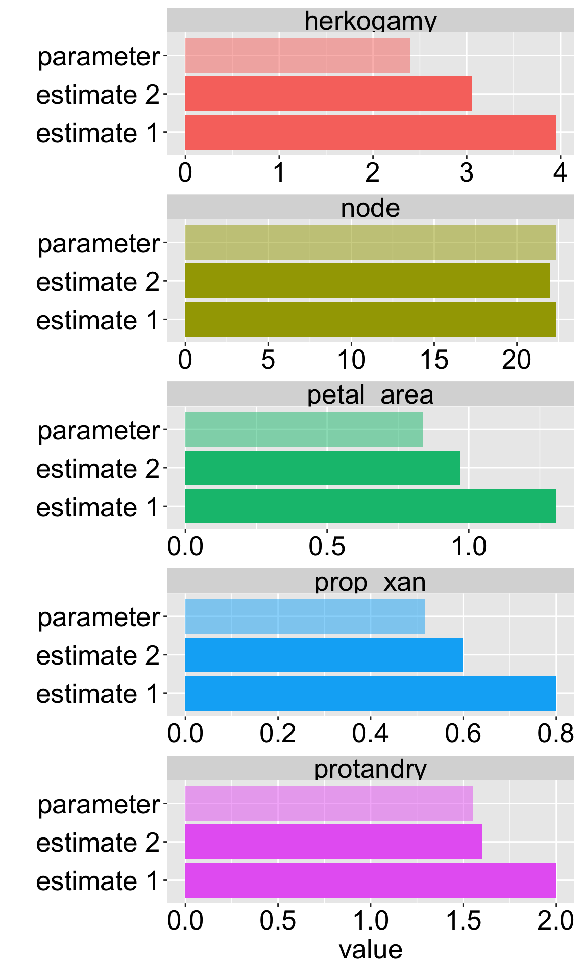
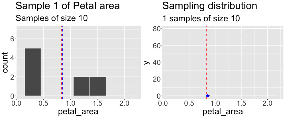
We concluded the previous subsection on sampling by taking a sample from what we pretended was an entire population. We then compared the estimates from this sample to the true parameter. Repeating this exercise (Figure 1) reveals that sample estimates differ not just from population parameters, but also from each other.
The sampling distribution
Grasping the concept of the sampling distribution is critical to understanding our goals this term. It requires imagination and creativity because we almost never have or can create an actual sampling distribution (since we don’t have access to the full population). Instead, we have to imagine what it would look like under some model given our single sample. That is, we recognize that we only have one sample and will not take another, but we can imagine what estimates from another round of sampling might look like. Above we took one sample of size ten from a population. Figure 2 builds the distribution of estimates we would get by repeatedly taking many samples of size ten.
“Insanity is doing the same thing over and over and expecting different results.”
“The sampling distribution is doing the same thing over and over and expecting the different results.”
In case you haven’t noticed, I think that understanding the sampling distribution is fundamental to understanding any bit of statistics. Not only is the sampling distribution key to understanding statistics, but we use sampling distributions often.
First, when we make an estimate from a sample, we build a sampling distribution around this estimate to describe the uncertainty in our estimate (see the upcoming section on Uncertainty).
Second, in null hypothesis significance testing (see the upcoming section on Hypothesis Testing), we compare our statistics to their sampling distribution under the null hypothesis to assess how likely the results were due to sampling error.
Thus, the sampling distribution plays a key role in two of the major goals of statistics — estimation and hypothesis testing. Below, I introduce how we quantify uncertainty in relation to the sampling distribution.
But before doing so, I insist that you watch the first five minutes of the video below for the best explanation of the sampling distribution I’ve come across. I am reiterating this so many ways because it’s important.
Quantifying uncertainty due to sampling error
The most common summary of uncertainty is the standard error.
- The standard error quantifies the expected variability in estimates as the standard deviation of the sampling distribution. If we had a sampling distribution in hand we could find this in R as
sd(my_sampling_dist).
We almost never have a population characterized (after all that’s why we are sampling), so we never know the sampling distribution. In the real world, we use mathematical or computational tricks to guess a sampling distribution given the distribution of values in our sample.
Minimizing sampling error
We cannot eliminate sampling error, but we can do things to decrease it. Here are two ways we can reduce sampling error:
Decrease the standard deviation in a sample. We only have so much control over this, because nature is variable, but more precise measurements, more homogeneous experimental conditions, and the like can decrease the variability in a sample.
Increase the sample size. As the sample size increases, our sample estimate gets closer and closer to the true population parameter. This is known as the law of large numbers. Remember that changing the sample size will not decrease the variability in our sample, it will simply decrease the expected difference between the sample estimate and the population mean.
Return to our web exercise to explore how sample size (\(n\)) influences the extent of sampling error. To do so, simply change sample_size to a small (e.g. 3) and large (e.g. 30) number and compare the difference between estimates and parameters.You will need to rerun all three R bits, in sequential order, and its probably best to do so a small handful of times.
Be Wary of Exceptional Results from Small Samples
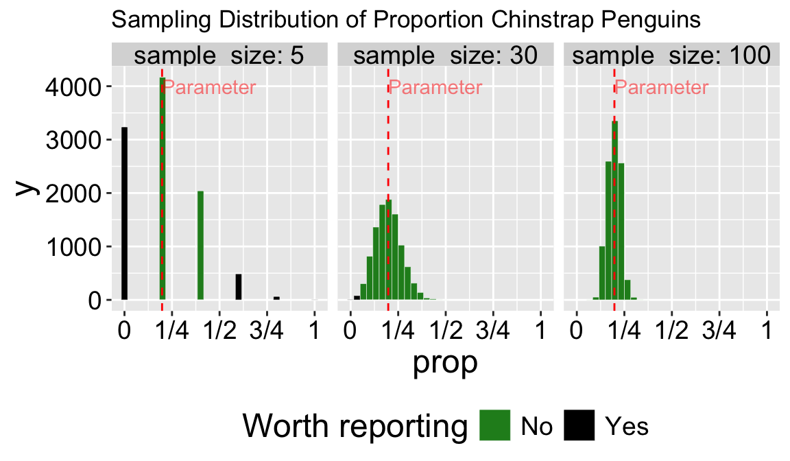
Because sampling error is most pronounced in small samples, estimates from small samples can easily mislead us. Figure 3 compares the sampling distributions for the proportion of Chinstrap penguins in samples of size five, thirty, and one hundred. About one-third of samples of size five have exactly zero Chinstrap penguins. Seeing no Chinstrap penguins in such a sample would be unsurprising but could lead to misinterpretation. Imagine the headlines:
“Chinstrap penguins have disappeared, and may be extinct!…”
The very same sampling procedure from that same population (with a sample size of five) could occasionally result in an extreme case where more than half the penguins are Chinstrap penguins (this happens in about 6% of samples of size five). Such a result would yield a quite different headline:
“Chinstrap penguins on the rise — could they be replacing other penguin species?”
A sample of size thirty is much less likely to mislead—it will only result in a sample with zero or a majority of Chinstrap penguins about once in a thousand times.
The numbers I provided above are correct and somewhat alarming. But it gets worse—since unremarkable numbers are hardly worth reporting (illustrated by the light grey coloring of unremarkable values in Figure 3), we’ll rarely see accurate headlines like this:
“A survey of penguins shows an unremarkable proportion of three well-studied penguin species…”
In summary – whenever you see an exceptional claim, be sure to look at the sample size and measures of uncertainty. For a deeper dive into this issue, check out this optional reading: The Most Dangerous Equation (Wainer, 2007).
Small Samples, Overestimation, and the File Drawer Problem
Let’s say you have a new and exciting idea—maybe a pharmaceutical intervention to cure a deadly cancer. Before you commit to a large-scale study, you might do a small pilot project with a limited sample size. This is a necessary step before getting the funding, permits, and time needed for a bigger study.
- What if you found an amazing result? The drug worked even better than you expected! You would likely shout it from the rooftops—issue a press release, etc.
- What if you found something subtle? The drug might have helped, but the result is inconclusive. You might keep working on it, but more likely, you’d move on to a more promising target.
After reading this section, you know that both of these outcomes could happen for two drugs with the exact same effect (see Figure 3). This combination of sampling and human nature has the unfortunate consequence that reported results are often biased toward extreme outcomes.
This issue, known as the file drawer problem (because underwhelming results are kept in a drawer somewhere, waiting for a mythical day when we have time to publish them), means that reported results are often overestimated, modest effects are under-reported, and follow-up studies tend to show weaker effects than the original studies. Importantly, this happens even when experiments are performed without bias, and insisting on statistical significance doesn’t solve the problem. It is therefore exceptionally important to report all results—even boring, negative ones.