Motivating scenario: We’re getting ready to compare means of two-samples. We have some understanding that statistical models make assumptions, and know that sometimes violating assumptions is a big deal, while in other cases analyses are robust to such violations of assumptions. Here we explore the assumptions of the two sample t-test, and what to do when data do not meet these assumptions.
Learning goals: By the end of this section, you should be able to:
List and explain the assumptions made in analyzing data with a “two-sample t-test”.
Independence.
Unbiased.
Mean is a good summary.
Normal residuals.
Equal variance.
Consider what to do when data fail to meet these assumptions.
Assumptions of linear models
We’ve already seen the basic assumptions when modeling a single continuous variable with the t-distribution: data should be
Independent.
Collected without bias.
Summarized appropriately by the mean, and
Approximately normal.
For comparing two samples, we clarify that:
Normality refers specifically to normality of residuals – that is, the differences between observations and their predicted values. or a one sample analysis, the predicted value was simply the overall mean so normality of the raw implied that residuals were normal. For a two-sample analysis, each group has its own mean. Normality of residuals means data are approximately normal within each group. The combined data may look non-normal (even bimodal), and that’s fine, as long as each group individually is roughly normal.
Linear models, like a two-sample t-test also assume:
Homoscedasticity: This is a fancy way of saying that variance is independent of the predicted value, \(\hat{Y}\). For two-sample analysis, this means that we are assuming equal variance in each group.
These data are independent (we use only one value per RIL – the mean across plants of a given RIL genotype), collected without bias (nice job Brooke!), and the mean seems like a good summary. So let’s look into the assumptions of normality and equal variance:
4. Data are far from normal, but transformation helps.
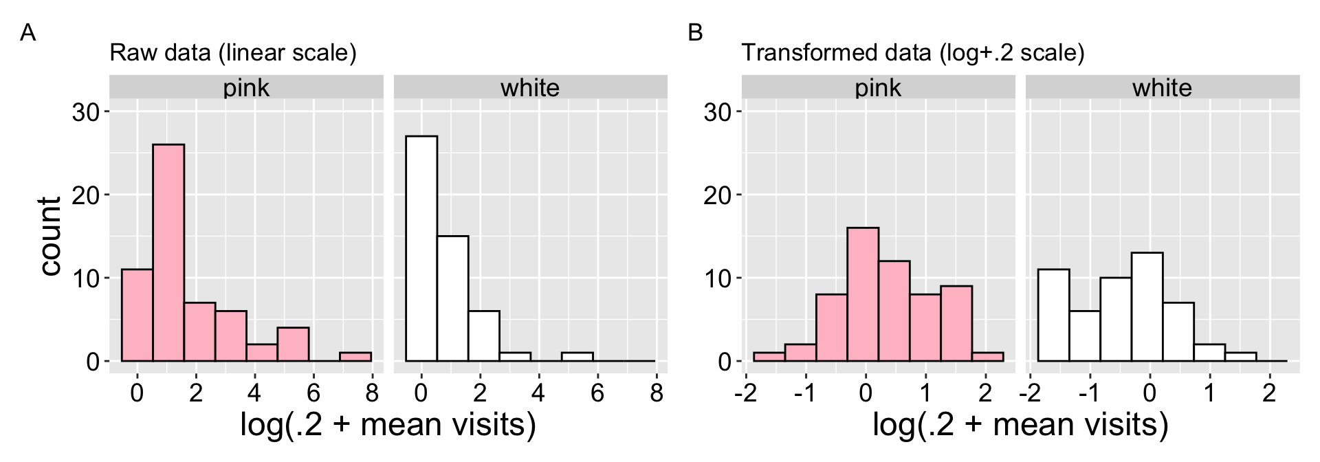
A look at the raw data shows that pollinators visits are far from normal – for both petal color morphs, many RILs have nearly no visits, while some have many visits (Figure 1 A). After log-transformation\(^*\) (Figure 1 B), the data becomes closer to normal – however, the many white flowers receiving no pollinator visits \(^\$\) remain, resulting a modest (but good enough for most stats) deviation from normality.
\(^*\) or more specifically log(x+0.2) transformation.
\(^\$\) this is called “zero inflation” – a common challenge for some types of statistical analyses.
Code for log-transformed plots.
library(patchwork)a <-ggplot(SR_rils, aes(x = mean_visits, fill = petal_color))+geom_histogram(color ="black", bins =8)+theme(legend.position ="none")+scale_fill_manual(values =c("pink", "white"))+labs(title ="Raw data (linear scale)", x ="log(.2 + mean visits)")+facet_wrap(~petal_color)+coord_cartesian(ylim =c(0,30))b <-ggplot(SR_rils, aes(x =log(.2+mean_visits), fill = petal_color))+geom_histogram(color ="black", bins =8)+theme(legend.position ="none")+scale_fill_manual(values =c("pink", "white"))+labs(title ="Transformed data (log+.2 scale)", x ="log(.2 + mean visits)")+facet_wrap(~petal_color)+coord_cartesian(ylim =c(0,30))a+b+plot_layout(axis_titles ="collect_y") +plot_annotation(tag_levels ="A")
Figure 1: Evaluating the normality assumptions for the raw (A), and log transformed (B) data. The “log” transform is actually log(+0.2) transformation because the data contains zeros, and adding one does not make the data particularly normal. This transformation makes the data more consistent with the normality assumption.
5. Variance is similar among groups
Comparing the variance in (log (x+.2) transformed) pollinator visits, reveals remarkably similar variance between groups. Thus we satisfy the equal variance assumption of linear models.
Linear models are remarkably robust to the assumption of equal variance. You can feel confident that differences in variance will have limited influence on your results until the larger variance is more than four times larger than the smaller variance.
What to do when data violate assumptions
Later we’ll briefly touch on advanced techniques for dealing with data that are non-independent or and/or poorly described by the mean. Biased data are even harder. So here we will focus on solutions for non-normal data and data with unequal variance.
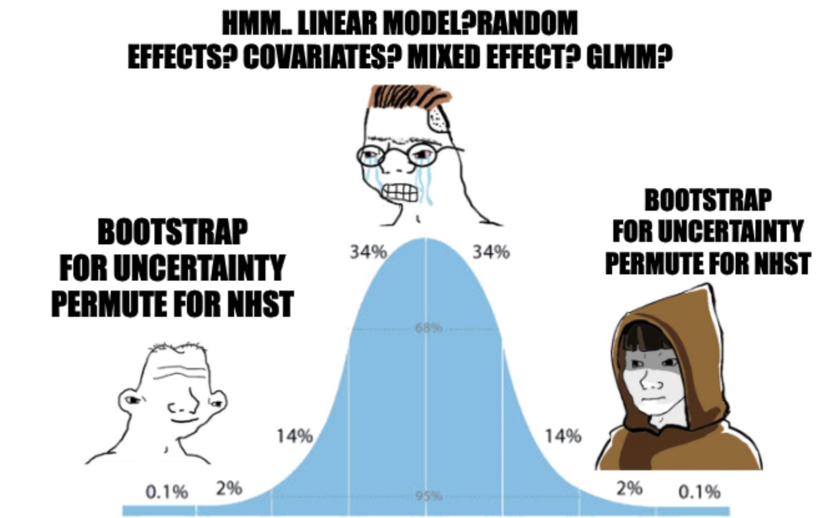
Figure 2: A stats meme! At the novice and expert ends of the experience distribution, both agree that bootstrapping for uncertainty and permuting for NHST are useful tools. The average biostatistician, stuck in the middle, frets over which modeling approach is appropriate.
When data are not normal: We can
Transform the data (as above).
Bootstrap to estimate uncertainty and permute to test null hypotheses (Figure 2). OR
Use a rank-based “non-parametric” test. Such tests are more formally a test for difference in medians. They work by ranking the data and comparing the observed distribution of rankings between groups to the null. We can do this in R as follows, which leads to serious rejection of the null hypothesis:
wilcox.test(log_visits ~ petal_color, data = SR_rils, exact =FALSE)
    Wilcoxon rank sum test with continuity correction

data:  log_visits by petal_color
W = 2127.5, p-value = 0.00001143
alternative hypothesis: true location shift is not equal to 0
When variance is unequal: We can use the “Welch’s t-test”, which does not assume equal variance. In fact, this is the default in R’s t.test() function. Here we use the standard t-test because the math is easier and is consistent with results in a broader linear model framework.