# Tranfsorm
gc_rils <-gc_rils |>
mutate(log10_petal_area = log10(petal_area_mm))• 15. Make It Normal
Motivating scenario: After looking at your data you can tell it’s pretty far from normal. You know that simply ignoring this violation could lead to incorrect conclusions. What do you do? Data transformation is valid way to change the shape of your data so that it better meets the assumptions of your statistical model.
Learning goals: By the end of this chapter you should be able to:
- Explain the primary reasons for transforming data in statistical analysis.
- List the key principles that make a data transformation legitimate.
- Identify common transformations used to correct for right skew, left skew, and to analyze proportions.
- Evaluate whether a transformation made the data normal enough.
Transforming Data
Because the normal distribution is so common, and because the Central Limit Theorem is so useful, many statistical approaches are built on the assumption of some form of normality. However, sometimes data are too far from normal to be modeled as if they are normal. Other times, certain characteristics of the data’s distribution may break other assumptions of statistical tests. When this happens, we have a few options:
- We can permute and bootstrap!
- We can transform the data to better meet our assumptions.
- We can use or develop tools to model the data based on their actual distribution.
- We can use robust and/or nonparametric approaches.
We have already discussed option 1 at length, and will return to options 3 and 4 later in the term. Here we visit option 2, transformation, in which we change the shape of our data (We already coverred this some earlier in the book).
Rules for Legitimate Transformations
There is nothing inherently “natural” about the linear scale, so transforming data to a different scale is perfectly valid. In fact, we should estimate and test hypotheses on a meaningful scale. Often, an appropriate transformation will result in data that are more “normal-ish.” Effective transformations are guided by the characteristics of the data, the processes that generated them, and the specific questions being addressed, ensuring that the transformation makes sense in context.
Rules for Transforming Data:
- Let biology guide you: Often, you can determine an appropriate transformation by considering a mathematical model that describes your data. For example, if values naturally grow exponentially, a log transformation may be appropriate.
- Apply the same transformation consistently to each individual in the dataset.
- Transformed values must have a one-to-one correspondence with the original values. For example, don’t square values if some are less than 0 and others greater than 0.
- Transformed values must maintain a monotonic relationship with the original values. This means that the order of the values should be preserved after the transformation—larger values in the original data should remain larger after the transformation.
- Conduct your statistical tests AFTER you settle on the appropriate transformation.
- Be cautious not to bias your results by inadvertently losing data points. This can happen, for example, if a log transformation fails on zero or negative values, or when extreme values are removed during the transformation process.
Common Transformations
There are several common transformations that can make data more normal, depending on their initial shape:
| Name | Formula | What type of data? |
|---|---|---|
| Log | \(Y'=\log_x(Y + \epsilon)\) | Right skewed |
| Square-root | \(Y'=\sqrt{Y+1/2}\) | Right skewed |
| Reciprocal | \(Y'=1/Y\) | Right skewed |
| Arcsine | \(\displaystyle p'=arcsin[\sqrt{p}]\) | Proportions |
| Square | \(Y'=Y^2\) | Left skewed |
| Exponential | \(\displaystyle Y'=e^Y\) | Left skewed |
Transformation example: The log transformation
We have seen that the normal distribution arises when we add up a bunch of things. If we multiply a bunch of things, we get an exponential distribution. Because adding logs is like multiplying untransformed data, a log transform makes exponential data look normal.
Take our distribution of the petal area of parviflora RILs we’ve been using all chapter. You will note that we have been using the log-scaled data. We have done so because petal area is initially far from normal (Fig. Figure 1.1 A,C), but after a log transformation it is much closer to normal (Fig. Figure 1.1 B,D) and would likely have a normal sampling distribution for relatively modest sample sizes.
Code to make the plots below
library(patchwork)
mean_val_raw <- mean(gc_rils$petal_area_mm, na.rm = TRUE)
sd_val_raw <- sd(gc_rils$petal_area_mm, na.rm = TRUE)

raw_hist <- ggplot(gc_rils, aes(x = petal_area_mm)) +
    geom_histogram(aes(y = after_stat(density)), bins = 11, color = "white", fill = "gray") +
    stat_function(fun = dnorm,
        args = list(mean = mean_val_raw, sd = sd_val_raw),
        color = "red", linewidth = 1.2) +
    labs(title = "Hist. of Petal Area with Normal Curve", x = "Petal Area (mm)",y = "Density") +
    scale_x_continuous(limits = c(10,130))+
  theme(axis.text = element_text(size = 14),
        axis.title = element_text(size = 18),
        title = element_text(size = 18))

# log10 transform
mean_val_log10 <-mean(gc_rils$log10_petal_area, na.rm = TRUE)
sd_val_log10 <- sd(gc_rils$log10_petal_area, na.rm = TRUE)

log10_hist <- ggplot(gc_rils, aes(x = log10_petal_area)) +
    geom_histogram(aes(y = after_stat(density)), bins = 11, color = "white", fill = "gray") +
    stat_function(fun = dnorm,
        args = list(mean = mean_val_log10, sd = sd_val_log10),
        color = "red", linewidth = 1.2) +
    labs(title = "Hist. of log10(Petal Area) w. Normal Curve", x = "log10(Petal Area) (mm)",y = "Density") +
    scale_x_continuous(limits = c(1.4,2.2))+
  theme(axis.text = element_text(size = 14),
        axis.title = element_text(size = 18),
        title = element_text(size = 18))

raw_qq <- ggplot(gc_rils, aes(sample = petal_area_mm))+
  geom_qq()+
  geom_qq_line()+
  labs(title = "QQ plot of Petal Area", y = "Petal Area (mm)",x = "Theoretical quantile") +
  theme(axis.text = element_text(size = 14),
        axis.title = element_text(size = 18),
        title = element_text(size = 18))

log10_qq  <- ggplot(gc_rils, aes(sample = log10_petal_area))+
  geom_qq()+
  geom_qq_line()+
  labs(title = "QQ plot of log10(Petal Area)", y = "log10(Petal Area) (mm)",x = "Theoretical quantile") +
  theme(axis.text = element_text(size = 14),
        axis.title = element_text(size = 18),
        title = element_text(size = 18))
raw_hist + raw_qq + log10_hist  + log10_qq+plot_annotation(tag_levels  = "A")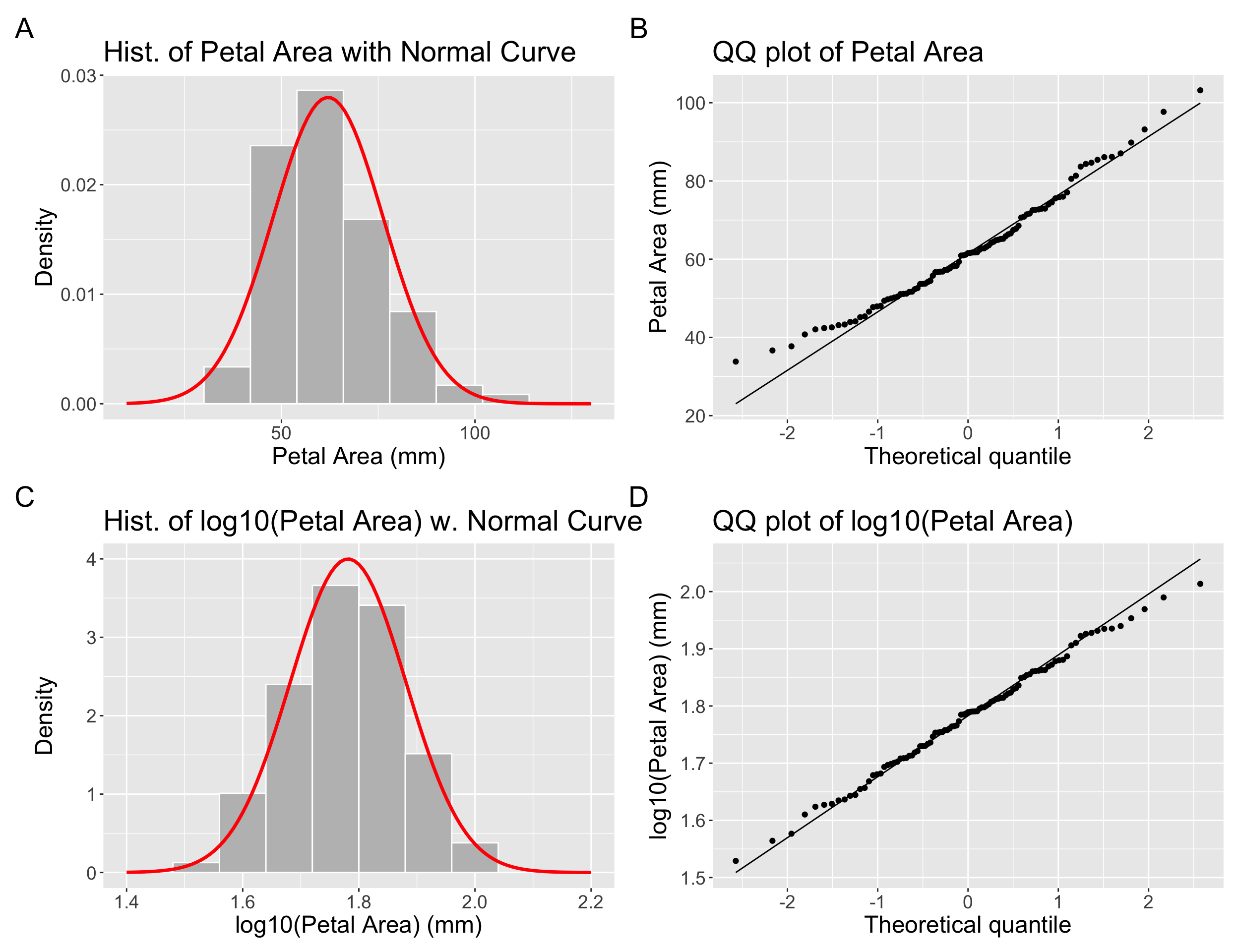
Be careful when log-transforming!! All data with a value of zero or less will disappear. For this reason, we often use a log1p transform, which adds one to each number before logging them.
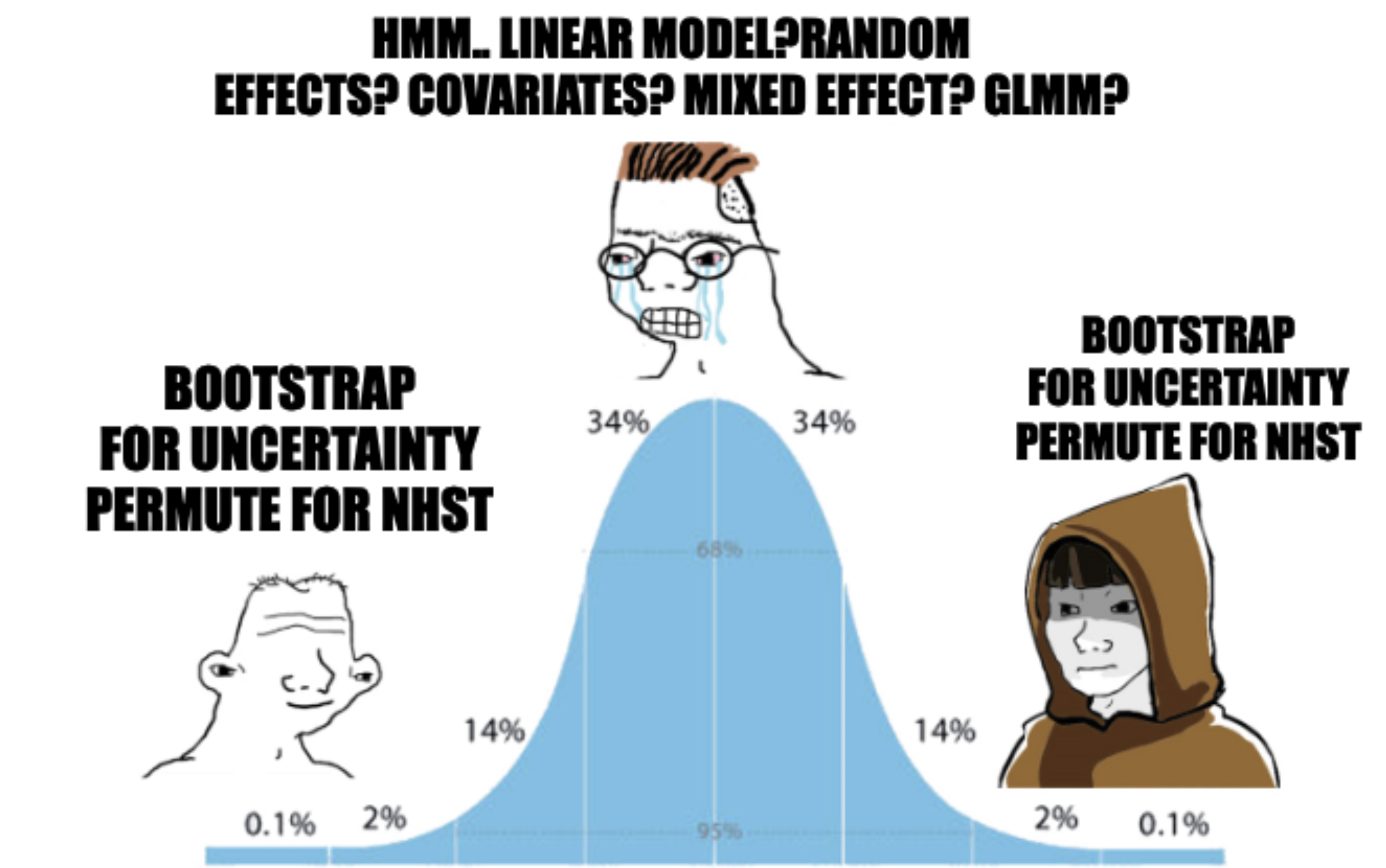
When transformation fails
Not all data can be made to be normal. If you are worried that even after transformation your data are too far from normal for standard linear models, don’t despair! We can build modles that better meet the data, permute/bootstrap (Figure 1.2), or find a better test.