• 3. Two categorical variables
Motivating scenario: You want to explore how two categorical variables are associated.
Learning goals: By the end of this sub-chapter you should be able to
- Make barplots with
geom_bar()andgeom_col().
- Make stacked and grouped barplots.
- Know when to use
geom_bar()and when to usegeom_col().
Categorical explanatory and response variables
Above, we saw that most plants received no visits, so we might prefer to compare the proportion of plants that did and did not receive a visit from a pollinator by some explanatory variable (e.g. petal color or location). Recall that we have added the logical variable, visited, by typing mutate(visited = mean_visits > 0).
Making bar plots: A Step-by-Step guide. There are two main geoms for making bar plots, depending on the structure of our data:
- If we have raw data (i.e. a huge dataset with values for each observation) use
geom_bar().
- If we have aggregated data (i.e. a summary of a huge dataset with counts for each combination of variables) use
geom_col()
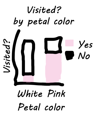
Note: Here we map petal color onto the x-axis, and visited (TRUE / FALSE) onto the fill aesthetic.
ril_data |>
    filter(!is.na(petal_color), !is.na(mean_visits))|>
    mutate(visited = mean_visits >0)|>
  ggplot(aes(x = petal_color, fill = visited))+
  geom_bar()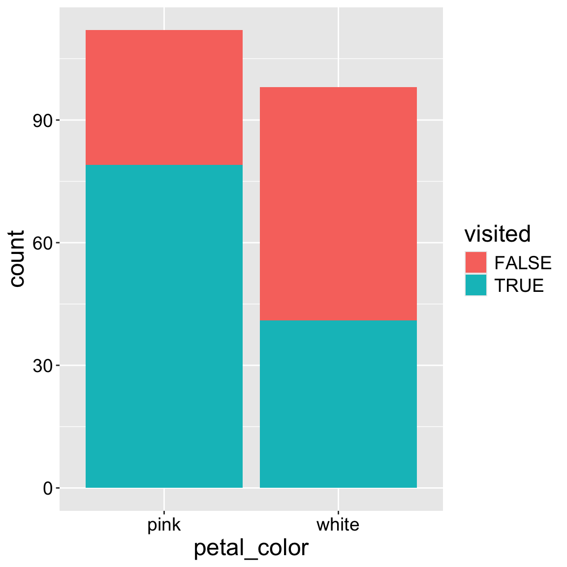
ril_data |>
    filter(!is.na(petal_color), !is.na(mean_visits))|>
    mutate(visited = mean_visits >0)|>
  ggplot(aes(x = petal_color, fill = visited))+
  geom_bar(position = "dodge")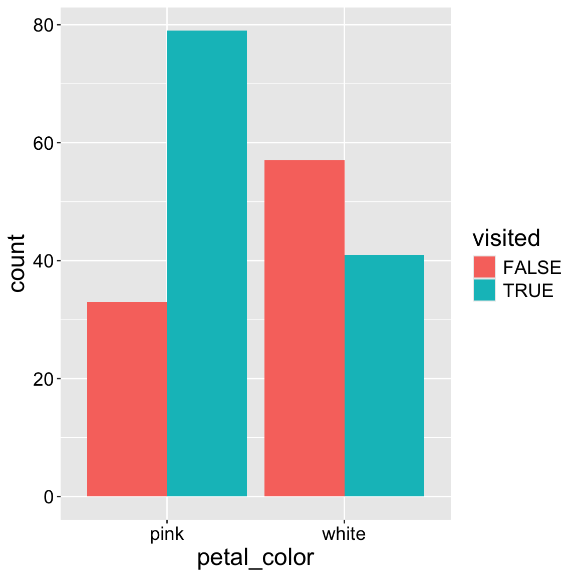
If you had aggregated data, like that below. We need to plot these data somewhat differently. There are two key differences:
- We map our count (in this case
n) onto theyaesthetic.
- We use
geom_col()instead ofgeom_bar().
| location | petal_color | visited | n |
|---|---|---|---|
| GC | pink | FALSE | 32 |
| GC | pink | TRUE | 23 |
| GC | white | FALSE | 46 |
| GC | white | TRUE | 2 |
| SR | pink | FALSE | 1 |
| SR | pink | TRUE | 56 |
| SR | white | FALSE | 11 |
| SR | white | TRUE | 39 |
ggplot(data = aggregated_pollinator_obs,
       aes(x = petal_color, y = n, fill = visited))+
  geom_col()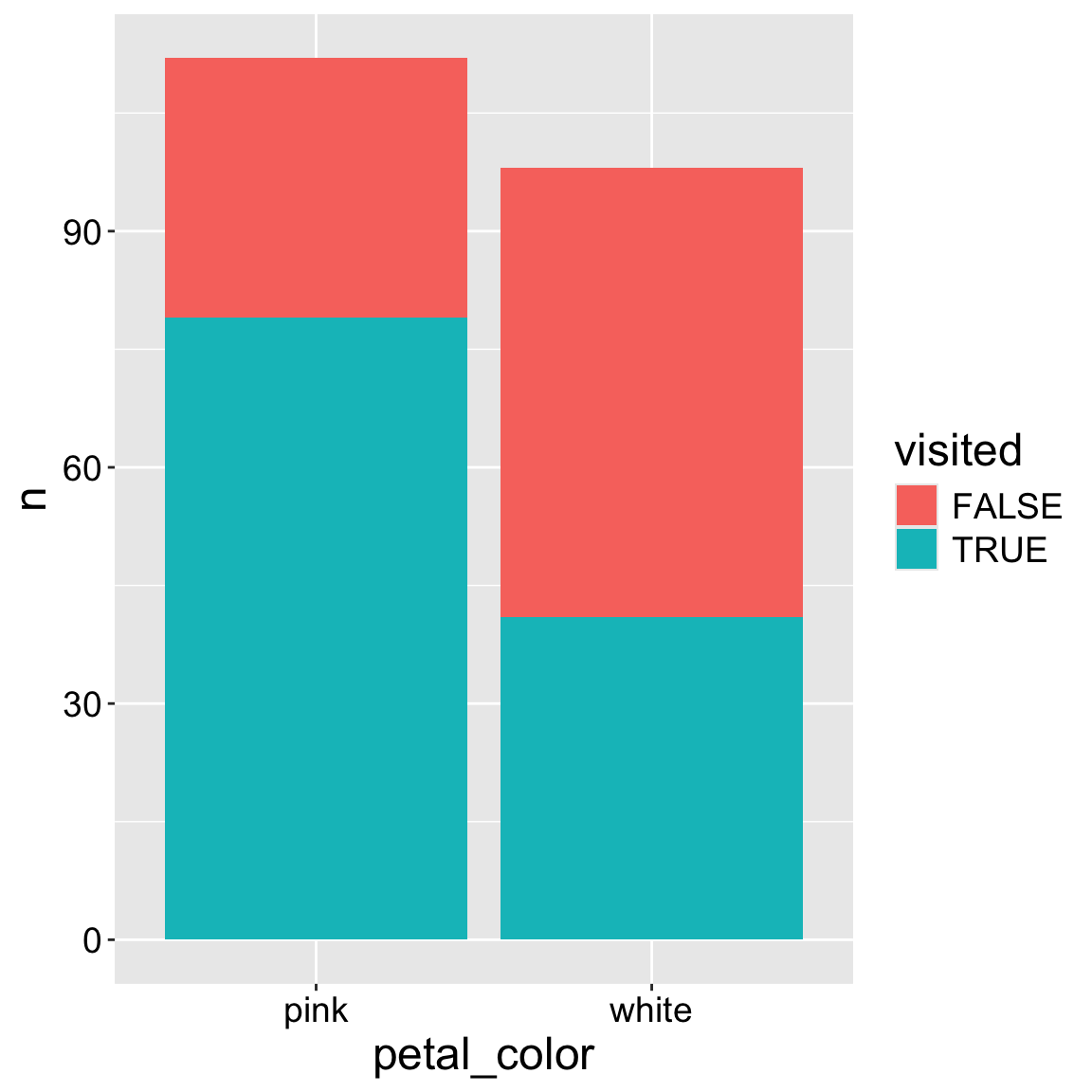
Interpretation: We see that a greater proportion of pink-flowered plants receive visits compared to white-flowered plants.