• 12. Confidence Intervals
Motivating Scenario: We understand the importance of quantifying uncertainty, and can build a bootstrap distribution. We now want to put a reasonable range on our estimate. Here, we will learn how a confidence interval solves this problem, and what it does and does not mean.”
Learning Goals: By the end of this subsection, you should be able to:
Explain the meaning of a confidence interval
Calculate a bootstrap confidence interval from the bootstrap distribution
Visualize uncertainty by adding confidence intervals to your plots
Understanding Confidence Intervals
Confidence intervals offer a different way to describe uncertainty than the standard error. While the SE is a single number representing expected error (e.g. a standard error of 2.37% percent hybridization around our estimated 15% hybridization rate for parviflora RILs in GC), a Confidence Interval provides a range of plausible values for the true population parameter.
Confidence intervals are a bit tricky to think and talk about. I think about a confidence interval as a net that does or does not catch the true population parameter. If we set a 95% confidence level, as is statistical tradition, we expect ninety five of every one hundred 95% confidence intervals to capture the true population parameter.
Choosing a confidence level: The choice of a 95% confidence interval is an arbitrary statistical convention. It is usually best to follow conventions so that people don’t look at you funny. But you may want to break with convention at times. When setting a confidence level there is a trade-off between certainty and precision – a 99% confidence interval gives you greater certainty that the true parameter has been captured but yields a wider, less precise range, while a 90% interval is narrower and more precise but carries a greater risk of having missed the true value.
This webapp from Whitlock & Schluter (2020) helps make this idea of a confidence interval more concrete. Here they produce a sample of size \(n\) from a population with a true mean of \(\mu\), and population standard deviation of \(\sigma\). Play with this app to see how these variables change our expected confidence intervals.
Because each confidence interval does or does not capture the true population parameter, it is wrong to say that a given confidence interval has a given chance of catching the parameter. The probability is in the sampling process, not in the parameter itself, which is fixed. Before we take a sample, we have a 95% chance of ‘catching’ that parameter in our net. After we’ve taken the sample and made our interval, that interval either contains the parameter or it does not. Think of it like a coin that has already been flipped but is hidden under a cup. The outcome is already set - it’s either heads or tails. You can’t say there is a 50% chance it’s heads; your statement that ‘it is heads’ is simply either right or wrong. The 95% confidence level applies to the process of creating nets, not to any single net after it has been cast.
These concepts are tough. This video from Crash course statistics can be very helpful. Note that it introduces some mathematical formulas we will cover later in the book, so feel free to focus on the core concepts for now.
Calculating Bootstrap Confidence Intervals
Calculating a bootstrap confidence interval from the bootstrap distribution is pretty straightforward. We first decide on our desired confidence level (0.95 is standard), and we will call one minus the confidence level \(\alpha\) (so for a .95 confidence level, \(\alpha\) = 0.05$). We then find the values on the border of the \(\frac{\alpha}{2}\) and \(1-\frac{\alpha}{2}\) by combining the summarize() and quantile() functions:
alpha <- .05
boot_dist |>
  summarise(lower_cl = quantile(est_prop_hybrid, probs = alpha/2),
            upper_cl = quantile(est_prop_hybrid, probs = 1-alpha/2))
# A tibble: 1 × 2
lower_cl upper_cl
<dbl> <dbl>
1 0.108 0.199This result shows that although our estimated hybridization rate is 15%, values between 10% and 20% are plausible. Figure 1 visually highlights the 95% bootstrap confidence interval from the bootstrap distribution.
Say no to bright lines! We found a 95% CI between 0.108 and 0.199. Does this mean that hybridization rate of 0.198 is plausible and 0.200 is implausible? Of course not. Confidence intervals help guide our thinking – but they should not be treated as rigid bounds.
Code for making a very involved histogram of the bootstrap distribution and the 95% condidence interval.
boot_dist <- read_csv("https://raw.githubusercontent.com/ybrandvain/datasets/refs/heads/master/gc_hyb_prop_boot.csv")

boot_cis <- boot_dist|>
  reframe(ci = quantile(est_prop_hybrid,probs = c(0.025, 0.975)))

boot_dist <- boot_dist |>
  mutate(extreme = (est_prop_hybrid < (boot_cis |> unlist())[1]) |
                   (est_prop_hybrid > (boot_cis |> unlist())[2]))

boot_dist |>
  ggplot(aes(x = est_prop_hybrid, alpha = extreme, fill = extreme))+
  geom_histogram(bins = 50, color= "white")+
  labs(title = "95% bootstrap confidence interval for proportion hybrids at GC",
       x = "Mean proportion hybrid (sample estimate)",
       fill = "2.5% tail",
       alpha = "2.5% tail")+
  theme_light()+
  guides(alpha  = guide_legend(position = "inside"),
         fill  = guide_legend(position = "inside"))+
  theme(axis.title.x = element_text(size = 14),
        axis.text.x = element_text(size = 14),
        title =  element_text(size = 14),
        axis.title.y = element_blank(),
        axis.text.y = element_blank(),
        legend.position = c(.8,.8),
        legend.box.background = element_rect(colour = "black"))+
  geom_vline(data =  boot_dist|>
               reframe(ci = quantile(est_prop_hybrid,
                       probs = c(0.025, 0.975))),
             aes(xintercept = ci),
             color = "purple",
             linewidth = 1,
             lty = 2)+
  scale_fill_manual(values = c("cornflowerblue","firebrick"))+
  scale_alpha_manual(values = c(.2,1))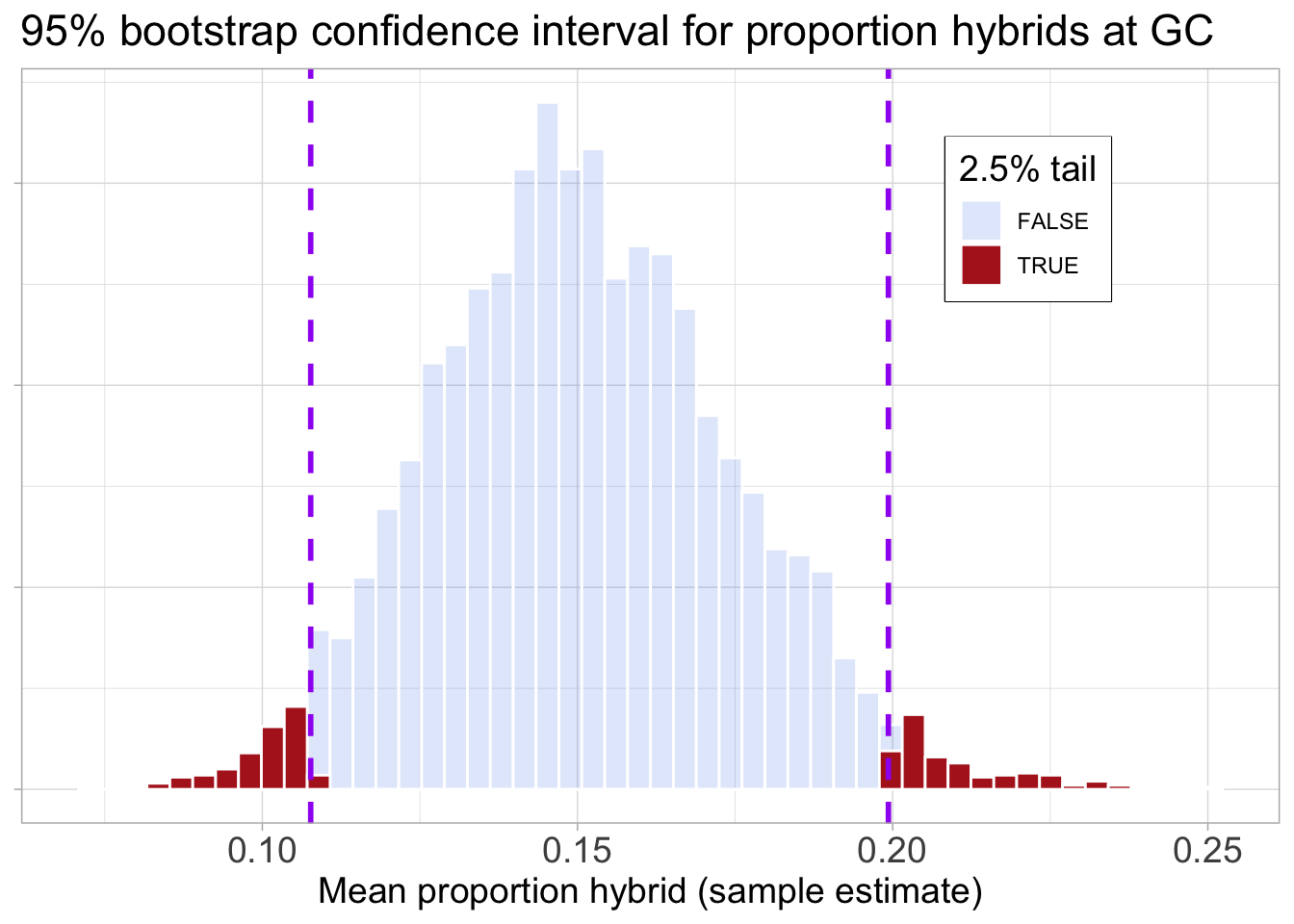
I introduce the idea of a confidence interval from the quantiles of the bootstrap distribution. As noted elsewhere, we can also use math tricks to estimate a confidence interval. For example:
- A 95% confidence interval is roughly equal to the estimated mean plus or minus two standard errors. (you may have seen this in the youtube video above).
You do not need to know this yet, but know that these approaches usually yield very similar confidence intervals.
Visualizing confidence intervals
We have previously discussed the importance of presenting honest, clear, and transparent plots. This includes both showing your data and highlighting patterns. It is therefore best practice to include both means and a confidence interval in your plots. You can do this with ggplot’s stat_summary() function.
NOTE stat_summary() requires the Hmisc package so you will likely need to install and load it.
We don’t even need to bootstrap the data ourselves! Supplying the argument fun.data = "mean_cl_boot" tells ggplot to perform the entire bootstrap procedure for us (just as we did manually), calculate the mean and confidence interval, and add them to the plot! Figure 2 shows that the bootstrap CI we calculated roughly matches the one that R calculated. Figure Figure 3 displays the output of the code below which adds confidence intervals to all groups.
Loading data
ril_link <- "https://raw.githubusercontent.com/ybrandvain/datasets/refs/heads/master/clarkia_rils.csv"
ril_data <- readr::read_csv(ril_link)|>
  filter(!is.na(location))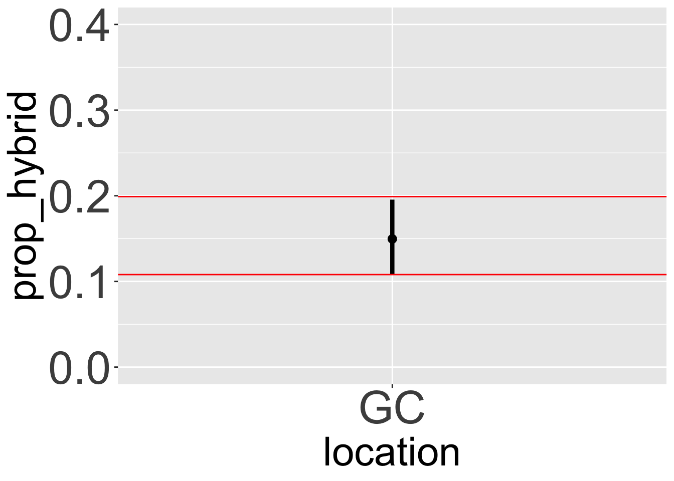
ggplot(ril_data, aes(x = location, y =prop_hybrid, color = location))+
  geom_jitter(height = 0, width = .2, size = 3, alpha = .6)+
  # THIS IS WHERE WE ADD BOOTSRAP CONFIDENCE INTERVALS
  stat_summary(fun.data = "mean_cl_boot", colour = "black")+
  # YAY WE JUST ADDED BOOTSRAP CONFIDENCE INTERVALS
  theme(legend.position = "none",
        axis.text = element_text(size = 14),
        axis.title = element_text(size = 16))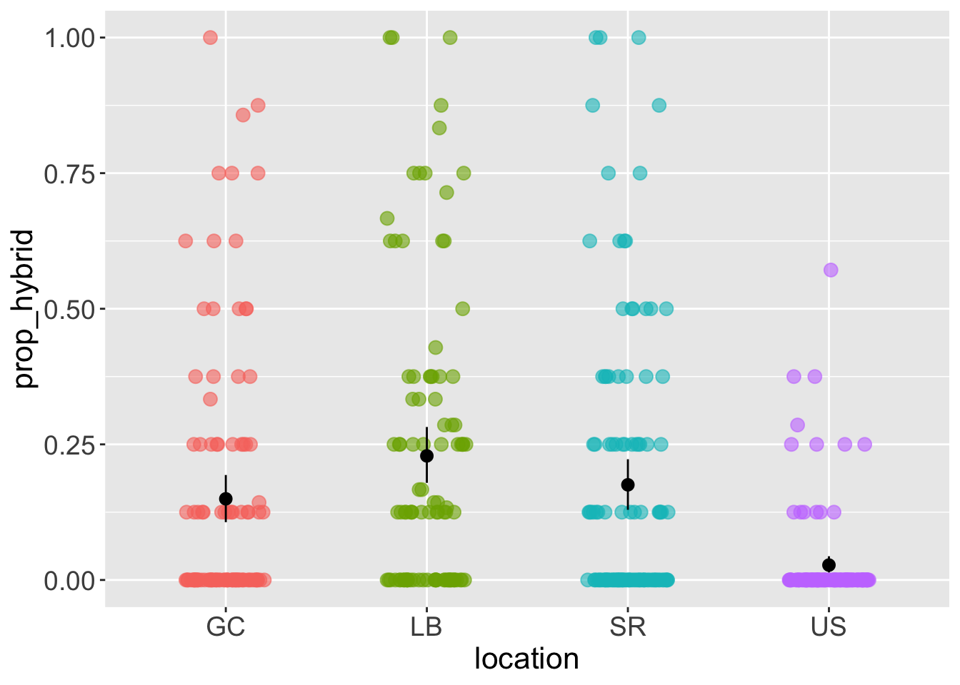
What influences the width of a confidence interval?
Three main factors determine the width, or precision, of a confidence interval – the sample size, the variability in the data, and the confidence level:
- Confidence intervals get narrower as the sample size gets bigger.
- Confidence intervals get wider as the variability in the data gets bigger.
- Confidence intervals get wider as we increase the confidence level (e.g., from 90% to 99%).