Motivating scenario: We want to know how to summarize deviations from expectations and how to use this summary and its null distribution to test null hypotheses.
Learning goals: By the end of this chapter you should be able to:
Explain what a \(\chi^2\) statistic measures conceptually.
Calculate a \(\chi^2\) value as a test statistic to quantify deviations between observations deviate and expectations.
Compare an observed \(\chi^2\) value to its null sampling distribution to find a p-value and conduct NHST.
If I told a class of forty-one students to pick an integer between one and ten at random, we would expect the following:
Number
1
2
3
4
5
6
7
8
9
10
Expected Count
4.1
4.1
4.1
4.1
4.1
4.1
4.1
4.1
4.1
4.1
But, of course, we never get exactly what we expect. This difference between expectation and observation can be due to both sampling error (because our sample was finite) and sampling bias (because people don’t really pick numbers at random).
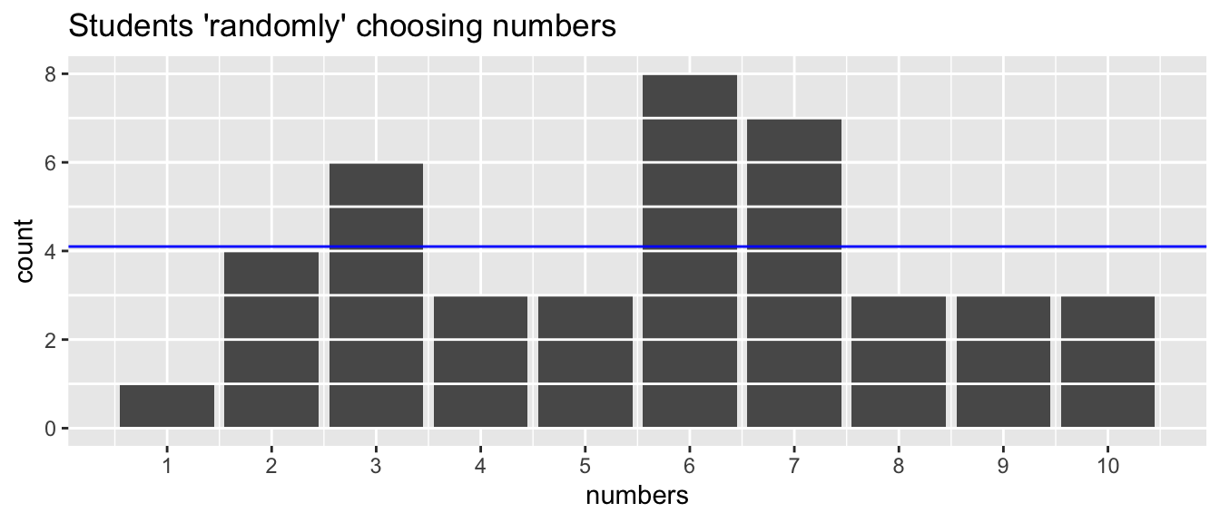
Figure 1 below shows the number of times each number (one through ten) was chosen by a student in my course. Because these results come from students, the deviation can be attributed to some combination of sampling error and sampling bias.
Code
peoples_numbers <-tibble(numbers=c(6,5,9,9,3,7,8,1,3,2,3,4,3,2,4,7,10,2,5,6,7,3,3,7,6,6,9,5,6,6,7,7,8,6,10,7,10,2,6,8,4))ggplot(peoples_numbers, aes(x=numbers))+geom_bar()+scale_x_continuous(breaks =1:10)+geom_hline(yintercept =0:max(table(pull(peoples_numbers))), color ="white")+geom_hline(yintercept =4.1, color ="blue")+labs(title="Students \'randomly\' choosing numbers")
Figure 1: Observed counts of numbers 1–10 as provided by 41 students in applied biostatistics. Each number has an expected count of 4.1 (blue horizontal line) under a uniform distribution, but sampling error and/or sampling bias causes observed frequencies to deviate from this expectation.
\(\chi^2\) quantifies the deviation from expectation.
How can we summarize the multidimensional view in Figure 1 into a single summary statistic? While there are many potential options (e.g., the number of times the most common number appears, the difference in counts between odds and evens, etc.). \(\chi^2\) – the sum of squared differences between observed and expected counts in each category divided by the expected counts in each category – is the most common summary.
I literally have no idea what a \(\chi^2\) of ten means. Ten sounds like a big number, but what do I know???
One issue is that χ² depends on sample size: with more data, even tiny deviations from expectation can give you a large χ² value. So we need to quantify how large the deviation itself is, independent of how many observations we have.
Fortunately, our friend Cohen came up with a measure of the “effect size” for this case. Cohen’s w measures the overall departure from the expected pattern in a standardized way:
\(\text{Cohen’s }w = \sqrt{\frac{\chi^2}{n}}\)
So for our case, \(\text{Cohen's w} = \frac{10.462}{41} = \sqrt{\frac{1}{4}}=\frac{1}{2}\). This is a borderline large effect!
Interpreting the “effect size” of Cohen’s w.
Effect size
w
Small
0.10
Medium
0.30
Large
0.50
So in this case, even though our sample isn’t huge, the pattern of student “random” number choices differs substantially from the uniform expectation. Cohen’s w helps us separate how interesting the pattern is from how certain we are about it.
Quantifying surprisingness of deviations
Effect size is important, but we also want to know if our observations can be easily attributable to sampling error. This is where we turn to NHST.
To conduct this (or any) NHST, we compare our observed test statistic to its expected distribution under the null hypothesis. Because we do not have paired observations to permute, I introduce simulation as a different computational approach to generate a null sampling distribution.
Later in this chapter we will see that the math for this sampling distribution is also worked out , so we don’t need to simulate, but I hope this helps us understand.
To start with, we can randomly select an integer from one to ten forty-one times to generate a single sample:
some_numbers <-sample(1:10,size =41, replace =TRUE) # generate a random sample
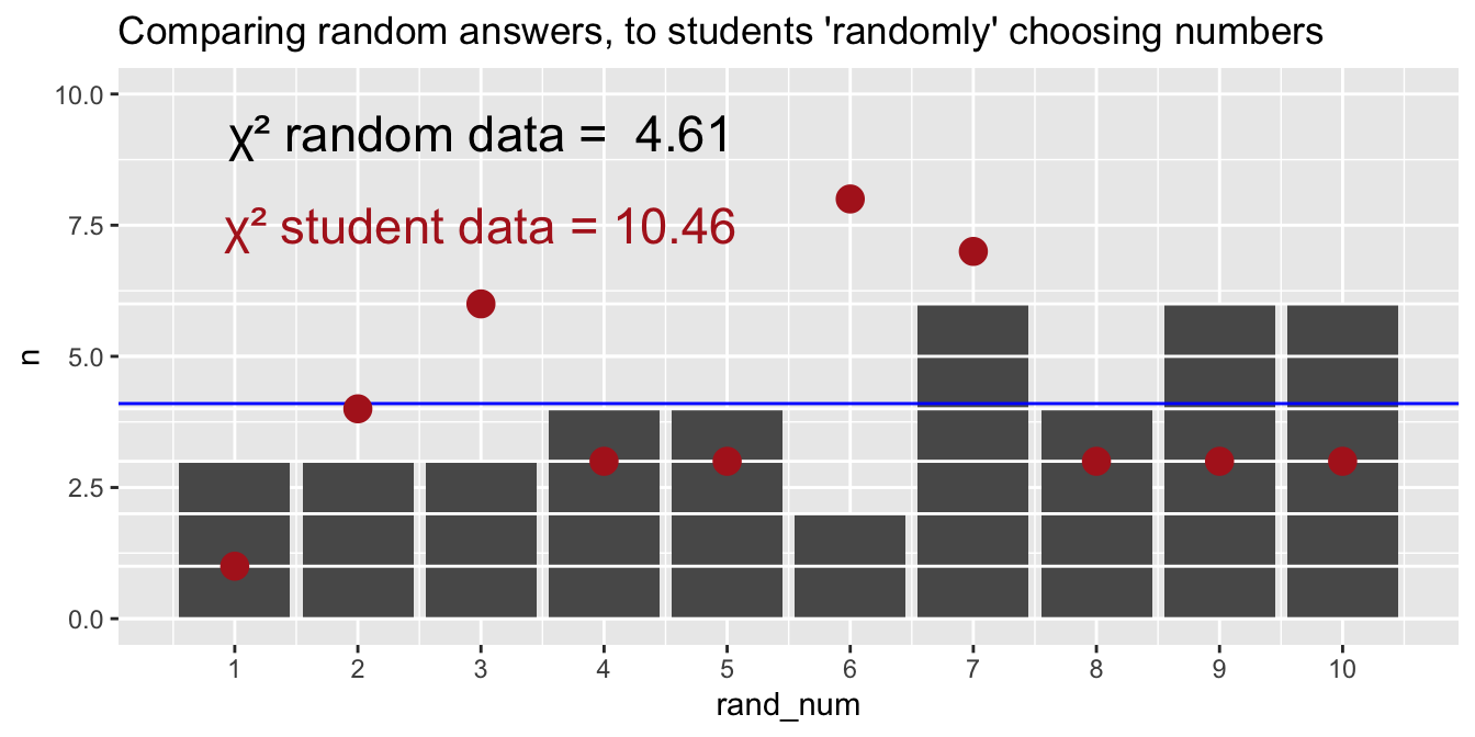
Figure 2 shows that our sample differs from one random sample from the sampling distribution.
Code
# to find chi2obs <-table(some_numbers)expected <-rep(41/10, 10) # expected counts under uniform distribution 4.1 for each binchi2 <-sum((obs - expected)^2/ expected) # calculate chi-squared statisticrand_num <-tibble(rand_num = some_numbers) # put these in a tibble for plottingggplot(rand_num, aes(x=rand_num))+geom_bar()+scale_x_continuous(breaks =1:10)+geom_hline(yintercept =0:max(table(pull(rand_num))), color ="white")+geom_hline(yintercept =4.1, color ="blue")+geom_point(data = peoples_numbers|>group_by(numbers)|>tally(),aes(x = numbers, y = n), color ="firebrick", size =4)+labs(title="Comparing random answers, to students \'randomly\' choosing numbers")+annotate(x =3, y =9.25,label =paste("χ² random data = " , round(chi2, 2)), geom ="text",size=6)+annotate(x =3, y =7.5 ,label ="χ² student data = 10.46" , geom ="text",size=6, color ="firebrick")+coord_cartesian(ylim =c(0,10))
Figure 2: Observed counts of numbers 1–10 as provided by 41 random answers from R. Each number has an expected count of 4.1 (blue horizontal line) under a uniform distribution, but sampling alone causes observed frequencies to deviate from this expectation. The red points display student responses.
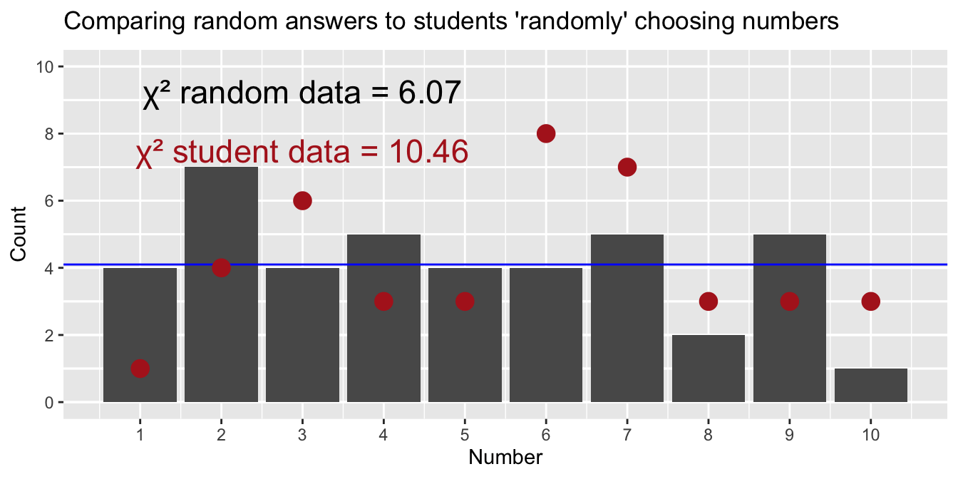
But, of course, that is just comparing one sample to another. To get a p-value, we find the proportion of the sampling distribution as or more extreme than what we have seen. Figure 3 shows that about one quarter of the 50 random samples have a \(\chi^2\) value more extreme than what we observed in our data. Thus, we will fail to reject the null hypothesis.
This is a one-tailed test because the \(\chi^2\) statistic incorporates all ways to be weird.
Figure 3: Animation comparing a computer’s random number choices (bars) to students’ “random” choices (red dots) over repeated trials. The blue horizontal line shows the expected count for each number if choices were perfectly uniform. Each frame represents a new simulated dataset for the computer.
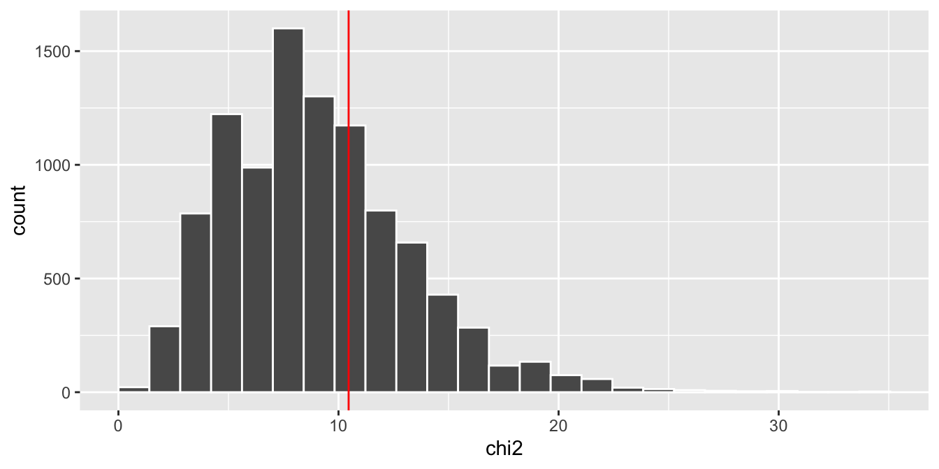
To find a more precise p-value, we will conduct one thousand such simulations. Figure 4 reveals that 29% of the null sampling distribution has \(\chi^2\) values greater than what we saw in class, so our p-value is 0.29, and we fail to reject the null hypothesis that people chose numbers at random.
Figure 4: Sampling distribution of χ² statistics under the null model, generated by repeated random simulations. Each bar shows how often a particular χ² value arose when the data truly were generated under the null. The red vertical line marks the χ² value observed in our actual data.
Interpretation
We fail to reject the null. This means that sampling error can easily explain the difference between our observations and expectations. But this does not mean that people chose numbers at random it simply means that we don’t have enough evidence to argue against this skeptical “null hypothesis.”