• 15. Is It Normal?
Motivating scenario: Many common statistical approaches assume that your data (or the model’s residuals) are normally distributed. So before we can run and intepret such models we must bets able to evaluate if this assumption is fair. Here I show you how to do that!
Learning goals: By the end of this chapter you should be able to:
- Explain why visually assessing normality is often preferred over formal statistical tests of the null that data came from a normal.
- Create and interpret a Quantile-Quantile (QQ) plot to evaluate if a dataset is approximately normal.
- Visually recognize common patterns of non-normality (e.g. skew and bimodality).
Is it normal?
Many standard statistical approaches rely, to some extent, on normal data (or more specifically, a normally distributed sampling distribution of residuals). It is therefore often important to know if our data (or at least the residuals of a linear model) are normally distributed, as this influences how much faith we have in the results of a given statistical procedure.
While there are ways to formally test the null hypothesis that data come from a normal distribution, we rarely use these because deviations from normality can be most critical when we have the least power to detect them. For this reason,we typically rely on visual inspection rather than null hypothesis significance testing to assess whether data are approximately normal.
“Quantile-Quantile” plots and the eye test
A QQ (aka “quantile-quantile”) plot is a useful tool to help us visually evaluate if data are roughly normal. It does so by comparing the quantiles of your data against the theoretical quantiles you would expect if your data came from some an ideal version of a specified distribution (in this case a normal distribution). If your data normal, the points will fall along a straight line.
The QQ-plot of petal area in parviflora RILs planted at site GC (Figure 2.3) reveals that the points are fairly close to the predicted line, although both the small and large values are slightly larger than expected. Is this a big deal? Is this deviation surprising? To answer that, we need to understand the variability we expect from a normal distribution.
gc_rils |>
  ggplot(aes(sample = petal_area_mm))+
  geom_qq()+
  geom_qq_line()+
  labs(x = "Theoretical quantiles",
       y = "Observed petal area",
       title = "Normal QQ plot of petal area among parviflora RILs")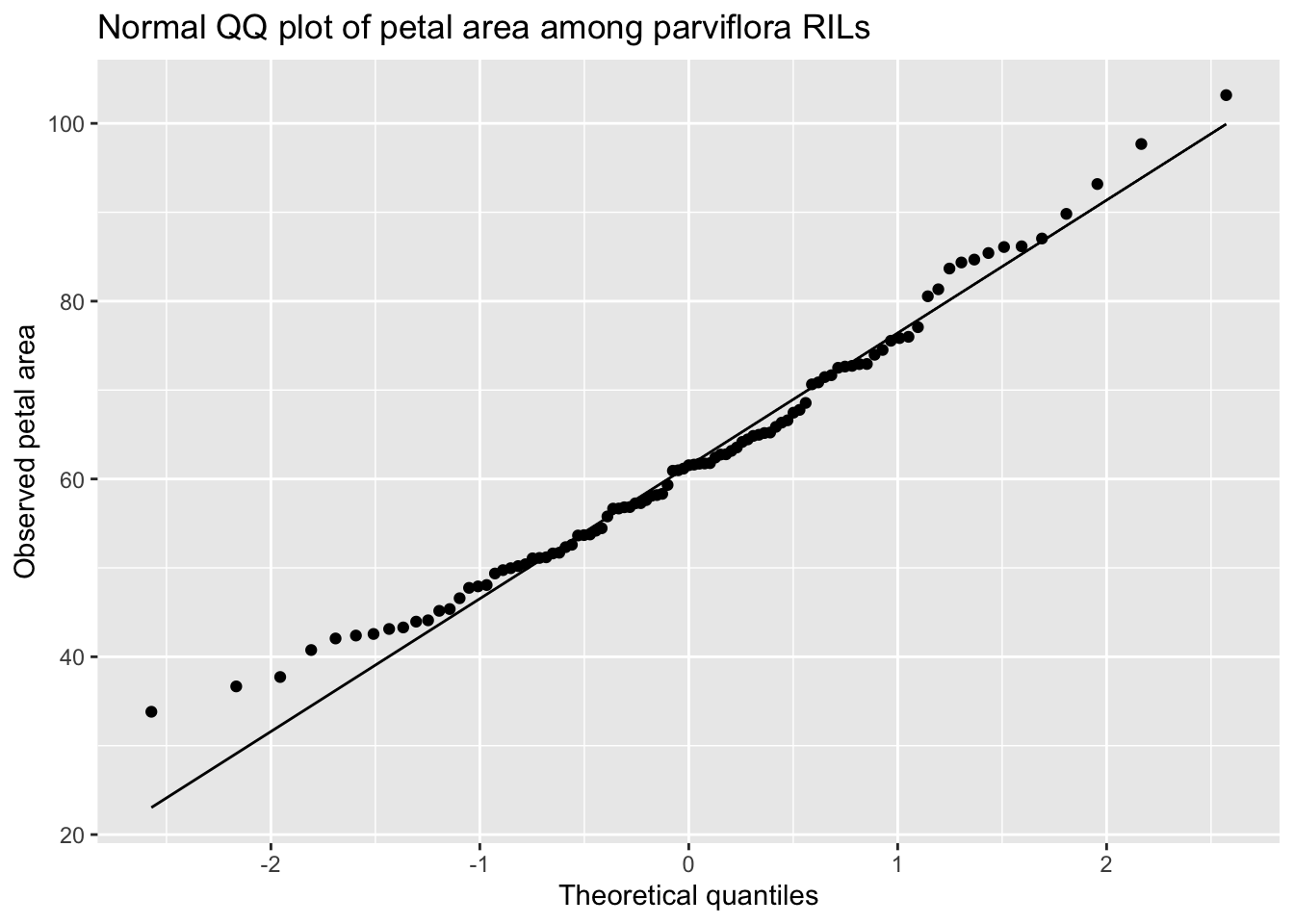
Making a QQ plot in R: We can create a QQ-plot using the geom_qq() function and add a line with geom_qq_line(). Here, we map our quantity of interest onto the sample attribute.
What normal distributions look like
I’m always surprised by how easily I can convince myself that a sample doesn’t come from a normal distribution. Try hitting the Generate a sample from the normal distribution button in the app below a few times, and experiment with the sample size to get a sense of the variability in what samples from a normal distribution can look like.
#| '!! shinylive warning !!': |
#|   shinylive does not work in self-contained HTML documents.
#|   Please set `embed-resources: false` in your metadata.
#| column: page-right
#| standalone: true
#| viewerHeight: 900
library(shiny)
library(ggplot2)
library(bslib)

ui <- fluidPage(
  theme = bs_theme(bootswatch = "flatly"),
  titlePanel("Getting a feel for normal distributions"),

  fluidRow(
    column(
      12,
      div(
        style = "margin-bottom: 10px;",
        actionButton("go", "Generate a sample from the normal distribution"),
        br(), br(),
        tags$label("Sample Size:", `for` = "n", style = "font-weight:600;")
      ),
      sliderInput(
        "n", label = NULL, min = 10, max = 100, value = 24, step = 1, ticks = TRUE, width = "100%"
      )
    )
  ),

  hr(),
  h3(textOutput("subtitle")),
  br(),

  # 2 x 2 plot grid
  fluidRow(
    column(
      6,
      h4("Histogram"),
      plotOutput("hist", height = "220px")
    ),
    column(
      6,
      h4("Density plot"),
      plotOutput("dens", height = "220px")
    )
  ),
  fluidRow(
    column(
      6,
      h4("quantile-quantile plot"),
      plotOutput("qq", height = "220px")
    ),
    column(
      6,
      h4("Cumulative distribution"),
      plotOutput("ecdf", height = "220px")
    )
  )
)

server <- function(input, output, session) {
  # Re-sample ONLY when the button is clicked (and use current n)
  sample_rv <- eventReactive(input$go, {
    rnorm(input$n)
  }, ignoreInit = TRUE)

  # Initialize once so there is something to show before first click
  observeEvent(TRUE, {
    if (is.null(isolate(sample_rv()))) {
      isolate({
        # seed-free initial draw; changes when button is pressed
        assign("._init_x", rnorm(isolate(input$n)), envir = .GlobalEnv)
      })
    }
  }, once = TRUE)

  x <- reactive({
    z <- sample_rv()
    if (is.null(z)) get("._init_x", envir = .GlobalEnv) else z
  })

  output$subtitle <- renderText({
    paste0("A sample of size ", length(x()), " from the standard normal distribution")
  })

  output$hist <- renderPlot({
    ggplot(data.frame(x = x()), aes(x)) +
      geom_histogram(color = "black", fill = "grey40", alpha = 0.7, bins = max(6, round(sqrt(length(x()))))) +
      labs(x = "x", y = "count") +
      theme_minimal()
  }, res = 150)

  output$dens <- renderPlot({
    ggplot(data.frame(x = x()), aes(x)) +
      geom_density(fill = "grey60", alpha = 0.5) +
      labs(x = "x", y = "density") +
      theme_minimal()
  }, res = 150)

  output$qq <- renderPlot({
    ggplot(data.frame(x = x()), aes(sample = x)) +
      stat_qq(size = 1.6) +
      stat_qq_line() +
      labs(x = "theoretical", y = "sample") +
      theme_minimal()
  }, res = 150)

  output$ecdf <- renderPlot({
    ggplot(data.frame(x = x()), aes(x)) +
      stat_ecdf(geom = "step", linewidth = 0.9) +
      coord_cartesian(ylim = c(0, 1)) +
      labs(x = "x", y = "y") +
      theme_minimal()
  }, res = 150)
}

shinyApp(ui, server)
Examples of a sample not from a normal distribution
Let’s compare the samples from a normal distribution, in our shinyapp above, to cases in which the data are not normal. For example,
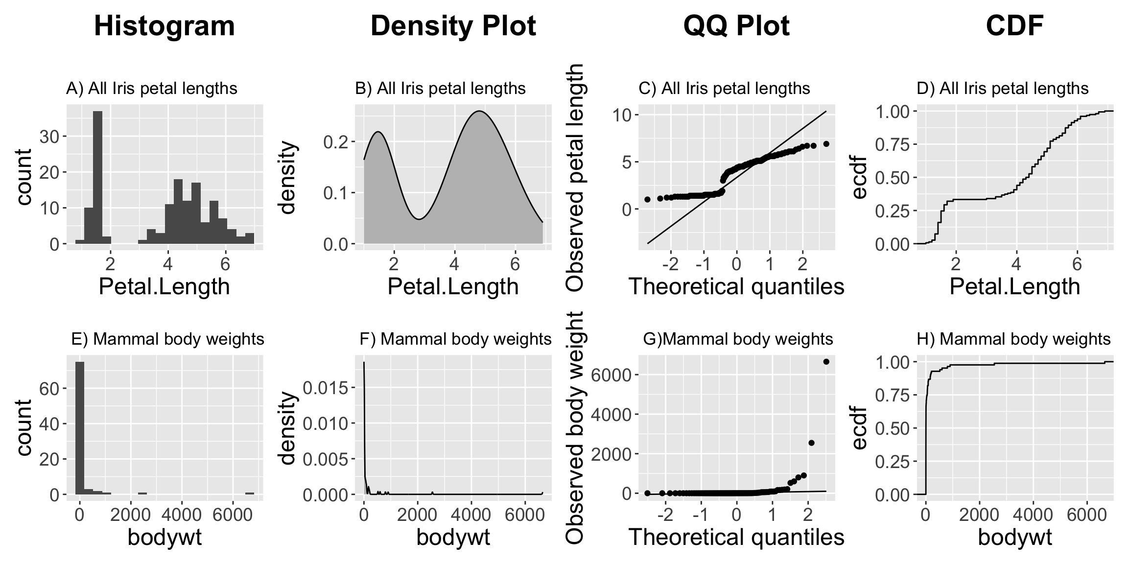
- Figure 3 A-D makes it clear that across the three Iris species, petal length is bimodal. -Figure 3 E-H makes it clear that across all mammals the distribution of body weights are exponentially distributed.
These examples are a bit extreme. Over the term, we’ll get practice in visually assessing if data are normal-ish.