• 3. A continuous variable
Motivating scenario: You want to see the distribution of a single continuous variable.
Learning goals: By the end of this sub-chapter you should be able to
- Familiarize yourself with making plots using the ggplot2 package.
- Use
geom_histogram()to make a histogram.- Specify the width (with
binwidth) or number (withbins) of bins in a histogram.
- Specify the width (with
- Use
geom_density()to make a density plot. - Change the outline color (with
color) and the fill color (withfill).
Visualizing Distributions
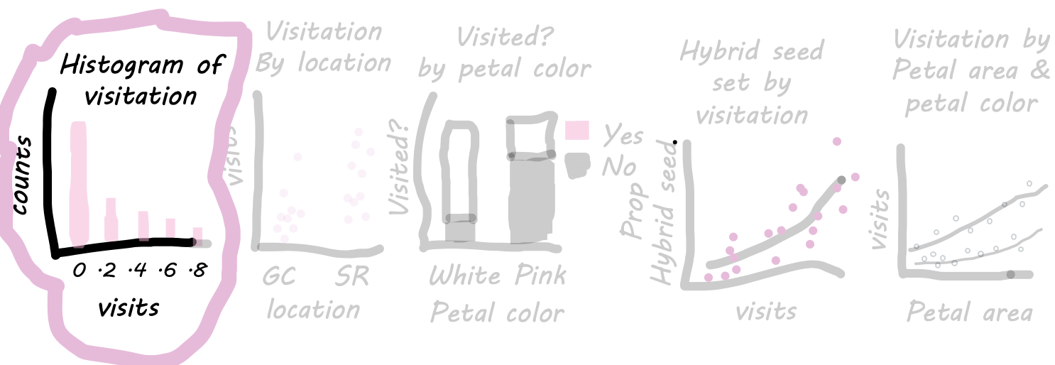
Let’s first consider the distribution of a single continuous variable—pollinator visitation. There are some natural questions we would want answered early on in our analysis:
- Are most flowers visited frequently, or do visits tend to be rare?
- Is the distribution symmetric, or is it skewed, with many flowers receiving few or no visits and a small number receiving many?
As we will see throughout the term, understanding the shape of our data helps guide our analysis. Let’s start with two common visualizations for distributions:
- A histogram bins the x-axis variable (in this case, visitation) into intervals and shows the number of observations in each bin on the y-axis. This allows us to see how frequently different levels of visitation occur.
- A density plot fits a smooth function to the histogram, providing a continuous representation of the distribution. This smoothing can sometimes make patterns easier (or harder) to see. Later, we’ll see that density plots can also help compare distributions.
Making histograms & density plots: A Step-by-Step Guide. To create these visualizations in ggplot2, we need to (minimally) specify three key layers:
- The data layer: This is the dataset we’re plotting—in this case,
ril_data. We pass this as an argument inside theggplot()function, e.g.,ggplot(data = ril_data).
- The aesthetic mapping: This tells R how to map each variable onto the plot. In a histogram, we map the variable whose distribution we want to visualize (in this case,
mean_visits) onto the x-axis. We define this inside theaes()argument withinggplot(), e.g.,ggplot(data = ril_data, aes(x = mean_visits)).
- The geometric object (
geom) that displays the data: In this case, we usegeom_histogram()for a histogram orgeom_density()for a density plot. These are added to the plot using a+, as shown in the examples below.
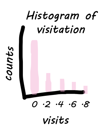
Inside the ggplot() function, we tell R that we are working with the ril_data, and we map mean_visits onto x inside aes(). The result is a boring canvas, but it is the canvas we build on.
ggplot(data = ril_data, aes(x = mean_visits))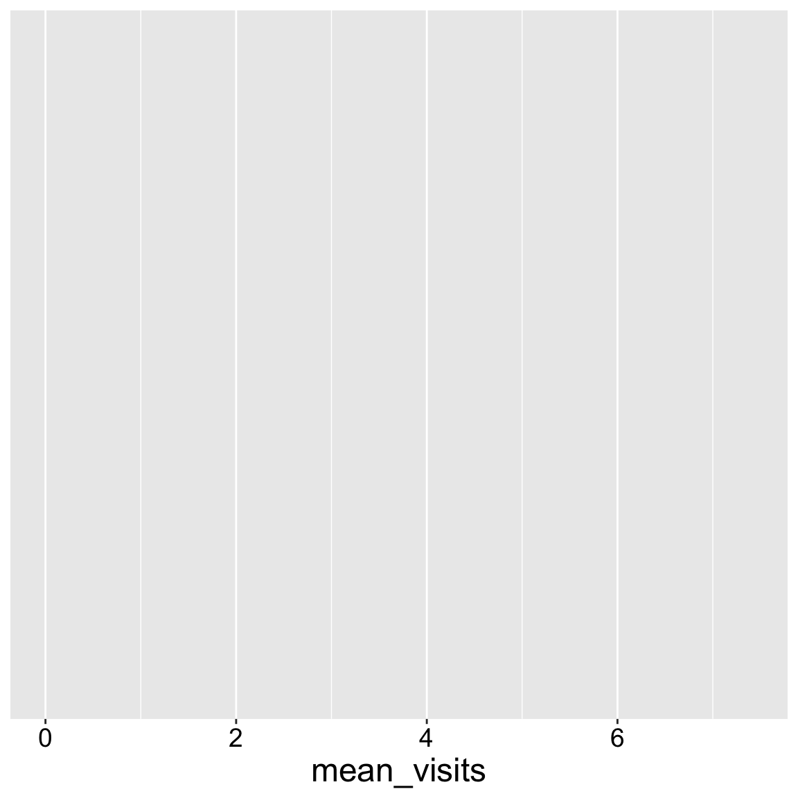
But now we want to show the data. To do so we need to add our geom. In this case we show the data as a histogram.
The resulting plot shows that most plants get zero visits, but some get up to five visits.
ggplot(ril_data,aes(x = mean_visits))+
  geom_histogram()
To take a bit more control of my histogram, I like to
- Specify the number or width of bins (with the
binwidthandbinsarguments, respectively).
- Add white lines between bins to make them easier to see (with
color = "white").
- Spruce up the bins by specifying the color that fills them (with e.g.
fill = "pink").
ggplot(ril_data, aes(x = mean_visits))+
  geom_histogram(binwidth = .2, color = "white", fill = "pink")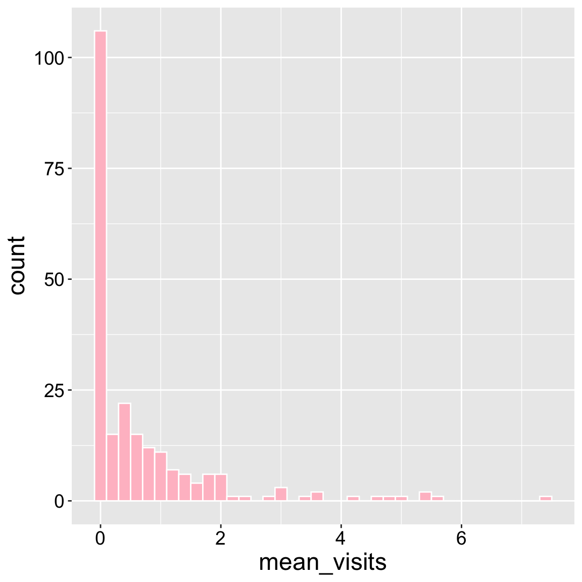
Now you can easily make a density plot if you prefer!
ggplot(ril_data, aes(x = mean_visits))+
  geom_density(color = "white", fill = "pink")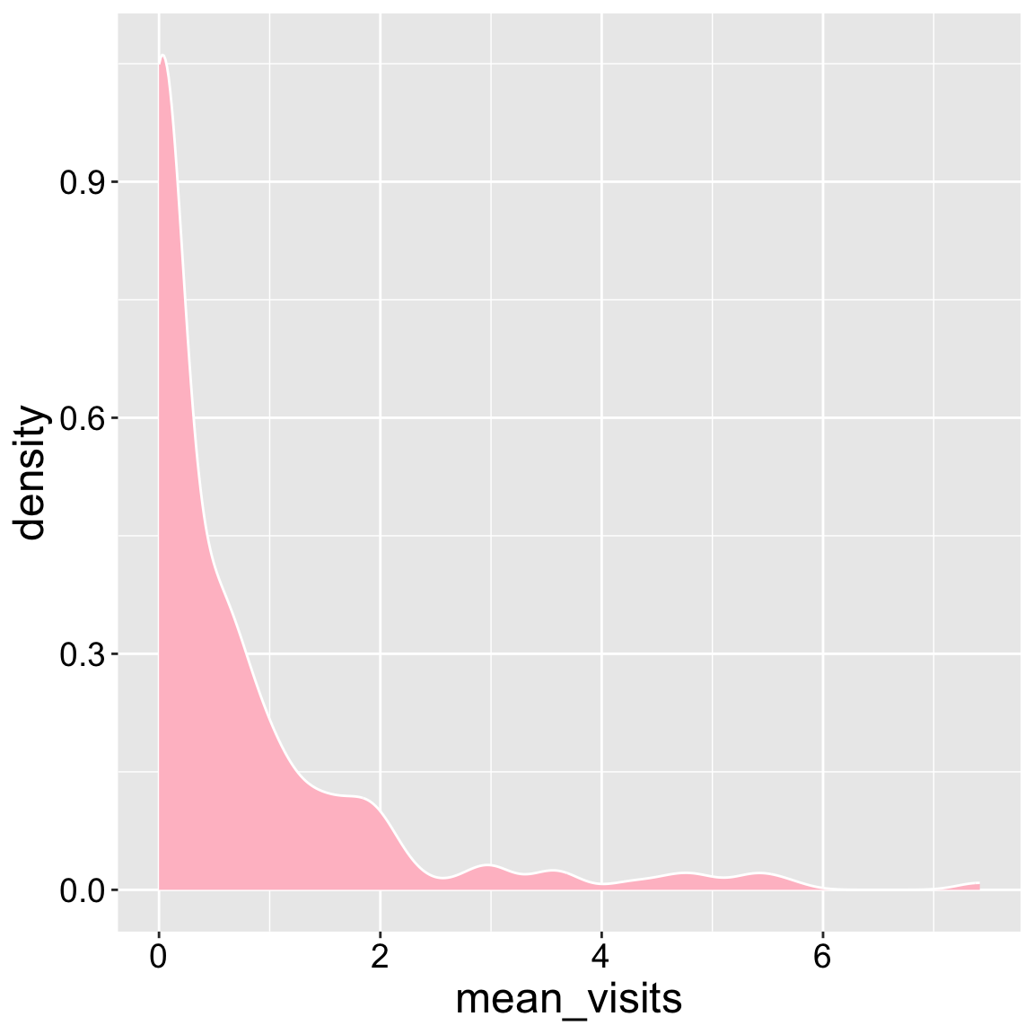
Interpretation: Returning to our motivating questions, we see that most plants receive no visits, but this distribution is skewed with some plants getting lots of visits.